Asset Allocation Quarterly (Second Quarter 2017)

  • The economy continues on a stable path, along with relatively low levels of inflation.
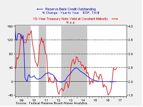
  • In this cycle, tighter Fed policy involves not only raising short-term rates, but also reducing the size of the Fed’s balance sheet.
  • The magnitude of growth of the Fed’s balance sheet in recent years was unprecedented. Its reduction is also unprecedented.
  • We expect the Fed to move gradually and telegraph its policy, allowing markets time to adjust without harmful disruptions.
  • Our equity allocations are unchanged this quarter and remain entirely domestic. We utilize large caps for conservative portfolios, while including mid and small caps where risk tolerance is higher.
  • Our bond allocations include short, intermediate and long maturities. We also believe speculative grade bonds are helpful in pursuing income objectives.
  • Our growth/value style bias shifts from 30/70 to an even weight of 50/50.

ECONOMIC VIEWPOINTS

The economy remains on a stable trend so far in 2017. Unemployment remains low, while consumer and business sentiment are improving. Accordingly, the Fed has continued on its path of gradually raising short-term interest rates. At this point, it appears the pace of tightening is appropriate, and isn’t tipping the economy toward a recession. Still, we’re keeping a close eye on monetary policy, because there’s a unique issue the Fed is managing in this cycle: the reduction of its own balance sheet.

What exactly is the Fed’s balance sheet? Without getting into too many details, the Fed’s balance sheet reflects the value of assets it has purchased in the financial markets, most of which are bonds. When the Fed buys assets, it pays for them by simply creating money. It’s sort of like a digital printing press that increases money supply. Conversely, when the Fed sells assets, the proceeds are taken out of the economy, lowering the supply of money. The Fed normally expands and shrinks its balance sheet by buying and selling short-maturity bonds, thereby directing short-term interest rates, according to its desired policy.

However, during the financial crisis in 2008, the Fed altered the kinds of assets it would purchase in order to help stabilize the markets. Then, after stabilizing markets, the Fed began purchasing long-maturity Treasury and mortgage bonds (a policy called “Quantitative Easing,” or “QE” for short) in an attempt to stimulate the economy by driving long-term interest rates lower. In this graph, we can see the total assets of the Fed. In 2008, its balance sheet had assets worth about $900 billion. Although this was a large number, it was a function of multi-decade growth, having risen along with the overall size of the economy.

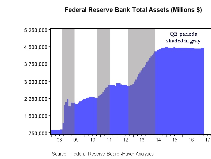
Through three rounds of QE, the Fed’s balance sheet growth accelerated rapidly, ultimately quintupling assets to almost $4.5 trillion. Unfortunately, the economic stimulus from QE didn’t materialize. Most of the increase in money supply remained parked as excess reserves in the banking system. Lending stalled as financial regulations made banks very cautious to lend, while at the same time most qualified borrowers were simply not interested in more debt.

So, today, as the Fed guides short-term rates gradually higher, it is also contemplating how to lower the size of its balance sheet. If most of the increase in money supply is parked as excess reserves in the U.S. banking system, a gradual decline in the Fed’s balance sheet shouldn’t be too disruptive to the availability of credit and shouldn’t harm the economy…in theory. The problem is, nobody really knows how to shrink a balance sheet of this size. How much? How fast? When? It’s an unprecedented endeavor.

Fortunately, the Fed has significant leeway in how it moves forward. It has already had success in telegraphing its interest rate policy, and we expect the Fed to communicate its balance sheet plan in a way that fosters gradual adjustments by financial markets, borrowers and lenders. It’s worth noting this leeway is derived from a stable economy. In the event the economy begins to falter, or is disrupted by geopolitical events, the Fed’s efforts will become much more complicated.

It’s also worth mentioning that uncertainty regarding White House policies may also cloud the economic landscape. We have not yet ascertained whether the president will favor traditional supply-side economics, or if populist priorities will rule the day. Generally speaking, a supply-side bias would create more predictability for the Fed, whereas populist policies toward protectionism would tend to create more inflation, geopolitical risk and uncertainty for the Fed. Accordingly, we’ll be closely monitoring economic trends, geopolitical risk, White House policies and how the Fed decides to navigate the unprecedented reduction of its balance sheet.

STOCK MARKET OUTLOOK

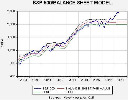
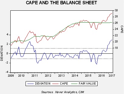
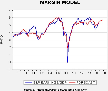
Even as the post-election euphoria leveled off, equities were still able to begin 2017 on a positive trend, with large caps delivering some of the best returns. We believe the environment for equities should remain generally good, although we are a bit more cautious given that valuations have risen over the past few years. Our work indicates there has been a close relationship between increases in the Fed’s balance sheet and equity valuations (stock P/E ratios rose during periods of QE), so we are monitoring equities to see if a shrinking balance sheet has the opposite effect. Our early work indicates that a gradual decline in the Fed’s balance sheet may not be overly disruptive to equities.

We maintain our focus on domestic equities, with no foreign developed or emerging equity exposure.  We continue to believe the return/risk profile is more favorable for U.S. equities against the backdrop of potential earnings, valuations, currency risk and geopolitical uncertainty. We utilize large caps for more conservative models, while including more exposure to mid and small caps where risk tolerance is higher. Within large caps, we are overweight financials, industrials and utilities, while being underweight telecom and consumer staples. We are adjusting our style bias from 30/70 growth/value to an evenly balanced 50/50, based upon our views toward sectors and industries within each style.

BOND MARKET OUTLOOK

After rising in the latter half of 2016, Treasury yields were generally stable in the first quarter of 2017. Seemingly, as the optimism for higher growth mellowed, so too did concerns for future inflation and more aggressive tightening by the Fed. Our expectation is for both growth and inflation to remain generally in line with current levels, with the potential to rise modestly over the next few quarters. A wildcard here may be trade policy. If protectionist policies were to actually manifest, they would likely drive inflation higher. We are also watching to see how the decline in the Fed’s balance sheet affects bond yields.

Against this backdrop, we feel it is appropriate for most bond investors to include a variety of maturities, sectors and credit qualities in their bond allocations. These include short, intermediate and long-maturities, including Treasury, corporate and MBS. We also include speculative grade bonds, where the default rates appear relatively benign. It is worth mentioning that we continue to see important diversification benefits from longer maturity bonds as this asset class has a tendency to rise when equities decline, helping to address overall portfolio risk.

OTHER MARKETS

Fundamentals in real estate are generally good, although we prefer to limit or avoid exposure to retailing, where certain markets may face ongoing challenges. Broadly speaking, real estate capital costs and financing should remain relatively low, while occupancy and rental rates are likely to be constructive. We also expect foreign capital to continue flowing into U.S. real estate.

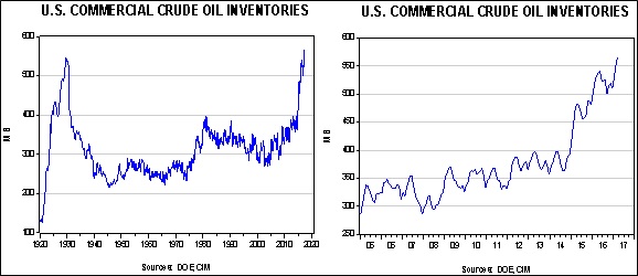
We remain out of commodities where the return/risk does not appear as favorable. China continues to be the marginal source of demand for most commodities, and we have concerns regarding the stability of the country’s growth rate. In addition, we expect energy commodities to have a negative bias given significant global supply capacity.

View the complete PDF

Asset Allocation Weekly (April 21, 2017)

by Asset Allocation Committee

Last week, we discussed the impact of reducing the size of the Federal Reserve’s balance sheet on the economy.  This week we will discuss the effects of QE on financial markets.

The relationship between the balance sheet and equities seems rather straightforward; expanding the balance sheet appears to be clearly supportive for equities.

This chart shows the S&P 500 Index regressed against the Fed’s balance sheet.  From 2009 until last year, this equity index closely tracked the level of the balance sheet.  Equities have lifted above the forecast level of the balance sheet recently.  If the relationship holds, equities are vulnerable to a large decline.  On the other hand, there is no evidence to suggest that bank reserves somehow found their way into the equity market.  Comparing the Shiller P/E (CAPE) suggests that the effect of QE was probably psychological; after fed funds reached the zero bound, QE signaled to investors that policy was still easy.

This chart regresses the CAPE against the Fed’s balance sheet; the CAPE’s behavior is similar to that of the overall equity market.  After the election, the market has mostly risen on multiple expansion, rising well above the model’s fair value.

It should be noted that low interest rates could have a similar effect.  However, the fact that equities and the P/E seemed to track the balance sheet does suggest that QE had an impact on market psychology.

The impact on bonds is rather interesting.

The gray bars show periods when QE was implemented.  Especially after QE 1, periods of QE tended to coincide with rising rates.  When QE was ending (shown by the decline in the yearly growth rate of the balance sheet), rates tended to decline.  Despite the FOMC bond buying, rates rose mostly on fears of inflation.  Once QE ended, those fears eased and bond yields declined.  The most recent rise is likely due to expectations of fiscal stimulus that will boost growth and potentially raise inflation.

If the Fed’s expanding balance sheet was a supportive psychological factor for bonds and stocks, will the contraction have the opposite impact?  Simply put, we don’t know.  If the economy and earnings are improving, the drop in the balance sheet probably won’t matter.  Unfortunately, if the economy disappoints, cutting the balance sheet could have a bearish impact on these assets.

Next week we will examine the impact of the Fed’s balance sheet on monetary policy.

View the PDF

Asset Allocation Weekly (April 13, 2017)

by Asset Allocation Committee

The most recent Federal Reserve minutes indicated that the U.S. central bank is preparing to reverse its experiment with quantitative easing (QE) by reducing the size of its balance sheet.  Although the eventual desire to reduce the size of the balance sheet is no real surprise, the timing was unclear.  It now appears that the FOMC will begin reducing the balance sheet by year’s end.  Over the next three weeks, we will look at the potential ramifications of reducing the Federal Reserve’s balance sheet.  This week we will examine the impact of QE on the economy.  Next week, we will focus on the financial markets.

QE was a controversial policy; as policymakers explained it, there seemed to be two elements to the decision to expand the central bank’s balance sheet.  First, it wanted to boost the level of reserves and lower short-term interest rates to spur bank lending.  Second, it wanted to lift the price level of financial assets to increase economic activity through the wealth effect.  There were always a number of risks imbedded in the policy.  First, if banks aggressively lent the money, the money supply would rise and lead to inflation.  Second, the opposite effect could also occur; banks could simply sit on the excess reserves and hamper the stimulative effect of lending.  Third, the wealth effect could exacerbate wealth inequality.  Upper income households tend to hold more of their wealth in financial assets whereas lower income households usually hold the bulk of their assets in real estate and cash.  By lowering bond yields and lifting price/earnings multiples, higher income families benefit.  If home prices don’t rise, or if lenders prevent cash-out refinancing, the policy’s wealth impact would widen wealth gaps.  Fourth, the support for financial asset markets could lead to valuation extremes and create fragile market conditions.

In practice, the effect from QE was rather mixed.  We suspect that a whole generation of economists will write dissertations on the impact of QE.  However, at this particular moment, we don’t have the benefit of this analysis.  Instead, we will have to focus on what effect the balance sheet reduction will have on the economy and financial markets.  Over the past three decades, bear markets in equities are closely tied to economic recessions; in fact, the last major market decline absent of a recession was the 1987 crash.  History also tells us that modern recessions occur for two reasons, a monetary policy mistake (policy is too tight) or a geopolitical event.  Reducing the Fed’s balance sheet, given the degree of uncertainty surrounding the impact of QE, raises the odds of a policy error.

The impact of QE on the economy: QE appears to have done little for the economy.  Economic growth has been stagnant and it isn’t obvious that low rates alone would not have yielded a similar outcome.

The fear among some analysts when QE was implemented was that it would spur inflation.  This was based on Fisher’s monetary identity, which is that money supply times velocity is equal to the price level times available supply, or MV=PQ.  If Q, which represents the productive capacity of the economy, is fixed, and V is thought to be dependent upon the institutional arrangements for the circulation of money, and thus mostly fixed as well, raising M will only lead to higher P.  If there is slack in the economy, Q could rise with steady prices, leading to higher real output.  However, at full employment, inflation is the only result.  In fact, what happened is that the reserves sat harmlessly on bank balance sheets, while the real economy grew slowly and velocity plunged.  The chart below shows annual velocity of money (GDP/M2, or using the identity, V=PQ/M).  Note that during the Great Depression, velocity plunged then as well.  Economists during this period soured on monetary policy and mostly focused on fiscal policy.  That shift of fiscal policy didn’t occur during the 2008 Financial Crisis.

It is unclear why expanding the money supply failed to boost lending.  However, deleveraging was common to both periods of low velocity.

This chart shows household debt as a percentage of GDP.  The plunge in the early 1930s coincides with a steady decline in household debt; the same is true now.[1]  If there is a drop in demand for loans, injecting reserves into the banking system won’t have much impact on the real economy.  Conversely, shrinking the balance sheet should do nothing more than reduce the level of excess reserves on commercial bank balance sheets.

View the PDF

________________________________

[1] It is interesting to note that velocity did rise in the early 1930s during the Great Depression.  This was due to a horrific policy error where the Federal Reserve tightened policy into the teeth of the downturn, triggering a deeper drop in growth.

Quarterly Energy Comment (April 11, 2017)

by Bill O’Grady

The Market
Since December, oil prices have been ranging between $48 and $55 per barrel.

(Source: Barchart.com)

Prices and Inventories
Inventory levels remain elevated, reaching historic highs.

In the above charts, the one on the left shows the long-term inventory situation, while the chart on the right shows a 12-year history.  Normal inventories would be below 400 mb, so stockpiles remain elevated.

View the complete PDF

Weekly Geopolitical Report – The EU at 60: Part II (April 10, 2017)

by Bill O’Grady

(Due to the Easter holiday, the next edition will be published April 24th.)

Last week, we began our retrospective on the EU.  This week we will examine the post-Cold War expansion of the EU, including a discussion of the creation of the euro and the Eurozone.  With this background, we will analyze the difficulties the EU has faced in dealing with the problems caused by the 2008 Financial Crisis.  We will look at several proposals being floated in the wake of Brexit about reforming the EU and, as always, conclude with potential market effects.

View the full report

Asset Allocation Weekly (April 7, 2017)

by Asset Allocation Committee

In our 2017 Outlook, our earnings forecast for the S&P 500 was $119.45 per share, up from $106.25 in 2016.[1]  Based on new data and other trends, we are raising this forecast to $126.44 for this year.  There are three reasons for the change.

The spread between Thomson-Reuters and S&P operating earnings is narrowing.  This is an issue we have discussed in the past.  There are two primary sources of information for earnings, Standard and Poor’s and Thomson-Reuters.  Most of the time, the two sources are consistent.  However, since the Great Financial Crisis, the latter has tended to report higher operating earnings for the S&P 500 than the former.  Explanations for this divergence vary.  It does appear that Thompson-Reuters takes a more “relaxed” view on what costs are excluded compared to Standard and Poor’s.  Here is the data through Q4 2016:

In 2001 and 2008, the spread between the two series coincided with recessions.  Since the Great Recession, we have had two periods where the spread has widened; both are tied to declines in oil prices.  As oil prices recover, the current spread should narrow.

Margins are showing some improvement.  We compare total S&P 500 earnings to GDP.  Our model for this percentage is indicating that margins will improve this year.

The blue line on the chart shows the actual percentage of S&P 500 total operating earnings to nominal GDP.  For most of this century, this percentage has been ranging between 5% and 6%.   The drop in oil prices led to some margin compression.  We also expect improving productivity and a modest widening of the trade deficit to boost margins, shown above as the red line, which is the model forecast.

Finally, the per-share data will be supported by a steadily declining divisor.  The below chart shows the S&P 500 divisor; it’s a scaling factor for the index.  

To calculate the index, one takes the overall market capitalization and divides it by the divisor.  The divisor adjusts to changes in the composition of the index, as well as new issuance, share repurchases and mergers.  The rise in share buybacks has led to a steady drop in the divisor; we are now at levels last seen in early 2000.  As the divisor declines, the per-share value rises.

Despite this increase in earnings, we have not boosted our S&P 500 target forecast of 2400 for the year.  We view the P/E as elevated at this point and so we expect the rise in earnings to mostly result in a weaker multiple.  At the same time, this change will make equity markets less expensive and thus less vulnerable to disappointment.  If the rise in business and consumer sentiment supports the multiple, we will make appropriate adjustments to our forecast.

View the PDF

________________________________

[1] This is basis S&P operating earnings.  The other major provider, Thomson-Reuters, has the higher numbers that are usually reported in the media.

Weekly Geopolitical Report – The EU at 60: Part I (April 3, 2017)

by Bill O’Grady

On March 25th, European Union (EU) leaders from 27 nations gathered in Rome to celebrate the 60th anniversary of the founding of the organization.  Although the EU currently consists of 28 members, the U.K. was absent due to its recent decision to leave the EU.

On that day in 1957, France, West Germany, Italy, Belgium, Luxembourg and the Netherlands signed the Treaty of Rome, creating the European Economic Community (EEC), which eventually became the EU.  Over time, new members joined the group.  This map shows the current members.[1]

(Source: EU)

It should be noted that this wasn’t the first attempt at a supranational European body.  France proposed the European Defense Community to be comprised of the six original EU members.  However, the French failed to ratify the treaty.  In 1951, West Germany and France built the European Coal and Steel Community which included the other four founding nations of the later EU and it became a forerunner of the EU.  In 1957, the same six nations agreed to cooperate on nuclear power.  Still, the EEC is considered the original source of what evolved into the EU.

The primary goal of the EU was to prevent another world war from being fought on European soil.  That goal, at least so far, has been successful.  The key to meeting this goal was to solve the “German problem.”  That issue continues to evolve.

In Part I of this report, we will discuss the German problem and how NATO and the EU were developed in response to resolving that problem.  In Part II, we will examine the post-Cold War expansion of the EU, including a discussion of the creation of the euro and the Eurozone.  With this background, we will analyze the impact of the 2008 Financial Crisis and the difficulties the EU has faced in dealing with the problems it caused.  There will be an analysis of immigration and European security as well.  We will look at several proposals being floated in the wake of Brexit about reforming the EU and, as always, conclude with potential market effects.

View the full report

_____________________________________

[1] For the next two years, the U.K. will remain a member.  PM May did submit an Article 50 letter on March 29 which begins the two-year process of exiting the EU.  It is possible that this deadline could be extended depending on negotiations.  Britain is the first nation to exit the EU.

Asset Allocation Weekly (March 31, 2017)

by Asset Allocation Committee

Historically, recessions tend to come from three sources—overly tight monetary policy, geopolitical events and inventory overhangs.  The latter has mostly become irrelevant due to improved inventory management, leaving overly tight monetary policy and geopolitical events as the typical causes of downturns.  As our regular readers know, we monitor both quite closely.

One of the problems with monetary policy is determining “tightness.”  Although we have a plethora of models that attempt to calculate the “neutral rate” for fed funds, in reality, the correct neutral rate changes over time due to economic conditions.  Again, we usually focus on inflation and the most visible data, such as the employment report and GDP, to gauge the health of the economy.  However, we also monitor more obscure numbers which may offer insights into the economy that are not being picked up by the bigger and more common reports.

One of these lesser watched metrics tracks vehicle miles driven.  The Federal Highway Administration measures how many miles are being driven by all vehicles, including commercial vehicles and passenger cars and trucks.  We have found that miles driven are sensitive to economic activity and oil prices.

These charts show the same data on different time scales.  The left chart shows the rolling 12-month data on vehicle miles driven since the early 1970s.  The gray bars indicate periods when the monthly total is not a new peak.  Once a new peak is reached, the gray bar ends.  Although there have been short-term declines from the peak, there were three significant events seen in 1973-75, 1979-82 and 2007-2014.  All three of these events occurred during deep recessions that coincided with high oil prices.  The chart on the right shows the data since 2000.  Note that we finally reached a new peak in early 2015, just over seven years after the previous high in late 2007.

As the chart on the right shows, in 2014, miles driven began to accelerate, suggesting the economy was improving.  However, since Q2 2016, the growth rate in miles driven has started to stall.  Although it is still making new highs, the slowdown does raise concerns.

This chart shows the annual change in the 12-month rolling total for vehicle miles driven.  Until 2012, negative readings coincided with recessions but only severe ones that also suffered from high oil prices.  However, even the 1990-91 downturn, which was part of the oil spike caused by the Iraqi invasion of Kuwait, did not bring a negative reading to this number.

There is a structural trend in the data as well.  Note that the level of driving seems to grow at a slower pace during each expansion.  The expansion after the 1973-75 recession was 3.8%; the expansion after the 1980-82 recession was 4.1%.  However, the subsequent growth rate after the 1990-91 recession was 2.5% and after the 2001 recession was 1.3%.  In this expansion, the average growth rate in miles driven is a mere 0.8%.  Why are fewer miles being driven?  We suspect a number of factors are at work.  To some extent, the law of large numbers is having an effect.  There are simply constraints to driving that are probably leading to slower growth, namely, road infrastructure and the amount of the population that can afford to own a car.  The aging baby boom population is being replaced by Americans who seem to drive less.[1]  The advent of social media may reduce the need to drive; baby boomers used to “cruise” to meet friends.  The internet allows gatherings to occur without leaving home.

Still, the jump in the data from 2014 into early 2016 and the subsequent slowdown do concern us.  This drop could be an early warning that consumers are retrenching; the lack of wage growth may be weighing on household spending.  We note that consumption trends are showing slowing growth.

This chart shows the three-year moving average of the contribution to GDP coming from household consumption.  The sharp decline in the last recession shows how damaging the last recession was to the household sector.  Although the recovery has been robust, the level of growth remains well below previous cycles.  In addition, for the past three quarters, the trend contribution level has been stuck at 2%.  If this reading fails to accelerate, it would suggest growth will remain slow.

Thus, the miles driven number does suggest some softening in the economy.  The slowdown isn’t serious enough to signal an imminent recession, but it should give policymakers pause on moving aggressively on interest rates.  If monetary policy remains accommodative, the bullish environment for equities should remain in place.

View the PDF

________________________________

[1] https://www.washingtonpost.com/news/wonk/wp/2014/10/14/the-many-reasons-millennials-are-shunning-cars/?utm_term=.3061591ca7d9


Weekly Geopolitical Report – It’s Tsar, Not Comrade (March 27, 2017)

by Bill O’Grady

February 12th was the 100-year anniversary of the Russian Revolution.  Surprisingly, the Kremlin has taken a very low-key stance on the centenary.  We believe the government’s decision to downplay this historical event offers an insight into Russian President Putin’s thinking.

In this report, we will present a history of the Russian Revolution, showing how civil order deteriorated in the years after 1917.  We will offer observations of how the Kremlin’s treatment of the revolution reflects Putin’s worldview.  As always, we will conclude with potential market effects.

View the full report