Asset Allocation Weekly (May 19, 2017)

by Asset Allocation Committee

One of the significant “known/unknowns” is the true condition of the labor market.  The below chart highlights the issue.

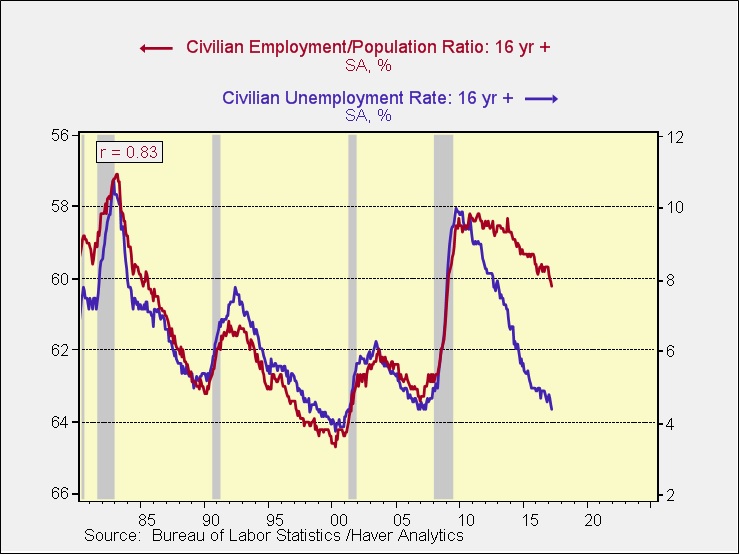
The blue line is the unemployment rate, while the red line is the employment/population ratio (scale inverted).  From 1980 until 2010, these two series closely tracked each other.  During the period since the last recession, the two have clearly diverged.  The current unemployment rate is 4.4%; if the relationship from 1980 to 2010 had held constant, the unemployment rate would be approximately 7.5%.

For policymakers, the problem is determining which measure of the labor market best characterizes the degree of slack in the economy.  If the employment/population ratio is correct, then ample slack exists and policymakers should keep policy accommodative.  If the unemployment rate is the better measure, then labor markets are tight and the FOMC needs to be raising rates.

To determine the degree of accommodation, we use four variations of the Mankiw Rule.  The Mankiw Rule models attempt to determine the neutral rate for fed funds, which is a rate that is neither accommodative nor stimulative.  Mankiw’s model is a variation of the Taylor Rule.  The latter measures the neutral rate using core CPI and the difference between GDP and potential GDP, which is an estimate of slack in the economy.  Potential GDP cannot be directly observed, only estimated.  To overcome this problem with potential GDP, Mankiw used the unemployment rate as a proxy for economic slack.  We have created four versions of the rule, one that follows the original construction by using the unemployment rate as a measure of slack, a second that uses the employment/population ratio, a third using involuntary part-time workers as a percentage of the total labor force and a fourth using yearly wage growth for non-supervisory workers.

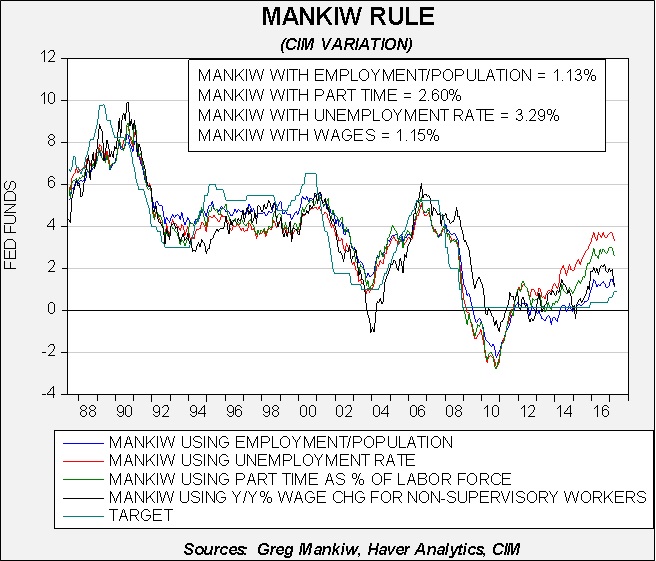
Using the unemployment rate, the neutral rate is now 3.29%.  Using the employment/population ratio, the neutral rate is 1.13%.  Using involuntary part-time employment, the neutral rate is 2.60%.  Using wage growth for non-supervisory workers, the neutral rate is 1.15%.  Note that for two of the variations, wage growth and the employment/population ratio, the FOMC is already near the neutral rate.  The fact that policymakers appear driven to lift rates further suggests they believe that some other measure is a proper measure of slack.

Since the Great Financial Crisis, it has been unclear which measure of employment accurately characterizes the labor market.  Because the Fed had been conducting very easy monetary policy, the debate was mostly academic; that isn’t the case anymore.  If the most accurate measure is actually the employment/population ratio or wage growth, but the Fed thinks either the unemployment rate or involuntary part-time employment is the correct indicator of slack, then policymakers could run the risk of overtightening and potentially risking a recession.

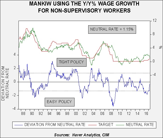
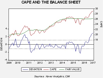
This chart shows the issue; this is the Mankiw model variation using wage growth.  The lower line on the chart shows the deviation from the neutral rate as projected by the model.  When the rate is below zero, policy is leaning toward accommodative.  Note the parallel lines on the lower part of the chart; these lines measure a standard error on either side of the neutral rate.  When the deviation is within the parallel lines, it suggests policy is mostly neutral.  Thus, based on wage growth, we are close enough to neutral policy that the Fed could stand pat until either wage growth accelerates or core CPI rises.

Thus, the coming months will be key.  If this model is the most accurate measure of slack then the Fed needs, at most, one more hike.  Policy would be tight at a fed funds target of 2.40%, so there is some margin for error.  Based on the dots chart, we would be at this level by the end of next year.  Simply put, we could be approaching a period where monetary policy shifts to a headwind.

The path of monetary policy has been a key element in the asset allocation committee’s analysis of the economy and markets.  We are moving into a more critical phase where the potential for a policy error is rising.  By year’s end, we could have a fed funds rate that would be modestly higher than neutral using at least two of the four variations of the Mankiw Rule model.  That would increase the potential for a recession which we would expect to have a negative impact on equity markets.  Thus, this is an issue we will be closely monitoring into the second half of 2017.

View the PDF

Asset Allocation Weekly (May 12, 2017)

by Asset Allocation Committee

Slow economic growth has plagued the West.  Although the concern has been acute since the Great Financial Crisis (GFC), worries about slowing growth predated that event.  Perhaps the most important factor contributing to sluggish growth has been tepid productivity growth.

This chart shows the five-year change in productivity; we use this longer term rate of change to more clearly show the trend in productivity growth.  As the chart indicates, productivity growth is remarkably weak; in fact, in the postwar era, only the weakness seen in the depths of the 1981-82 recession recorded lower productivity growth by this measure.

Economic theory holds that production comes from the combination of land, labor, capital and entrepreneurship.  Most models focus on capital and labor.  The Cobb-Douglas production function[1] is a canonical expression of how economists think about forecasting output.  Production is the combination of capital and labor, scaled by productivity.  If productivity is constant, growth comes by adding capital (investment in plant and equipment, etc.) and workers (or, specifically, hours worked).  If an economy increases its productivity, more output is gained for each additional unit of labor and capital.  That’s why falling productivity is such a problem; it means that additional labor and capital resources must be deployed just to keep production steady.

Productivity is something of the holy grail of economics.  Theories of what boosts productivity abound; deregulation and competition are thought to increase it, supporting entrepreneurship with low taxes could be a factor, education and immigration could support increases and, of course, technological progress is a necessary ingredient.  However, no economist has yet been able to definitively say what causes productivity to universally rise under all conditions.

However, we can say that an economy with weak productivity growth will struggle.  Capital and labor essentially divide total output and low productivity makes that division difficult.  On the other hand, rising productivity can allow both capital and labor to enjoy a rising absolute share of output.  Social peace is much easier to achieve with rising productivity.  It is probably no accident that the rise of populism in the West has coincided with weak productivity growth.

From the mid-1970s into the GFC, the relationship between corporate profits and the five-year growth rate of productivity was fairly consistent.

This chart shows pre-tax corporate profits, on a national income product accounts basis, as a percentage of GDP along with the five-year growth rate of productivity.  From the mid-1970s into 2007, the two series were highly correlated at 75.8%, with trend productivity leading profits by four years.  Since 2007, the two are inversely correlated at the 53.3% level.  Clearly, profits have remained elevated despite weak trend productivity, which begs the question—how did profits hold up in the face of falling productivity?

What has occurred is that relative labor compensation has fallen.

The upper line on this chart shows pre-tax profits as a percentage of GDP.  The lower line shows labor’s share of output along with a time trend calculated from 1947 to 2004.  From 1947 through 2004, the share held fairly steady; although there was a clear downtrend, the slope was fairly benign.  Clearly after 2004 the share fell well below trend, and the labor share plummeted after the GFC.  It has recovered some of its losses since 2015 but the data is still well below trend.  A falling share to labor has allowed firms to overcome weak productivity trends and retain high margins.

Why has labor’s share of output declined?  The media discusses a litany of reasons…technology and globalization have given firms market power over labor and allowed companies to keep wages contained despite tightening labor markets.  Although this condition has been a boon for profit margins, it has been difficult for workers and we suspect the rise of populism is a direct result of wage pressures.

As the first chart shows, because of the lagged effect of trend productivity, the effects of weak productivity will become acute starting around mid-2018.  Without a decline in the labor share of output, profit margins will come under growing pressure.  Using a simple regression of trend productivity and labor share, to maintain pre-tax profits of 12% would require the labor share to fall to 55% by the end of 2018.  If the labor share remains constant, profit margins will decline to 9.6% of GDP.  This level is still historically high but, given market expectations of continued strong profit margins, even this decline will be problematic.

The Trump administration continues to straddle the line between a traditional GOP stance that favors business and capital and a populist variant that calls for trade protection and immigration restrictions.  If President Trump decides to favor his working class supporters, which would likely boost the labor share, profit margins would come under even more pressure.  This is a factor we will be monitoring closely as the year progresses.

View the PDF

_______________________________

[1] P(L, K) = bLαKβ, where:  • P = total production (the monetary value of all goods produced in a year) • L = labor input (the total number of person-hours worked in a year) • K = capital input (the monetary worth of all machinery, equipment and buildings) • b = total factor productivity • α and β are the output elasticities of labor and capital, respectively.  These values are constants determined by available technology.

Asset Allocation Weekly (May 5, 2017)

by Asset Allocation Committee

In our most recent quarterly asset allocation meetings, our analysis determined that emerging markets would not be added to the portfolios.  Since this asset class has been this year’s best performer, some explanation is in order.  One of the primary reasons we have refrained from adding emerging markets is the dollar’s strength.

The blue line on this chart looks at the relative performance of emerging markets to the S&P 500.  When the line is rising, the S&P is outperforming emerging markets.  The red line is the JPM real dollar index.  The two series are positively correlated at 80.8%, meaning that a stronger dollar tends to reflect the S&P 500 outperforming the emerging markets.  This correlation has weakened modestly recently, but is still quite elevated.

The second reason we have been reluctant to add emerging markets is because the relative outperformance is occurring with weaker commodity prices.

Although the correlation isn’t as strong as with the dollar, rising commodity prices tends to coincide with stronger relative emerging market performance.  Although commodities are off their lows, they remain depressed. Thus, the current level of commodity prices seems to support weaker relative emerging market equities.

This chart shows a model of the emerging market/S&P 500 relative performance regressed against the JPM dollar index, the CRB index and fed funds (advanced six months).  Currently, the model is suggesting that emerging market equities are overvalued relative to the S&P against these three independent variables.

Despite this overvaluation, it is possible that the strong relative performance of emerging markets is anticipating a recovery in commodities, a slowing of monetary policy tightening or a weaker dollar.  The dollar lifted on expectations of tighter policy and if the FOMC does not raise rates as much as expected or if foreign central banks reverse their current easy policy stances, then the dollar could weaken.  However, this model suggests that emerging market equities have already discounted that outcome.  Thus, we are concerned that emerging market equities may be ahead of the fundamentals.  If this is true, the current strong performance of emerging markets could stall even with dollar weakness, rising commodities or a stall in Fed tightening.  And, if the dollar rises, commodities fall further or the FOMC raises rates according to the “dots plot,” emerging markets could be quite vulnerable.  For now, we believe the risks exceed the potential return from these levels.

View the PDF

Asset Allocation Weekly (April 28, 2017)

by Asset Allocation Committee

Last week, we discussed the impact of reducing the size of the Federal Reserve’s balance sheet on stocks and bonds.  This week we will discuss the effects of QE on monetary policy.

The FOMC dropped rates to near zero by January 2009.  Although European central banks (including the ECB) have since taken policy rates below zero, in 2009, the “zero lower bound” was considered to be the lowest rates could fall.  Thus, when the Fed wanted to stimulate further, it felt it could not lower rates below zero.  The U.S. central bank was left with nothing but unconventional policy.  The two policy tools employed at this point were forward guidance and QE.  The former was a clear signal from the Fed that rates would be kept low for the foreseeable future.  The latter was the expansion of the balance sheet.

The problem was that it was difficult to determine how much stimulus these tools generated.  One attempt to answer this question came from the Atlanta FRB.  To estimate the impact of unconventional policy, Wu and Xia used the yield curve to measure the impact on borrowing rates.

Based on their analysis, QE and forward guidance were the equivalent of negative nominal rates of nearly -3.0%.  As tapering set in, the “shadow” rate rose rapidly.  The bank has discontinued calculating the rate, suggesting that once the fed funds target rate leaves the zero floor, the applicability of the shadow rate is reduced.  Essentially, they argue that once rates lift off the zero bound, the shadow fed funds rate is no longer applicable.

Using the shadow rate as a guide, we can get a feel for how much policy has tightened relative to earlier cycles.

This chart shows the effective fed funds rate from 1957 to 1982, the estimated and actual target from 1982 to 2009, the shadow rate (shaded in yellow on the chart) from 2009 to 2015 and a return to the target rate after 2015.  We have then calculated the trough and peak in fed funds tied to the end of each expansion from 1960 through 2008 along with the current cycle using the shadow rate.

(Source: Haver Analytics, CIM)

We have highlighted the current cycle in yellow and excluded it from the average.  To reach the average level that has preceded recessions in the past, the FOMC will need to make around seven more rate hikes of 25 bps.  Excluding the Volcker money-targeting regime years would reduce the average by roughly 125 bps, meaning that the Yellen Fed will be flirting with recession with only two more rate hikes.(Source: Haver Analytics, CIM)

We are quite concerned about this situation because of an unresolved policy debate.  It is unclear if QE stimulation is a function of the level or the change in the balance sheet.  If it’s the level, the balance sheet is quite large; however, if it’s the change that matters, then reducing the balance sheet could create unanticipated risks for the economy and markets.

The balance sheet, scaled to GDP, is off its all-time highs but, at 23.4%, is well above the pre-QE level of 5.8%.  If level is the key determinant of stimulus, then the FOMC can reduce the balance sheet substantially.  On the other hand, the Wu-Xia shadow rate seems to follow the yearly changes in the balance sheet.

Comments from Fed officials clearly signal that policymakers believe the level is the key indicator of stimulus; last week’s report, which compared equity markets to the level of the balance sheet, would support that contention.  However, as the above chart suggests, a case can be made that the change in the balance sheet has an impact as well.

By 2018, it is quite possible the FOMC will have raised rates by another 50 bps and will have started the process of reducing the balance sheet.  The latter policy could tighten monetary policy by an unknown amount.  And, as we noted above, excluding the early Volcker years, two rate hikes may be getting us closer to recession levels than generally believed if the shadow rate accurately represents the actual trough in the policy rate.  It should be remembered that forward guidance was part of the policy as well.  Simply indicating that hikes will occur in the future affects financial markets today.  Although this isn’t an immediate concern, it appears we are gliding into a period of enhanced risk by autumn.  Adding to this issue is that both Chair Yellen and Vice Chair Fischer are expected to leave the FOMC in January.  Depending on who President Trump appoints, we could have a change in the policy stance of the central bank.

We will be watching financial markets closely in the coming months to see how these issues we have raised over the past three weeks will affect the economy and financial markets.  Our concern is that policymakers and markets have never experienced a sustained drop in the Fed’s balance sheet; it may be innocuous or it may be a problem.  History will be of only modest use and thus the potential for a mistake will be elevated.

View the PDF

Asset Allocation Weekly (April 21, 2017)

by Asset Allocation Committee

Last week, we discussed the impact of reducing the size of the Federal Reserve’s balance sheet on the economy.  This week we will discuss the effects of QE on financial markets.

The relationship between the balance sheet and equities seems rather straightforward; expanding the balance sheet appears to be clearly supportive for equities.

This chart shows the S&P 500 Index regressed against the Fed’s balance sheet.  From 2009 until last year, this equity index closely tracked the level of the balance sheet.  Equities have lifted above the forecast level of the balance sheet recently.  If the relationship holds, equities are vulnerable to a large decline.  On the other hand, there is no evidence to suggest that bank reserves somehow found their way into the equity market.  Comparing the Shiller P/E (CAPE) suggests that the effect of QE was probably psychological; after fed funds reached the zero bound, QE signaled to investors that policy was still easy.

This chart regresses the CAPE against the Fed’s balance sheet; the CAPE’s behavior is similar to that of the overall equity market.  After the election, the market has mostly risen on multiple expansion, rising well above the model’s fair value.

It should be noted that low interest rates could have a similar effect.  However, the fact that equities and the P/E seemed to track the balance sheet does suggest that QE had an impact on market psychology.

The impact on bonds is rather interesting.

The gray bars show periods when QE was implemented.  Especially after QE 1, periods of QE tended to coincide with rising rates.  When QE was ending (shown by the decline in the yearly growth rate of the balance sheet), rates tended to decline.  Despite the FOMC bond buying, rates rose mostly on fears of inflation.  Once QE ended, those fears eased and bond yields declined.  The most recent rise is likely due to expectations of fiscal stimulus that will boost growth and potentially raise inflation.

If the Fed’s expanding balance sheet was a supportive psychological factor for bonds and stocks, will the contraction have the opposite impact?  Simply put, we don’t know.  If the economy and earnings are improving, the drop in the balance sheet probably won’t matter.  Unfortunately, if the economy disappoints, cutting the balance sheet could have a bearish impact on these assets.

Next week we will examine the impact of the Fed’s balance sheet on monetary policy.

View the PDF

Asset Allocation Weekly (April 13, 2017)

by Asset Allocation Committee

The most recent Federal Reserve minutes indicated that the U.S. central bank is preparing to reverse its experiment with quantitative easing (QE) by reducing the size of its balance sheet.  Although the eventual desire to reduce the size of the balance sheet is no real surprise, the timing was unclear.  It now appears that the FOMC will begin reducing the balance sheet by year’s end.  Over the next three weeks, we will look at the potential ramifications of reducing the Federal Reserve’s balance sheet.  This week we will examine the impact of QE on the economy.  Next week, we will focus on the financial markets.

QE was a controversial policy; as policymakers explained it, there seemed to be two elements to the decision to expand the central bank’s balance sheet.  First, it wanted to boost the level of reserves and lower short-term interest rates to spur bank lending.  Second, it wanted to lift the price level of financial assets to increase economic activity through the wealth effect.  There were always a number of risks imbedded in the policy.  First, if banks aggressively lent the money, the money supply would rise and lead to inflation.  Second, the opposite effect could also occur; banks could simply sit on the excess reserves and hamper the stimulative effect of lending.  Third, the wealth effect could exacerbate wealth inequality.  Upper income households tend to hold more of their wealth in financial assets whereas lower income households usually hold the bulk of their assets in real estate and cash.  By lowering bond yields and lifting price/earnings multiples, higher income families benefit.  If home prices don’t rise, or if lenders prevent cash-out refinancing, the policy’s wealth impact would widen wealth gaps.  Fourth, the support for financial asset markets could lead to valuation extremes and create fragile market conditions.

In practice, the effect from QE was rather mixed.  We suspect that a whole generation of economists will write dissertations on the impact of QE.  However, at this particular moment, we don’t have the benefit of this analysis.  Instead, we will have to focus on what effect the balance sheet reduction will have on the economy and financial markets.  Over the past three decades, bear markets in equities are closely tied to economic recessions; in fact, the last major market decline absent of a recession was the 1987 crash.  History also tells us that modern recessions occur for two reasons, a monetary policy mistake (policy is too tight) or a geopolitical event.  Reducing the Fed’s balance sheet, given the degree of uncertainty surrounding the impact of QE, raises the odds of a policy error.

The impact of QE on the economy: QE appears to have done little for the economy.  Economic growth has been stagnant and it isn’t obvious that low rates alone would not have yielded a similar outcome.

The fear among some analysts when QE was implemented was that it would spur inflation.  This was based on Fisher’s monetary identity, which is that money supply times velocity is equal to the price level times available supply, or MV=PQ.  If Q, which represents the productive capacity of the economy, is fixed, and V is thought to be dependent upon the institutional arrangements for the circulation of money, and thus mostly fixed as well, raising M will only lead to higher P.  If there is slack in the economy, Q could rise with steady prices, leading to higher real output.  However, at full employment, inflation is the only result.  In fact, what happened is that the reserves sat harmlessly on bank balance sheets, while the real economy grew slowly and velocity plunged.  The chart below shows annual velocity of money (GDP/M2, or using the identity, V=PQ/M).  Note that during the Great Depression, velocity plunged then as well.  Economists during this period soured on monetary policy and mostly focused on fiscal policy.  That shift of fiscal policy didn’t occur during the 2008 Financial Crisis.

It is unclear why expanding the money supply failed to boost lending.  However, deleveraging was common to both periods of low velocity.

This chart shows household debt as a percentage of GDP.  The plunge in the early 1930s coincides with a steady decline in household debt; the same is true now.[1]  If there is a drop in demand for loans, injecting reserves into the banking system won’t have much impact on the real economy.  Conversely, shrinking the balance sheet should do nothing more than reduce the level of excess reserves on commercial bank balance sheets.

View the PDF

________________________________

[1] It is interesting to note that velocity did rise in the early 1930s during the Great Depression.  This was due to a horrific policy error where the Federal Reserve tightened policy into the teeth of the downturn, triggering a deeper drop in growth.