

Tag: housing
Asset Allocation Bi-Weekly – #77 “Homebuilders Versus Apartment Builders” (Posted 6/13/22)
Asset Allocation Bi-Weekly – Homebuilders Versus Apartment Builders (June 13, 2022)
by the Asset Allocation Committee | PDF
After two years of press reports about skyrocketing home prices, we assume investors are well aware that the housing market has been hot. However, “housing” includes at least two main asset types: single-family homes and apartment properties. A deep dive into the data reveals significant differences between these two submarkets in terms of their current conditions and future outlooks. As we show in this article, the economic environment is currently worsening for the builders and sellers of single-family homes, even if the longer-term position looks bright. In contrast, conditions look favorable for apartment owners in the near term, but they may face future problems from overbuilding.
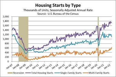
As shown by the purple line in the chart below, new U.S. home construction began to accelerate late in the previous economic expansion, around the start of 2019. Homebuilding plunged when the pandemic hit in early 2020, but it quickly recovered and accelerated further in response to the Federal Reserve’s dramatic interest-rate cuts, the federal government’s massive fiscal support to individuals, and people’s desire for more “work from home” space. What many people miss is that the jump in single-family home construction was a one-time event. Groundbreakings for single-family homes jumped from an annual rate of 1.003 million just before the pandemic to a rate of 1.308 million in December 2020 but have plateaued at an average rate of 1.139 million since then (the teal line in the chart). The situation has looked much better for multi-family developers. Their groundbreakings were little changed in the first year after the pandemic hit, but they’ve been on a steady uptrend since early 2021 (the orange line in the chart). In the first four months of this year, single-family housing starts were up just 4.8% from the same period one year earlier, while multi-family starts were up 27.7%.
Over the coming year or so, we think these trends will continue to diverge. Rising mortgage interest rates and sky-high prices are already cutting into the demand for single-family homes. Sales transactions have started to fall, and we are even seeing a slowdown in price appreciation. These dynamics are a key reason we recently eliminated our overweight to the stock market’s Homebuilder sector in our asset allocation strategies. At the same time, we think high prices for single-family homes and low inventories of homes for sale will keep pushing people into the apartment market, driving up rents, and prompting companies to develop many new properties. But does that mean we’re on the hunt for investments in the apartment sector? Not necessarily.
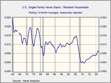
We think the longer-term outlook for single-family homebuilders remains bright despite the near-term challenges. After all, single-family home construction in the U.S. has still not recovered from its steep drop after the housing bubble burst. In the three decades just before that crisis, U.S. homebuilders each year broke ground for approximately 1.2 new single-family homes per 100 existing households. By 2011, they were breaking ground for just 0.4 new homes per 100 households, and the figure only recovered to 0.9 per 100 last year (see chart below). This implies that the U.S. has an enormous deficit of modern single-family homes. Reaching the previous 1.2-per-100 standard now would require firms to build and sell more than 1.5 million new single-family homes this year, versus their recent pace of about 1.1 million homes. Reaching the 1.2-per-100 standard plus making up the post-bubble shortfall over the next decade would imply building and selling about 2.5 million new homes each year.
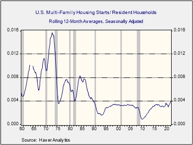
In contrast, today’s strong apartment building suggests that sector could eventually return to the overbuilding of the past, with its falling rents, reduced profitability, and weaker stock prices. Outside of recession periods, multi-family developers over the last three decades have typically built about 0.3 apartment units per 100 households. They are now consistently building 0.4 units per 100 households for the first time since the late 1980s (see chart below).
Admittedly, future single-family home construction could still be constrained to some extent by the new dominance of big, publicly traded homebuilders, the banking system’s strict post-bubble standards on construction loans, and challenges in finding buildable land. The sector could also face some headwinds from demographic changes like weaker population growth, population aging, and people’s increased preference to stay in their homes longer. Nevertheless, we think single-family homebuilders will have plenty of opportunities for profitable new business and higher stock prices once we get past the Fed’s current rate-hiking cycle and construction costs moderate again. In contrast, the risk of apartment overbuilding and the difficulty in finding suitable apartment-focused investments discourages us from trying to jump into that sector. We think the best strategy right now is to avoid the entire housing sector temporarily until we see a new buying opportunity in single-family homebuilders in the future.
Asset Allocation Weekly – #38 (Posted 5/14/21)
Asset Allocation Weekly (May 14, 2021)
by the Asset Allocation Committee | PDF
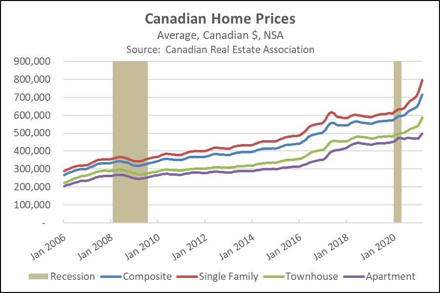
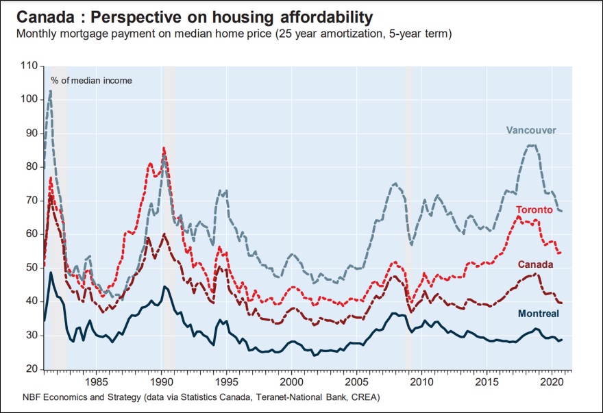
Since the Great Financial Crisis of 2007-2008 (GFC), any rapid rise in home prices has tended to spark fears of another bubble bursting. U.S. home prices have recently been up more than 10% from one year earlier, marking their strongest gains since the recovery period right after the GFC. However, those gains have been overshadowed by the even bigger increases in Canada. Home prices north of the border rose 13% in the year ended December 2020, and they were up an even stronger 20.1% in the 12 months ended March 2021 (see chart). Does that mean the Canadian housing market is in a bubble? What’s the risk that Canadian home prices will crash back to earth, dragging down the financial system and Canadian stocks?
One reassuring sign is that Canadian homes are still affordable despite the recent price surge. Based on today’s median home price, mortgage interest rates, and typical Canadian mortgage terms, a homebuyer’s monthly mortgage payment would equal only about 40% of the country’s median income. As shown in the following chart, that’s similar to the level seen during most of the last decade. It’s also much lower than in the 1980s and 1990s. Naturally, housing costs can be much higher in major metropolitan areas. However, even in those locales, affordability has improved over the last few years. That’s because the recent price hikes have been largely offset by falling interest rates and rising incomes. Between 2017 and 2019, price gains were also held in check by tightened regulations, like a new tax on foreigners buying property in Vancouver and Toronto and “stress test” rules requiring loan applicants nationwide to show they could afford their mortgage even if interest rates were 2% higher than when they applied. Current affordability levels suggest Canadian home sellers can still find plenty of buyers.
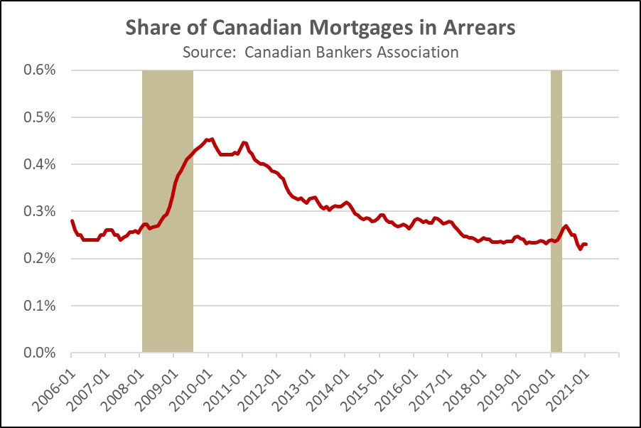
Finally, it’s important to remember that Canadian bank regulations and mortgage terms are much more conservative than in the U.S. The typical Canadian mortgage payment is calculated based on an amortization period of 25 years, and the loan matures in five years, with steep penalties for early refinancing. Long-term homeowners in Canada expect to roll over their mortgage on a strict five-year schedule. Even when homeowners sell their property to buy another, the outstanding balance on the original mortgage is usually applied to the new house. This system helps protect Canadian banks from falling interest rates. In addition, the new stress tests help ensure that borrowers are good credit risks, while government rules discourage banks from selling or securitizing their mortgage loans. The Canadian system therefore tends to keep lenders and homeowners “married” for extended periods, which appears to improve underwriting standards. As evidence of that, the chart below shows that there has been no discernable rise in Canada’s mortgage delinquencies. Canadian mortgage delinquencies remain just a fraction of U.S. delinquencies, despite the recent jump in home prices and increased mortgage debt.
In sum, it appears that the Canadian housing market is responding to the same kinds of pandemic-driven trends facing the U.S. market. Increased desire for personal space, falling mortgage rates, and ample savings have boosted housing demand, even as job fears or health concerns have limited new listings. The boom in Canadian home prices simply doesn’t seem to reflect loose mortgage standards or irresponsible lending, so we are not currently concerned about a housing bubble bursting or causing widespread financial problems north of the border.
Asset Allocation Weekly (April 30, 2021)
by Asset Allocation Committee | PDF
(Due to staff vacations, there will not be an accompanying podcast and chart book this week. The multimedia offerings associated with this report will resume next week, May 7.)
In our asset allocation strategies, we continue to have a separate provision to homebuilders. The reason for this particular position is due to our belief that homebuilding and associated industries are poised for a multiple-quarter expansion. One reason for this expectation is that housing and homebuilding are still recovering from the housing bubble that peaked in 2005. The aftermath of that bubble caused a decline in homebuilding.
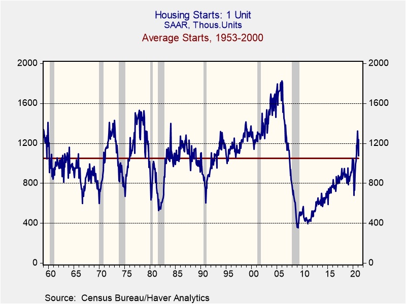
This chart shows housing starts from 1953 to the present. From 1953 to 2000, the average was 1.048MM single-family starts per month on a seasonally adjusted annualized basis. Note that starts rose well above average during the housing bubble and then plunged during the Great Financial Crisis. They only returned to their earlier average last August. Given that the population was smaller in the past, existing sales per capita would be even lower now.
The shortage of single-family homes relative to starts is even more stark when compared to the single-family home vacancy rate.
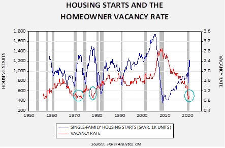
This chart shows single-family housing starts compared to the vacancy rate. We have marked low vacancy levels with teal circles. In the 1970s, vacancies at the current level led to starts between 1.3MM and 1.4MM starts. We are currently around 1.1MM, which suggests a boom in homebuilding is not only likely, but probably necessary to meet the demand for housing. Thus, our outlook for the homebuilding sector remains especially positive.
Asset Allocation Weekly – #36 (Posted 4/23/21)
Asset Allocation Weekly (April 23, 2021)
by Asset Allocation Committee | PDF
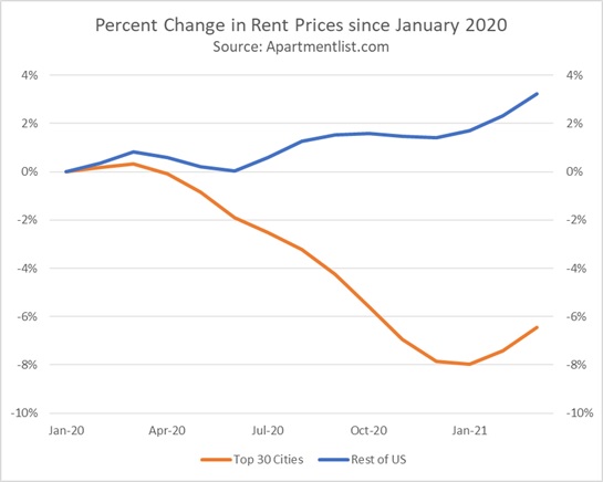
A decade ago, the Rent Is Too Damn High Party became a viral sensation after a candidate for the New York governorship, Jimmy McMillan, announced lowering New York rent as his central platform. Now, over a decade later, rent prices in New York have finally started to fall. The pandemic-driven moratorium on evictions has likely played a role in declining prices in New York, but more of this change can likely be attributed to the phenomenon of people leaving cities in favor of suburban and rural areas. In fact, this migration out of major cities into the suburban and rural areas has been so pronounced that national rent prices have risen. Additionally, this increase in rental rates has led some economists to speculate that the uptick in rent prices is a sign that inflation is on the horizon. In this report, we will discuss how the rise in rental rates, and home prices for that matter, may not have as big of an impact on the Consumer Price Index (CPI) as many would claim.
The real estate market has changed dramatically since the start of the pandemic. Rent prices have dropped in the most populated cities, while suburban and rural areas have seen an increase. Since last year, the top 30 cities by population have seen a decline of roughly 6% in rent prices, while the rest of the country has seen a 4% rise. Purchase prices for homes have also risen sharply during the pandemic, with the S&P CoreLogic Case-Shiller index showing an 11% rise since January 2020. Because shelter is heavily weighted in the CPI, there have been concerns that increasing rental and home prices could push the overall CPI higher.
The CPI estimates the total cost of shelter for the urban areas in the country. Shelter prices account for approximately one-third of headline CPI and about 40% of core CPI. Its heavy weighting is due to the fact that it is the one service most consumers cannot avoid. Because of its weight, a significant movement in shelter prices can lead to huge swings in the index. This is one of the reasons people have been paying close attention to rental and home prices. Shelter has two major components: rent for primary residence and owners’ equivalent rent. Owners’ equivalent rent accounts for approximately 73% of the shelter price, while rent for primary residence accounts for 24%.[1]
Since homes are a capital investment, they are excluded from CPI. As a substitute, the index uses owners’ equivalent rent, which is the implicit rent that homeowners believe they would have to pay if they were to rent their own home. In order to gauge what the prospective rent went would be, the BLS asks consumers who own their primary residence the question, “If someone were to rent your home today, how much do you think it would rent for monthly, unfurnished and without utilities?” This approach reduces the impact home prices could have on CPI because the consumers have to take into account actual economic conditions when responding. Thus, consumers cannot simply answer the question by stating their mortgage payment.
In addition, the way shelter is calculated may also contribute to why CPI doesn’t seem to reflect the upturn in rental and home prices. Because 88% of the population lives in urban areas, CPI primarily tracks prices in cities. In fact, the top five heavily weighted cities ― New York, Los Angeles, Dallas, Philadelphia, and Chicago ― account for about one-fifth of the sample size. Therefore, any increase in rent prices and owners’ equivalent rent in areas outside these cities will not likely swing the index significantly. This helps explain why shelter prices in the CPI have waned in recent months, despite the rise in real estate purchase prices. Put another way, the BLS, which calculates CPI, has to create a weighted average for the entire economy. The problem of averaging is that there is a dispersion around an average that may be wide, but the average masks that issue.[2] It also makes sense to weight the average by population; after all, the central bank would probably not want to react to rising rent prices in Salina, KS, when rents are not rising in New York, NY.
In short, due to the way the CPI is constructed and sampled, increases in rental and home prices may not have a strong impact on the index, depending on the dispersion of pricing changes. Furthermore, the slowdown in the rise in shelter prices, as determined by CPI, is due to people moving out of major cities in favor of suburban and rural areas. Thus, we suspect inflation fears about the rise in rental prices are likely overblown, at least in terms of the CPI. On the other hand, because each person purchases their own unique basket of goods and services, some people may be experiencing rising prices in a way that is different from the average experience across the economy.
[1] The other two components are lodging away from home and tenants’ and household insurance.
[2] Often this situation is highlighted in statistics classes by the example of a person with their head in a 350o oven and foot in an ice bucket; on average, the person’s temperature is normal.