

Asset Allocation Bi-Weekly – A New Factor for Gold Prices (July 15, 2024)

by the Asset Allocation Committee | PDF

The standard regression model is as follows:

Y = α +β(X) + ε

Where Y is the dependent variable, X is the independent variable, α is the intercept, β is slope and ε is the error term.  No model, no matter how many independent variables are added, can capture the complete relationship to the dependent variable.  However, a well-constructed model will account for most of the variation in the behavior of the dependent variable.

Although it tends to get short shrift in statistics classes, the error term is rather interesting, especially with regard to time series models.  Essentially, the error term, or epsilon, is where the unspecified causal factors that affect the dependent variable are housed.  The goal of modeling is to select the most meaningful independent variables and then assume the ones that are not specified are not important enough to dramatically affect the dependent variable.  It may be that the unspecified terms are not all that important, or if they are, they are offset by other unspecified variables so that the model’s performance isn’t adversely affected.

Sometimes, a dependent variable begins to exhibit deviations to the model’s estimate; this may be caused by several factors.  One is that the relationship between an already specified independent variable and the dependent variable has changed.  The relationship may have rested on some other factor, such as policy, that has made it more or less important.  Over time, the β, or the correlation coefficient, will adjust to this new relationship.  In other cases, a previously unimportant variable, contained in epsilon, becomes important.

We think this latter situation is affecting the gold market.
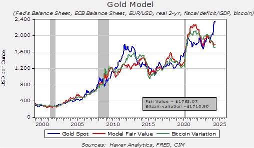
The chart above is our basic gold price model.  As the chart shows, the model’s estimation occasionally deviates from the actual price.  If nothing has changed, this deviation may suggest an over or undervalued market.  The recent spike in gold prices is clearly running well above our model’s estimation.  However, we think we have isolated a change that accounts for this deviation.
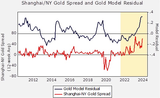
The upper line on the above chart shows the model’s residuals since 2012.  The lower line shows the spread between gold prices in Shanghai and New York.  The history of this spread shows some deviation, but in general, this condition invites arbitrage if prices are higher or lower in one market compared to the other.  Note that the New York prices far exceeded those in Shanghai during the pandemic.  We can assume the mechanisms for arbitraging that market were disrupted by the pandemic, and the spread narrowed when these mechanisms returned.  The area on the chart above in yellow indicates the Russian invasion of Ukraine.  Note that gold prices in Shanghai have been persistently elevated relative to those of New York.

The G-7 implemented sanctions on Russia in the wake of the invasion, and perhaps the most draconian of those was the move to freeze Russian foreign reserves.  This move raised fears in other nations that if they were to see relations with the US deteriorate, then similar actions might be deployed against them as well.  So, in response, foreign governments have been increasing their gold purchases.  Since the Chinese are concerned about the vulnerability of their massive US Treasury holdings, it appears they have been aggressively buying gold to the point where the Shanghai price has been persistently above the New York price.

It’s still too early to determine what impact this spread relationship will have on the overall gold price in the future, but this situation is a good example of when a previously quiescent variable, well contained in epsilon, suddenly becomes important.  Faced with a model that is deviating from its past performance, the challenge for the analyst is to determine the cause.  We believe that Asian buying, both from central banks and private investors, is the cause in this case.  This condition could mean that when traditional bullish conditions for gold return (e.g., lower interest rates, weaker dollar, central bank balance sheet expansion), the price of gold could move sharply higher, bolstered by this new factor — enhanced Asian buying.
View PDFAAW_Jul_15_2024

Asset Allocation Bi-Weekly – Copper, Gold, Treasurys, and the New World (June 10, 2024)

by the Asset Allocation Committee | PDF

Early 2023 served as a stark reminder that correlations can break down when least expected. Last year, a decline in the copper/gold ratio led many investors to anticipate a fall in longer-term yields, particularly for the 10-year Treasury note. However, these expectations were shattered as yields not only increased but surged to multi-decade highs by October. This episode underscores the challenge of relying too heavily on old assumptions. In this report, we’ll delve into the dynamics between the copper/gold ratio and 10-year yields and explore whether this historical connection has been permanently severed.

The copper-to-gold ratio is a closely watched indicator of investor risk sentiment. This ratio compares the price of copper, an industrial metal heavily used in construction and manufacturing, to the price of gold, a traditional safe-haven asset. A rising ratio generally signals investor optimism about economic growth. As economic activity picks up, demand for copper rises and pushes its price higher relative to gold. Conversely, a declining ratio suggests investor pessimism and a potential economic slowdown. This could be due to fears of recession or other economic troubles, leading investors to seek the perceived safety of gold.

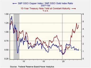
As shown in the chart below, a rising copper-to-gold ratio has historically coincided with increasing long-term Treasury yields. This reflects investor expectations of accelerating economic growth, which can lead to inflation. To compensate for the potential erosion in bond values, investors demand higher yields on longer-term bonds. The relationship also works in the opposite direction. Investor fears of geopolitical risks or recession trigger a decline in both the copper/gold ratio and bond yields as investors seek safety in gold and US government bonds.

The once strong correlation between the copper/gold ratio and interest rates seems to be unraveling in the post-pandemic recovery. While the ratio initially surged with the global reopening, China’s economic slowdown has caused it to fall over the last couple of years. In contrast, the 10-year Treasury yield has climbed as stubbornly high inflation has prompted central banks to tighten monetary policy, leading to further interest rate increases. This disconnect between the traditional indicators suggests a potential shift in market dynamics.

Prior to the pandemic, investors largely operated under the assumption of a stable, low-inflation world. This fostered an environment where long-term investments were attractive, and there was minimal fear that duration risk would erode their value. Consequently, investors primarily focused on the long end of the yield curve only during periods of economic concern or during major events that might prompt the Fed to cut rates and stimulate growth. This preference for bonds during economic downturns mirrored that of gold — a safe-haven asset. As a result, both bond yields and the copper-to-gold ratio had previously moved counter-cyclically.

However, these market relationships started to change as government efforts to prevent a recession through the creation of massive deficits led to higher long-term interest rates. The issuance of new Treasurys pushed up interest rates as the market struggled to absorb the new bonds. A further contributing factor to this dynamic is the Federal Reserve’s hawkish monetary policy. The Fed’s tapering of its bond holdings has reduced a key source of demand. Additionally, recent interest rate hikes have discouraged investors from holding long-term bonds as short-term bonds offer more attractive yields.

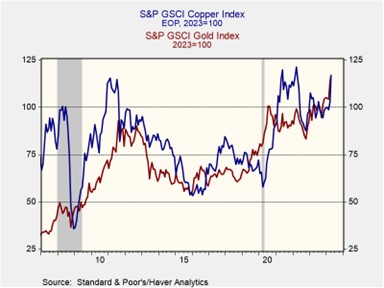
The metals market has also seen a transformation. So far this year, China’s modest industrial rebound has lifted copper prices from their 2023 lows, while the collective central bank buying of gold, spearheaded by China, has sent bullion prices skyrocketing. This unusual gold surge has offset the rise in copper prices, which explains why the ratio has been relatively subdued this year. While this trend may seem fleeting, evidence suggests emerging economies are accumulating gold as a potential hedge against the US government’s frequent use of sanctions tied to the dollar. As a result, it is possible that the copper/gold ratio could continue to move in the opposite direction of 10-year Treasury yields.

The breakdown in the relationship between the copper/gold ratio and 10-year Treasury yields likely stems from a new global economic reality. Higher deficits and inflation expectations have driven up long-term yields, while China’s slowdown and central bank gold purchases have suppressed the copper/gold ratio. A return to the prior correlation could occur if investors become confident in a return of price stability and if the accumulation of gold by foreign central banks proves temporary. However, we are doubtful of a near-term return, given persistent labor shortages, inflation pressures, and rising geopolitical tensions, particularly between the US and China.

View PDF

The Case for Hard Assets: An Update (June 2023)

by Bill O’Grady & Mark Keller | PDF

Background and Summary

Secular markets are defined as long-term trends in an asset. There are both secular bear and bull markets. In most markets, there are also cyclical bull and bear markets, often tied to the business cycle, and in some markets, there are seasonal bull and bear markets that are usually tied to annual production or consumption cycles. For example, a secular bull market in bonds is characterized by falling inflation expectations that trigger steady declines in interest rates. A secular bear market in bonds is caused by the opposite condition―rising inflation expectations which lead to consistently rising interest rates. In comparison, a cyclical bull market in bonds is often related to the business cycle and monetary policy.

In general, secular cycles tend to last a long time. Using bonds as an example, we are likely concluding a four-decade secular bull market which encompassed several cyclical cycles. The length tends to be tied to specific characteristics of each market.

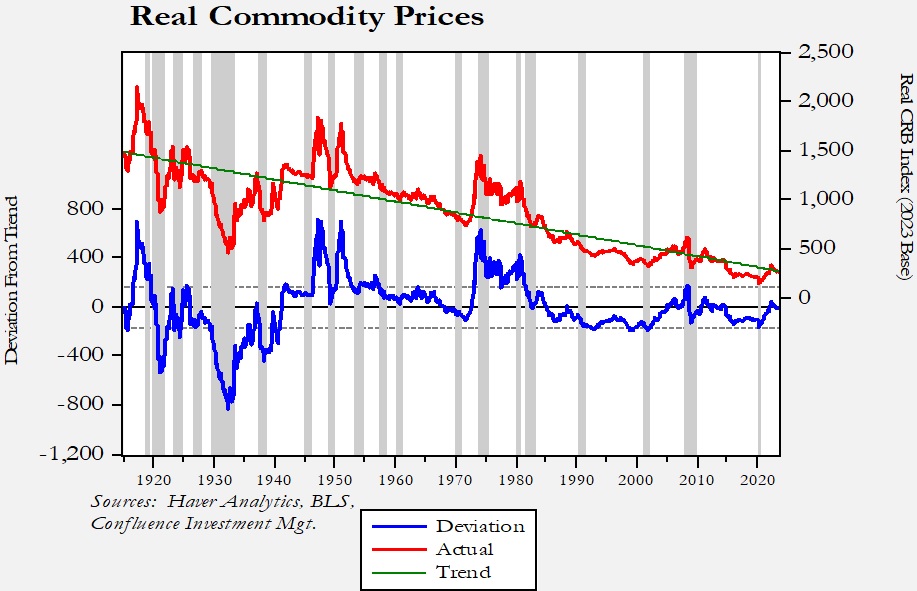
Commodity markets have secular cycles as well. Commodity demand is mostly a function of economic and population growth, whereas commodity supply comes from agriculture, ranching, mining, and drilling. As this chart shows, commodity producers face a serious secular headwind—capitalist economies tend to persistently improve their efficiency in producing finished goods from raw commodities. Commodity production is also subject to steady improvement in productivity.

Read the full report

Bi-Weekly Geopolitical Report – Mineral Commodities in the World’s New Geopolitical Blocs (June 6, 2022)

by Patrick Fearon-Hernandez, CFA | PDF

For many years, we’ve discussed how the United States has been backing away from its historical role as global hegemon, setting the stage for deglobalization and a fracturing of the world into separate geopolitical and economic blocs.  In our Bi-Weekly Geopolitical Report from May 9, 2022, we provided a detailed, comprehensive forecast of which countries are likely to end up in either the U.S.-led or China-led bloc, which countries will lean toward one or the other, and which ones will try to be neutral.  As a follow-up to that analysis, this report looks at the distribution of key mineral resources among those camps and what the different endowments might mean for geopolitics, the global economy, and financial markets in the future.

With China and Russia becoming ever more threatening from a military and geopolitical standpoint, and with the coronavirus pandemic demonstrating the vulnerability of supply chains even in peacetime, investors have become more sensitive to the security of commodity supplies and the way nations might try to monopolize or weaponize them.  As such, we conclude with a discussion of the ramifications for investors.

Read the full report

Don’t miss the accompanying Geopolitical Podcast, available on our website and most podcast platforms: Apple | Spotify | Google

Asset Allocation Bi-Weekly – A Commodity Update (March 21, 2022)

by the Asset Allocation Committee | PDF

Since the beginning of the year, commodities, as measured by the Bloomberg Commodity Index, have been up 15.4%.  All other major asset classes are down for the year.  Among the S&P 500 sectors, only energy is positive.  Commodity prices were strong going into the war in Ukraine, but the incursion coupled with the subsequent sanctions have triggered a historic rally.  In this report, we put this rally in context and examine if it will continue.

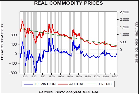
In this chart, we deflate the CRB Index, starting in 1915, and regress the real index against a time trend.  The fact the green line declines over time shows why it is hard to be a commodity producer.  Over time, commodity prices adjusted for inflation tend to decline.  Market economies tend to use less “stuff” when making goods and services, meaning that the final product that a commodity producer makes doesn’t keep up with inflation.  However, as the deviation line on the chart shows, there are periods where commodity prices move well above trend.  The three spikes above-trend that occurred before 1970 were caused by war—WWI, WWII, and Korea.  The WWII spike was delayed until after the end of the war because of rationing and price controls.  The spike that lasted from 1973 to 1981 was partly due to the Vietnam War but was mostly a result of the monetary uncertainty triggered by Nixon’s decision to leave the Bretton Woods Agreement.  That bull market ended with the combination of the Reagan/Thatcher deregulation[1] and the Volcker’s interest rate shock in the early 1980s.  Since then, we have not had a major commodity bull market.  The one observed from 2000 to 2007 can be seen on the chart, but compared to earlier events, it was rather modest.

The above chart raises two questions.  First, will the war in Ukraine have an effect comparable to other major conflicts?  Second, if a commodity bull market is in the offing, will it look similar to those before 1981 or the one in 2000-07?  Let’s tackle the first question.  On its face, it seems unlikely that the war in Ukraine will become a resource-heavy industrialized conflict.  Although Moscow likely has designs on further expansion, an attack on a NATO nation could escalate to a superpower confrontation.  Thus, we expect Russia to use some degree of discretion before even considering expansion

However, even without a major mobilization similar to those of the pre-1980 wars, the impact on commodities could be similar.  There are two reasons.  First, Russia is a substantial commodity supplier, and the sanctions levied on Moscow have already disrupted commodity flows.  Without a quick resolution to the Ukraine War, these will likely stay in place indefinitely, and the longer they are in effect, the more consumers will adjust to higher prices.  Second, and even more concerning, are the financial sanctions effectively rendering most of Russia’s foreign reserves worthless.  Reserve managers worldwide must now account for the fact that if their nation becomes a target of the U.S., they could see similar treatment.  Thus, what assets are now reserve assets?  Again, as long as a nation has good relations with the U.S., it is probably safe to hold dollars and Treasuries.  But, if there is any chance of soured relations, the question of viable reserve assets becomes critical.  Russia found that euro assets proved to have the same problem as dollar assets, and even moving gold in quantity is difficult under sanction.  Reserve managers may conclude that the only assets that may have value in a crisis are commodities.  In other words, it would not surprise us to see nations start expanding stockpiles of commodities that would act as a buffer in a sanction crisis.

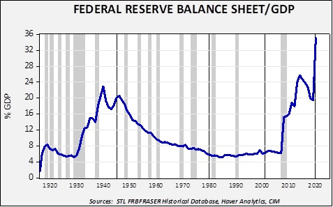
The answer to the second question probably rests on the behavior of central banks.  Part of the reason we saw commodity price spikes after WWII and during the Korean War was that the Federal Reserve was not independent.  During WWII, the Fed was forced to fix interest rates across the entire Treasury yield curve.  It led to a massive expansion of the Fed’s balance sheet.

Into WWII, the balance sheet rose to 22.9% of GDP and remained elevated into the early 1950s.  However, after the Fed’s independence in 1951, it gradually declined to around 6% of GDP…until the Great Financial Crisis.  The bouts of quantitative easing that occurred in the last decade led to a steady expansion of the balance sheet until quantitative tightening began in 2018.  That policy was abandoned in 2019 due to financial stress, and then quantitative easing resumed in earnest during the pandemic.  One could argue that the Federal Reserve accommodated the rise in commodity prices through its balance sheet practices in the 1940s into the early 1950s.  Given the vast expansion of the balance sheet since 2009, it is arguable that there is ample liquidity to accommodate another commodity bull market.

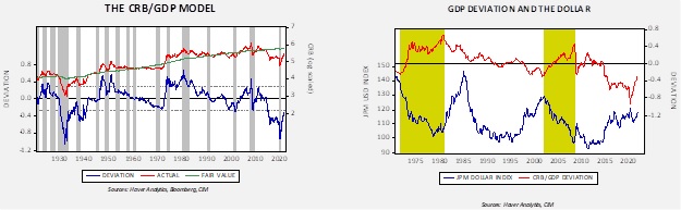
Finally, relative to GDP, the CRB Index remains undervalued.

The chart on the left shows the CRB Index, log-transformed, regressed against the level of nominal GDP.  Note that since around 2014, when oil prices fell, the CRB has been trading well below GDP.  In fact, the commodity market since 2014, relative to GDP, looks familiar to the 1930s commodity bear market.  A rally to fair value would put the CRB Index at 323.09 (from the current 295.41) and to a standard error above fair value; with the usual definition of a commodity bull market, the level would be 428.98.  However, the chart on the right suggests that a primary component to a major commodity bull market will be a weaker dollar.  So far, the dollar has been mostly rangebound, although the greenback has benefited recently from flight to safety flows triggered by the war.

In conclusion, even with the strong rally seen recently in commodities, market conditions and geopolitical factors suggest further upside is probable.  Yet, the next substantial “leg” higher in commodities will likely require a weaker dollar.  If reserve managers begin to shun the dollar, a decline in the greenback is certainly possible.

View PDF


[1] To be historically accurate, deregulation began under President Carter, but that policy is mostly tied to President Reagan.