Asset Allocation Weekly (October 20, 2017)

by Asset Allocation Committee

The Financial Accounts of the United States (formerly known as the Flow of Funds Report) is published by the Federal Reserve and provides data on the level of financial assets and liabilities by sector.  Using this data, we can approximate the average asset allocation of American households over different periods.  This accounting of assets is broad; for example, the equity portion includes equities held in defined benefit plans and insurance policies.  In addition, the Federal Reserve includes non-profits in its data.  In our view, non-profits are not material to the overall calculations.

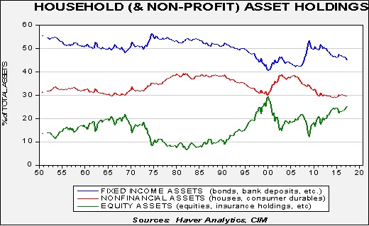
The data goes back to the 1950s.  On average, 50% of household assets are held in some sort of fixed income, while equity assets average 16% and non-financial assets average 34%.  A casual observation of the data suggests that allocations to fixed income and non-financial assets (likely housing) are favored during periods of high levels of inflation and elevated nominal interest rates.  On the other hand, equity allocations are higher during periods of low inflation and low nominal interest rates.  The allocation to non-financial assets rose sharply after 2000 as part of the housing bubble.  After the Great Financial Crisis, non-financial asset holdings declined; initially, fixed income rose and equities fell, but since 2010, that trend has steadily reversed as equities have taken a large share of assets.

Some of the gains in the various asset classes have come from price appreciation and other parts from reallocation of assets.  It isn’t completely obvious how much is coming from which part, although in future reports we will examine this issue more fully.  However, the chart does suggest that equities have benefited from being “the only game in town.”  Historically low interest rates and the aftermath of the housing crisis have undermined allocations to fixed income and housing.  Historical patterns suggest that allocations to fixed income don’t increase until 10-year Treasury rates exceed 6%.

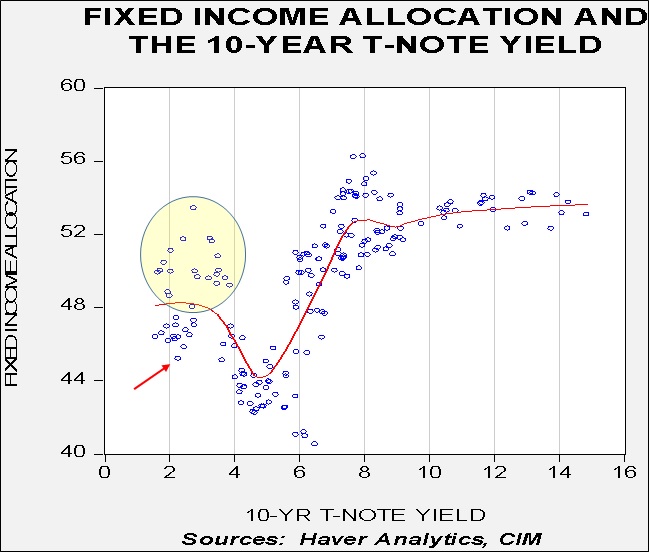
This chart shows a scatterplot of the percentage of total assets held in fixed income and the 10-year T-note yield.  We have plotted a nearest neighbor fit study to the data.  We have seen high fixed income levels along with low rates (shown in the circle), but these mostly occurred during the Great Financial Crisis.  Although the current level of fixed income is low (shown by the arrow), a consistent rise above 50% generally has been seen with interest rates in excess of 6%.  Thus, history suggests that it would take a more significant rise in interest rates to trigger a flight to fixed income.

Of course, recessions or geopolitical events could trigger a move out of equities.  At 25%, the current allocation to equities is elevated.  This level is similar to where it was in Q3 1999 and not far from the peak of 27% in Q1 2000.  At the same time, the liquidity does need another place to go.  After the 2000 tech crash, the primary beneficiary was housing.  We don’t expect that pattern to repeat itself.  Thus, without an event to scare households out of equities or a sizeable rise in interest rates, equities should maintain their favored status for the time being.

View the PDF

Weekly Geopolitical Report – North Korea and China: A Difficult History, Part I (October 16, 2017)

by Bill O’Grady

The U.S. and North Korea have had a difficult history.  The two countries were the primary combatants during the Korean War and still have not established a peace treaty.  However, in the late 1970s, the Kim regime and the Carter administration considered normalizing relations.  Carter’s national security team concluded there was little value in talking directly to North Korea[1] and, ever since, the U.S. has essentially “outsourced” North Korea to China.[2]

On its face, this decision makes sense.  China is critically important to North Korea’s economy; more than 80% of North Korea’s foreign trade is with China.  Mao described relations between the two countries as “close as lips and teeth.”  However, relations are more than just economics.  A review of historical relations between China and North Korea indicates a deep animosity that inhibits China’s ability to control the policies and decisions in Pyongyang.

In Part I of this report, we will begin our study of the historical relationship between North Korea and China, including a review of the Minsaengdan Incident and a broad examination of the Korean War.  Part II will complete the analysis of the war, discuss the Kim regime’s autarkic policy of Juche and outline the impact of the Cultural Revolution on North Korean/Chinese relations.  Part III will cover the controversy surrounding North Korea’s Dynastic Succession, the end of the Cold War and the ideological issues with Deng Xiaoping.  Finally, we will recap this history and its impact on American policy toward the Democratic People’s Republic of Korea (DPRK) along with market ramifications.

View the full report


[1] Carter was worried about being seen as weak by GOP critics.  Creekmore, M., Jr. (2006). A Moment of Crisis: Jimmy Carter, The Power of a Peacemaker, and North Korea’s Nuclear Ambitions (chapter 7). New York, NY: Perseus Books Group.

[2] http://www.38north.org/2017/09/jperson092617/ This report borrows heavily from Mr. Person’s analysis and his reference material.

Asset Allocation Weekly (October 13, 2017)

by Asset Allocation Committee

With the S&P making new highs almost daily, it is probably a good time to look at long-term trends to build some parameters.

This is a simple trend chart of the S&P 500 Index.  We have log-transformed the weekly Friday closes of the index data and regressed it against a time trend.  The chart on the left shows the index from 1929 while the chart on the right shows the index from 1990 (same regression trend lines for both charts).

Equities clearly trend higher over time.  The yearly trend shows an average return for the S&P 500 Index of just over 6%.  However, as the charts show, there is a fair degree of variation over time.  The trend data shows that two standard errors above the trend is a dangerous area.  One standard error above the trend is a concern.  We are currently just below one-half standard error above the trend.  That level by itself isn’t a big worry.  In the 1950s into the early 1970s, we saw the index vacillate between the trend and one standard error above trend.  These are not inconsequential market moves; in the current context, the trend line for the S&P 500 Index is 2090.26, meaning a pullback from current levels to the trend line would be a decline of about 17.6%.

Simply put, barring a recession or geopolitical event, equities are not seriously extended on a trend basis.  We also note that the last two bear markets dropped a full two standard errors from peak to trough.  The bear market that began in 2000 fell from two standard errors above the trend to the trend line (the bold red line on the chart), and the 2008 bear market ran from one standard error above the trend to one standard error below.  Thus, a recession-triggered bear market would be a significant market event.

So, what does this tell us?  Although there is a rather elevated sense of concern among investors, overall, the path of least resistance is to grind higher.  Equities are not cheap but alternatives are even more expensive.  The other insight this research offers is that a “melt-up” would take us well above 3000.  If investors were to become “irrationally exuberant” we would expect a move to this level.  At this point, there appears to be enough caution to prevent that from occurring.  However, if a dovish Fed chair is nominated or a major tax cut appears likely to pass, a rise to these levels might be triggered.  A recession is a clear worry; falling to one standard error below the trend line, which would be a drop of lesser magnitude than normal, would be to 1454.81 by year’s end.  Obviously, because the trend line moves higher over time, the longer it takes to have a correction, the higher the expected bottom.  For now, equities, based on this analysis, are not at levels that would usually signal a major bear market.  At the same time, this doesn’t mean that there are no risks.  It just means that, in terms of trend, we are not at extremes.

View the PDF

Keller Quarterly (October 2017)

Letter to Investors

In my last letter I wrote of the tendency of investors to think of the economy and the markets as linear phenomena, rather than cyclical phenomena.  In other words, an inclination to think that a good economy will continue its upward path forever unless some villain intercedes and causes a recession.  However, at Confluence we believe that both the economy and markets are cyclical because they are the products of human behavior, which always tend toward extremes, extremes which sow the seeds of their own reversals.  This quarter I’d like to call your attention to another fallacy of thought that many investors fall prey to: “fighting the last war.”

If you left the gate to your backyard open and your dog ran away, it’s natural for you to fear that that might happen again.  Thus, you’ll worry greatly about it and be extraordinarily vigilant about locking the gate ever after, such that it’s most unlikely your dog walks out of your open gate again.  It is more likely, however, that he gets out of the yard some other way that you haven’t thought of.

Investors are unusually well attuned to how the last bear market unfolded, and take measures to make sure they are not injured in that manner again.  Usually, however, the next bear market unfolds in an entirely different fashion and catches most investors unaware.  Citizens and politicians also take measures to “cure the ills that led to the last recession,” which unfortunately often leaves them unprepared for the next recession that unfolds quite differently.

As investors, it’s important to study the history of the economy and markets, not just that of the last ten or twenty years, but of the last several centuries.  There are many ways that recessions can unfold and there are many types of bear markets.  The same type of recession rarely strikes twice in a row and two identical bear markets usually don’t occur back-to-back.  One must be vigilant to all the possible ways the economy can get into trouble and look for all kinds of impending trouble.

I mention these things because in my recent travels visiting many clients in all parts of the country, I’ve been hearing a constant theme: fear of a return to the travails of 2008-09, when the economy hit a major recession and stock indices fell more than 50% over 18 months.  While I believe it’s inevitable that we’ll have a recession again in the next several years, I’m fairly certain it won’t look anything like 2008-09.  Why?  The last recession was driven by a liquidity crisis of the highest order, i.e., almost nobody, individuals or businesses, had any cash.  The real estate bubble of the preceding decade had led everyone to believe that property prices would never decline, thus, “Why hold cash?  Put all that money to work!”  In fact, legions borrowed lots of money to buy all the property they could.  When real estate prices finally fell, everyone (well, almost everyone) was cash poor.  People scrambled to sell assets (stocks, bonds, property, you name it!), raise cash, and pay down debt.  This led to a recession as people stopped buying other stuff all at the same time.  And, debt reduction has continued for most of the last eight years, which has led to very slow growth since.

Today, even though both real estate and stock prices have recovered, few investors are cash poor.  In fact, both data and anecdotal evidence show that investors and institutions (especially banks) are still sitting on “big piles” of cash (that’s not a technical term).  In other words, people are not going to let 2008 happen to them again.  They have padlocked the backyard gate.  Whatever sort of recession occurs next, it’s most unlikely to be similar to the last one.

In fact, fears by so many that a recession and bear market are just around the corner is good evidence that they are not.  Recessions and bear markets are usually the product of complacency, not fear.  Our economic analysis leads us to conclude that the precursors of recession are not yet visible.  And while this bull market is getting old, it doesn’t appear to us to be ready to reverse course.  Of course, bad things can go bump in the night and unsettle the world, and we watch for those.  But inasmuch as everyone seems to be ready to fight the last war, that last enemy is not likely to show up.

Thank you for your confidence in us.


Gratefully,

Mark A. Keller, CFA
CEO and Chief Investment Officer

View the PDF

Weekly Geopolitical Report – The Four Horsemen of Leveling: A Book Review (October 9, 2017)

by Bill O’Grady

Occasionally, we find a book that has such an interesting message that we dedicate a Weekly Geopolitical Report to reviewing it.  This week, we will look at The Great Leveler by Walter Scheidel.[1]  The book is an extensive historical analysis of inequality and the factors that reduce it.

In this report, we will discuss the premise of the book, the “four horsemen” of income leveling and the future it portends.  As always, we will conclude with potential market ramifications.

The Basic Premise
Inequality has become a critical issue.  In 2013, President Obama said the following about inequality:

And that is a dangerous and growing inequality and lack of upward mobility that has jeopardized middle-class America’s basic bargain—that if you work hard, you have a chance to get ahead.  I believe this is the defining challenge of our time: Making sure our economy works for every working American.[2] 

Interestingly enough, Scheidel’s historical analysis makes it clear that the current level of inequality is hardly unique.  And, a certain degree of inequality has been with us since the early stages of human existence.  Archeologists note that even early gravesites of hunters and gatherers show distinctions of wealth and status.  These differences steadily became more widespread as civilization developed.

In theory, society could take steps to prevent or reduce inequality.  However, history suggests the opposite usually occurs.  As agriculture developed, Scheidel’s analysis shows that wealth became increasingly concentrated.  Scheidel’s key insight is that civilization and peace tend to bring rising income and wealth inequality.

However, a casual observation of history also suggests that wealth and income distributions are not permanent.  Sadly, Scheidel’s conclusion is that massive societal disruption reduces inequality.  He refers to these as the four horsemen of equality.

The Four Horsemen
The “Four Horsemen of the Apocalypse” comes from scripture.[3]  The biblical reference is widely debated but, in general, it refers to tribulations.  Scheidel suggests that his four horsemen refer to events that cause inequality to decline.  Here is his list: Mass Mobilization War, Transformative Revolution, Societal Collapse and Plague.

View the full report


[1] Scheidel, W. (2017). The Great Leveler: Violence and the History of Inequality from the Stone Age to the Twenty-First Century. Princeton, NJ: Princeton University Press.

[2] Ibid, page 2.

[3] Rev. 6:1-8

Asset Allocation Weekly (October 6, 2017)

by Asset Allocation Committee

The latest FOMC meeting and subsequent comments from Chair Yellen have increased the likelihood of a December rate hike.

(Source: Bloomberg)

This chart shows the implied likelihood of a rate hike compared to steady policy from fed funds futures for the December meeting.  In early December, the projected odds of a hike were just above 30%; those odds have recently jumped to over 70%.  Although the core personal consumption deflator remains well under 2%, which is considered the target of the central bank, Chair Yellen indicated that tight labor markets raise the chances that inflation might rise quickly and force the Fed to boost rates sharply, potentially triggering a recession.  By raising rates when inflation is below the inflation target, the FOMC hopes to avoid a rapid increase in rates.

Most members of the FOMC base their policy decisions on the Phillips Curve, which postulates that there is a relationship between unemployment and wages, and if the latter rises, inflation tends to follow.  This idea has become increasingly controversial as the relationship between wages and inflation has weakened over the past two decades.

This chart shows the yearly change in core PCE and wage growth for non-supervisory workers.  Note that the correlation broke down after 1995.  We believe this is because the full impact of deregulation and globalization has put a lid on inflation and thus wage changes have less impact on price levels.

The key concept for the Phillips Curve is the Non-Accelerating Inflation Rate of Unemployment (NAIRU), which is the unemployment rate that is the lowest possible rate an economy can achieve without triggering inflation.  The idea is that if unemployment falls below NAIRU, the labor markets become too tight, triggering excessive wage growth and inflation.  The above chart shows the Greenspan-Bernanke-Yellen Federal Reserve.  We have put vertical lines where tightening cycles began.  Note that Greenspan began two tightening cycles while the unemployment rate was above NAIRU (1994, 2004) but waited to raise rates until 1998 when the unemployment rate was well below NAIRU.  The latter tightening cycle was a rather famous one; Greenspan held that rising productivity would keep inflation under control and thus waited to raise rates.  Notably, Janet Yellen, a Fed governor at the time, lobbied hard for raising rates sooner due to the drop in unemployment.

The current tightening cycle began with the unemployment rate very close to NAIRU, which is consistent with Chair Yellen’s thinking on inflation.  So far, wage growth has remained subdued.  Since the early 1980s, wage growth has usually exceeded 4% when the unemployment rate falls below NAIRU.  It is currently 2.3%.  It is unclear why wage growth is so weak relative to what appears to be a tight labor market.  That is what makes boosting the policy rate risky.  Since the meeting, we have seen the dollar strengthen and bond yields rise.  However, the odds of a policy mistake, though currently low, are rising.  This is an issue we will be monitoring closely in the coming months, especially as the president chooses not only a new Fed chair but also a vice chair and two other open governor positions.

View the PDF

Weekly Geopolitical Report – The 19th Party Congress (October 2, 2017)

by Bill O’Grady

On October 18th, the Communist Party of China (CPC) will meet for the 19th Party Congress.  China’s leadership for the next five years will be determined at this meeting.

In this report, we will offer a background on China’s government, focusing on the difference between de jure (what is the official structure of China’s governance) and de facto (how it really works).  From this discussion, we will examine the likely developments from this meeting and what they will mean for China and the world over the next five years.  As always, we will conclude with potential market ramifications.

China’s Government (Official Version)
China’s government has a parallel structure.  The CPC operates alongside the government of China.  Since the CPC is the only political body in China, the governance of China is dominated by the CPC, but there are elements of power that are separate from the party.  For example, Xi Jinping is both the President of China (head of government) and General Secretary of the Central Committee (head of the CPC).  He is also the Commander in Chief of the People’s Liberation Army.  There exists a National Party Congress (as noted below, the most powerful body in China, at least in theory) and a National People’s Congress, which is the primary legislative arm of the government.  The President has a strict legal limit of two five-year terms, while the General Secretary’s term limit is based on tradition.  In theory, a General Secretary could remain in that role after relinquishing the presidency.  This extended control of the CPC hasn’t happened since Mao Zedong,[1] who remained in control of the party from 1943 until his death in 1976.  Deng Xiaoping brought order to the transition of power, and since then General Secretaries have held office for 10 years, consisting of two five-year terms.

China’s most powerful body is the National Party Congress.  It meets every five years; in 2012, it had 2,268 members.[2]  Its primary job is to elect the Central Committee.  The Central Committee, which had 376 members in 2012, elects the General Secretary, the Politburo and the Standing Committee of the Politburo.  The Politburo consists of 25 members and is the executive body of the CPC.  The Standing Committee of the Politburo has seven members, all of which are also members of the Politburo.  The Central Committee meets annually, while the Politburo meets monthly and the Standing Committee of the Politburo meets weekly.

Thus, in theory, the most powerful body in China is the National Party Congress.  The second most powerful is the Central Committee, followed by the Politburo and the Standing Committee of the Politburo.

View the full report


[1] Mao was referred to as “Chairman of the Central Politburo” or “Chairman of the Central Committee.”

[2] As a point of reference, the CPC has 85.13 mm members out of a population of 1.4 bn, roughly 6.2% of the population.

Asset Allocation Weekly (September 29, 2017)

by Asset Allocation Committee

The Financial Accounts of the U.S. was released last week by the Federal Reserve.  The report is a treasure trove of data about the economy.  This report shows the flow of funds and the balance sheet of the American economy.  Although there is much to look at, here are a few charts that show the underlying health of the economy and the financial system.

First, household debt relative to after-tax income has stabilized.  Essentially, household deleveraging has come to an end but we are not seeing releveraging relative to income.

This is a “good news/bad news” situation.  On the good side, the end of deleveraging will support stronger consumption.  When households are trying to pay back debt, it acts as a dampener on economic growth.  If households begin to add to debt relative to their incomes, growth accelerates.[1]  The bad news is that the deleveraging has ended at historically high levels of debt.  Although this level is probably manageable at current interest rates, spending may prove to be unusually sensitive to interest rates due to the current elevated levels of debt relative to income.

This chart is one we closely monitor; it is net saving by sector.  Net saving in macroeconomics is much like a balance sheet—saving in one sector is always offset by dissaving in another and the sum of the four sectors always equals zero.  What is most disturbing in the data is that household saving has declined and business saving has increased.  In general, business saving funds investment; in a well-functioning economy, businesses should be dissavers.  Rising business saving means less investment and the decline in household saving means that the household sector will become vulnerable to economic weakness.

The last chart of interest is the shares of national income.  We divide national income into what is earned by labor compared to capital.

Since roughly 1990, the labor share has tended to decline and has made new lows in each business cycle.  Capital income has performed in an opposite fashion.  This growing divergence is part of the reason for the rise in populism.  Even with the advanced age of the business cycle and low unemployment, the labor share remains low relative to history.

The Financial Accounts of the U.S. are showing that the expansion is getting a bit old.  Although there is no evidence of a recession on the horizon, the weakness in household saving is a concern.  The end of deleveraging does bode well for the economy in the short run but the continued high level of debt is a worry.  Finally, the current political problems the country is facing will likely require a drop in the share of capital at some point.  That will not be a favorable event for financial assets.

View the PDF


[1] Assuming, of course, that all the additional consumption would not be supplied by imports.

Weekly Geopolitical Report – Using History (September 25, 2017)

by Bill O’Grady

Geopolitics is the study of the exercise of power within a specific geographic area.  Geopolitical analysis is a multi-disciplined examination that starts with geography and includes economics, sociology and, of course, history.  Geopolitics is generally used for two purposes.  First, it offers a multi-faceted way of looking at how nations behave.  Second, it may be able to offer insights into future behavior.

Although all of the above disciplines offer insights into geopolitical analysis, for prediction purposes, history can, in many respects, offer the most concrete path of future behavior.  After all, history can tell us what happened when a nation faced a problem.

However, there is a particular problem with history.  The successful use of a historical analog requires selecting one that has the best fit to the current situation.  Because historical events are specific, especially compared to the more general theories from the social sciences, selecting an inappropriate historical analog can be seriously misleading.  Behavioral economics has a concept called “anchoring,” which means that a certain idea colors a person’s ability to analyze a situation.  For example, if investors become accustomed to a certain interest rate and assume it is normal, then investors may be slow to act when rates change because the original rate acts as an anchor.  In other words, an anchor is considered what is normal and where rates should return.  The presence of an anchor in investors’ minds can blind them to changes in conditions that may support an interest rate different than the anchor.

History isn’t a science; there isn’t a theoretical construct in history that is usually available from social sciences.  Thus, there is no generalized method to inform analysts on the proper way to select a historical analog.  However, picking a good analog is critical because of the problem of anchoring.  An analyst that uses an inappropriate analog can find himself “trapped” by that historical parallel and thus miss differences that may lead to mistakes.

Although history will never be a science, there is a working model for analyzing historical parallels.  Richard Neustadt and Ernest May wrote a working handbook[1] for practitioners and policymakers to analyze history and pick an effective analog.  We will begin by offering a brief discussion of Neustadt and May’s methodology.  To show how it is used, we will compare the current superpower uncertainty to three historical analogies using this book’s structure.  As always, we will conclude with market ramifications.

View the full report


[1] Neustadt, R. E. and May, E. R. (1986). Thinking in Time: The Uses of History for Decision Makers. New York, NY: The Free Press.