Asset Allocation Weekly (October 20, 2017)
by Asset Allocation Committee
The Financial Accounts of the United States (formerly known as the Flow of Funds Report) is published by the Federal Reserve and provides data on the level of financial assets and liabilities by sector. Using this data, we can approximate the average asset allocation of American households over different periods. This accounting of assets is broad; for example, the equity portion includes equities held in defined benefit plans and insurance policies. In addition, the Federal Reserve includes non-profits in its data. In our view, non-profits are not material to the overall calculations.
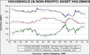
The data goes back to the 1950s. On average, 50% of household assets are held in some sort of fixed income, while equity assets average 16% and non-financial assets average 34%. A casual observation of the data suggests that allocations to fixed income and non-financial assets (likely housing) are favored during periods of high levels of inflation and elevated nominal interest rates. On the other hand, equity allocations are higher during periods of low inflation and low nominal interest rates. The allocation to non-financial assets rose sharply after 2000 as part of the housing bubble. After the Great Financial Crisis, non-financial asset holdings declined; initially, fixed income rose and equities fell, but since 2010, that trend has steadily reversed as equities have taken a large share of assets.
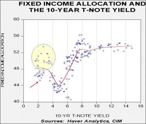
Some of the gains in the various asset classes have come from price appreciation and other parts from reallocation of assets. It isn’t completely obvious how much is coming from which part, although in future reports we will examine this issue more fully. However, the chart does suggest that equities have benefited from being “the only game in town.” Historically low interest rates and the aftermath of the housing crisis have undermined allocations to fixed income and housing. Historical patterns suggest that allocations to fixed income don’t increase until 10-year Treasury rates exceed 6%.
This chart shows a scatterplot of the percentage of total assets held in fixed income and the 10-year T-note yield. We have plotted a nearest neighbor fit study to the data. We have seen high fixed income levels along with low rates (shown in the circle), but these mostly occurred during the Great Financial Crisis. Although the current level of fixed income is low (shown by the arrow), a consistent rise above 50% generally has been seen with interest rates in excess of 6%. Thus, history suggests that it would take a more significant rise in interest rates to trigger a flight to fixed income.
Of course, recessions or geopolitical events could trigger a move out of equities. At 25%, the current allocation to equities is elevated. This level is similar to where it was in Q3 1999 and not far from the peak of 27% in Q1 2000. At the same time, the liquidity does need another place to go. After the 2000 tech crash, the primary beneficiary was housing. We don’t expect that pattern to repeat itself. Thus, without an event to scare households out of equities or a sizeable rise in interest rates, equities should maintain their favored status for the time being.


