Weekly Geopolitical Report – The North Korean Summit: Part II (March 26, 2018)

by Bill O’Grady

(Due to the Easter holiday, the next report will be published on April 9.)

Last week,[1] we discussed the six major nations involved in the North Korean issue and each country’s geopolitical goals, constraints and meeting positions for the recently proposed summit between the U.S. and North Korea.  This week, we will examine why the talks are being proposed now and offer reasons why they may fail or succeed.  We will summarize the costs and benefits of the summit meeting and conclude with market ramifications.

How did this happen?
The key figure in setting up this meeting was South Korean President Moon Jae-in.  Since his election last May, Moon has been working furiously to prevent a war on the Korean Peninsula.  When he took office, the U.S. was steadily ratcheting up pressure on North Korea, adding sanctions and using military intimidation.  The Kim regime was testing missiles and conducted what appeared to be a thermonuclear device test on September 3, 2017.  The U.S. and North Korea appeared to be careening toward war.

Moon comes from a political tradition of pushing for unification through improving relations with the North.  Previous left-wing governments in South Korea have run afoul of U.S. policy toward North Korea but Moon seems to have avoided this problem.  He defended South Korean sovereignty by insisting that no war could occur on the peninsula without South Korean acquiescence.  At the same time, he supported sanctions against the Kim regime and didn’t push for removal of the THAAD anti-missile system advocated by the U.S.

Perhaps his most well-executed policy was to avoid criticism of the Trump administration and, at times, praise it for its sanctions policy.  Moon refrained from responding negatively when Trump accused Moon of “appeasement” last September.  Moon has decided that direct opposition to American policy is counterproductive as that approach has been the downfall of previous leftist governments.

View the full report


[1] See WGR, North Korean Summit: Part I, 3/19/18.

Asset Allocation Weekly (March 23, 2018)

by Asset Allocation Committee

Last week, the Federal Reserve published its Financial Accounts of the United States report, formerly known as the Flow of Funds report.  The report is a storehouse of important financial information.  In this most recent report, a few things emerged that raised concerns.  The first issue is net saving.  Net saving is a macroeconomic identity; for every sector that saves, some other sector must dissave so the four major sectors of the economy—business, households, government and foreign—balance to zero each quarter.

The chart on the left shows the four major sectors.  Household saving is income less consumption, business saving is revenue less investment, government saving is taxes less spending and the foreign sector is the inverse of the current account.  All the data are scaled by GDP.  Business saving vacillates between saving and dissaving; when businesses dissave, it means their investment exceeds their income and they are using the capital markets for funding.  This chart shows important long-term trends in the economy; household saving peaked in the mid-1970s and fell steadily into the Great Financial Crisis, with dissaving in 2004-05.  Foreign saving (a larger trade deficit) became common during the 1980s and has remained elevated ever since.  To accommodate the foreign saving, either government or the private sector has lowered saving rates.

The chart on the right shows a rather disturbing development—a sharp drop in household saving and a commensurate rise in business saving.  It isn’t clear what exactly caused households to lower their saving, but it could be that households were anticipating the tax cut and increased their spending.  It’s also not clear why businesses boosted saving.  In general, rising business saving comes at the expense of lower investment.  One quarter’s data doesn’t make a trend, but if this pattern persists it would suggest lower future household consumption (eventually, the lack of saving undermines spending) and a decline in investment.  Given that government dissaving is poised to rise and the president wants to impede trade, the domestic private sector would be called upon to fund the public deficit.  That development would likely lead to slower growth.

The second issue shown in the recent report is that household deleveraging appears to have ended in Q4.

This chart shows household debt as a percentage of after-tax income.  Although this ratio stabilized in 2016, it rose this quarter to its highest level since Q4 2014.  Although not a major increase, the trend is disturbing because we doubt households have much additional debt capacity.

The two upper lines in this chart show the household financial obligations ratio, which includes debt payments plus auto leasing payments, rent, property taxes and homeowners insurance relative to after-tax income, and the household debt service ratio, which is just debt service (mortgage and consumer credit) relative to after-tax income.  The lower line on the chart shows the difference between the two ratios.  Both ratios have been rising but the financial obligations ratio has been increasing faster, likely reflecting higher rent payments.  The difference, which has distributional effects, is now at record levels.  The other concern is that both ratios are rising at the same time as tightening monetary policy.  Rising interest rates coupled with higher levels of debt will likely mean rising debt obligations, which will eventually weaken consumption.

While our analysis of the economic data still suggests a recession won’t happen this year, the trends in some series do suggest the cycle is aging and the potential is rising for a slowdown in 2019.  We continue to monitor the data closely as this year unfolds.

View the PDF

Weekly Geopolitical Report – The North Korean Summit: Part I (March 19, 2018)

by Bill O’Grady

On March 8, officials from South Korea, including Chung Eui-yong, the director of South Korea’s National Security Office, came to Washington to brief U.S. officials on a recent dinner with Kim Jong-un, the leader of North Korea.  The dinner was held in Pyongyang at North Korea’s Workers’ Party Headquarters, Kim’s workplace, where Mr. Chung and Suh Hoon, the National Intelligence Service director, were joined by Kim and his sister.  This event marked the first time that South Korean officials had been inside North Korea’s Communist Party headquarters since the Korean War.

According to reports, the dinner meeting was a surprising success.  Kim was said to be warm and open.[1]  He proposed a hotline between the two Koreas and a summit meeting with himself and South Korean President Moon Jae-in.  Kim also wanted the South Koreans to send a message to Washington that the North Korean leader would like a summit meeting with President Trump.

As the South Korean delegation was meeting with Trump administration officials on March 8, President Trump made an unscheduled appearance; he was scheduled to meet with the South Koreans the next day.  At this meeting, the South Koreans informed the American president of Kim Jong-un’s desire to have a meeting and President Trump immediately agreed.

This decision was a shock and set off a plethora of uncertainties.  This would be the first time since the creation of North and South Korea that a sitting American president has met directly with the leader of North Korea.  It appears the State Department was not aware of the invitation or the acceptance.  U.S. allies, such as Japan, were not warned and major powers in the region, such as China, were also informed after the fact.

So, in the matter of a few months, we have moved from fears of war to an unprecedented meeting.  This meeting is a high stakes wager; if the summit fails to improve relations between the U.S. and North Korea, it isn’t clear how the path forward doesn’t include war.  At the same time, if it works, Trump will have resolved one of the most intractable problems in American foreign policy.

In this week’s report, we will discuss the geopolitical goals, constraints and meeting positions of the major regional parties.  Next week, we will examine why the talks have been proposed now.  We will then offer the reasons why the talks may fail or succeed.  We will summarize the costs and benefits from the summit meeting and conclude with market ramifications.

The Players
There are six nations involved in the North Korean issue—North Korea, South Korea, China, Japan, Russia and the U.S.  We will cover the geopolitical goals, constraints and meeting concerns of each country.

View the full report


[1] https://www.wsj.com/articles/north-koreas-kim-jong-un-was-jocular-and-at-ease-at-boozy-banquet-1520606867

Asset Allocation Weekly (March 16, 2018)

by Asset Allocation Committee

Last week, we discussed the fact that the generally strong economy should be supportive for equity markets as economic growth will tend to support earnings.  However, the other important element of equity valuation is what multiple investors put on those earnings.  The most common valuation metric is the price/earnings ratio (P/E).  Our equity market forecast is based upon expectations for earnings and the multiple investors put on those earnings.

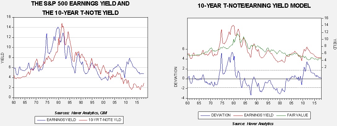
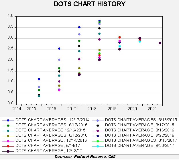
This week we will discuss modeling the multiple.  The most common way to estimate the P/E is to compare it to the 10-year T-note yield.  This is known as the “Fed model” on the idea that the P/E represents the “yield” on equities.[1]

The chart on the left shows the 10-year yield and the S&P earnings yield from 1960.  There have been periods when the two series moved closely together—the early 1980s into 2002 is notable.  However, there have been significant deviations as well, such as the mid-1970s and the past 15 years.  The chart on the right shows a regression model of the earnings yield using the T-note yield.  The variation is rather wide; in addition, the model suggests equity markets were mostly overvalued from the 1980s into 2000.

The primary argument for the Fed model is that portfolios tend to be constructed of equities and fixed income.  Thus, measuring the relative valuation between these two assets makes sense.  However, it also has some serious weaknesses.  First, there are different motivations for owning each asset.  One buys equities to own a portion of the productive capacity of the nation’s economy.  Owning fixed income gives one a return for forgoing current consumption.  Thus, it would make sense for someone to buy equities when they are upbeat about the future; equities are the asset for optimists.[2]  Treasuries, on the other hand, are serviced by the taxing power of the U.S. government.  The risk of equity earnings is fundamentally different than that of Treasuries.  Second, it’s a relative valuation model.  Consequently, during periods when there is a deviation from fair value, it’s hard to know which market is “out of whack.”

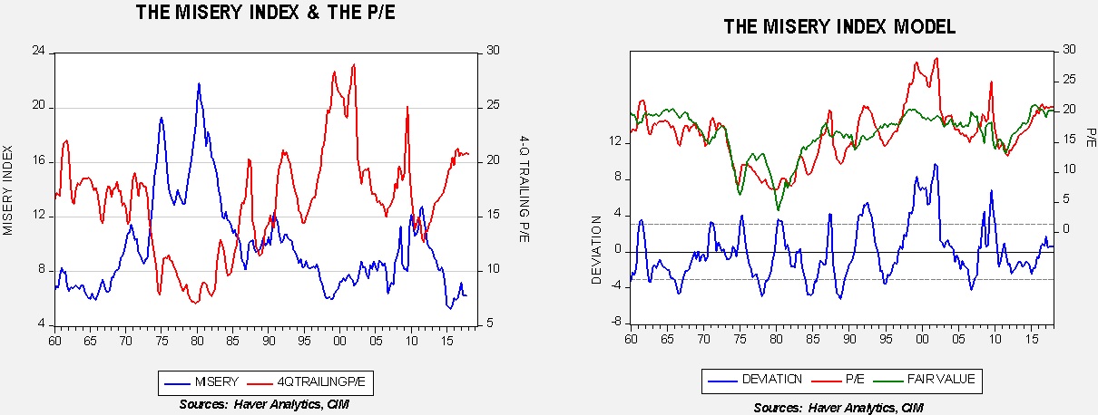
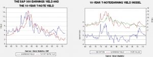
Another way of looking at equity valuation is relative to the economy.  The trick is which combination of economic variables has the most explanatory power?  Earnings are, in part, a function of economic growth, and inflation determines the “real” value of those earnings.  A classic indicator that captures both economic activity and inflation is the “misery indicator,” which is the sum of the unemployment rate and the yearly change in inflation.  Created by the Nobel Laureate Arthur Okun, it is designed to measure the degree of “pain” from a weak economy and inflation.

The misery index is clearly inversely correlated to the P/E.  The unemployment rate is an indicator of overall economic health and inflation is, to a great extent, a measure of the relative attractiveness of real assets compared to financial assets.  Although the misery index model isn’t perfect, it gives rather consistent results and generally offers better signals of valuation—in other words, it suggests periods when the market is overvalued or undervalued, whereas the Fed model tends to have longer swings in valuation.  On the other hand, the misery index has one significant flaw—it would not work well during periods of deflation as it would be signaling improvement when, in fact, deflation tends to occur during periods of economic turmoil.

Both models suggest the current P/E is not excessive.  We expect unemployment to remain low and inflation contained, which should mean the misery index model would support equities.  Additionally, the Fed model indicates that the recent rise in yields has simply reduced the undervaluation of equities.  Thus, we remain bullish equities despite recent turmoil.

View the PDF


[1] The inverse of the P/E is the “earnings yield.”

[2] However, buying equities when one is hopeful about the future might not be the best investment plan; history suggests buying equities when times are dire may actually be more prudent because they tend to be less expensive.

Quarterly Energy Comment (March 13, 2018)

by Bill O’Grady

The Market
Over the past quarter, oil prices have ranged from a low of around $56 to a high of $66 per barrel.

(Source: Barchart.com)

Prices remain elevated, supported by OPEC production discipline and solid global oil demand.

Prices and Inventories
Inventory levels remain elevated but have clearly declined from last year’s peak.

View the complete PDF

Weekly Geopolitical Report – Emperor Xi: Part II (March 12, 2018)

by Bill O’Grady

Last week, we discussed China’s power structure and how the suspension of term limits changes recent precedents.  We examined President Xi’s actions in his first term to consolidate power and prepare for the next phase in China’s adjustment.  We concluded with the reasons for moving now and what it potentially signals about Xi’s view of his power and political capital.

This week, we will continue this topic by analyzing China’s challenges while shifting from the world’s high growth/low cost producer to a slower growth, “normal” economy.  We will show how these challenges fit into China’s overall geopolitics and Xi’s response to these constraints.  From there, we will offer an analysis of America’s policy toward China in the postwar era with specific discussion on the critical assumptions regarding democracy and markets that have clouded policymakers’ expectations toward China.  Finally, we will conclude with market ramifications.

China’s Challenges
China is in the process of making the adjustment from being the world’s high growth/low cost producer to a slower growth economy.  Since the industrial revolution, the world has seen a number of nations make this transition.  The British carried the high growth/low cost producer role from the onset of the industrial revolution in the early 1800s until around 1870.  After 1870, the U.S. and Germany both played this role.  Following WWII, Germany and Japan were high growth/low cost producers, with a parade of nations succeeding them in this position, including South Korea, Taiwan and, now, China.

In general, the high growth/low cost producer engages in a set of policies designed to boost the industrial capacity of the economy.  This usually requires policies designed to increase saving.  Saving can be domestic and/or foreign.  The U.S. did attract a good deal of foreign saving from Britain after the Civil War but still exported saving (which is running a trade surplus).  Most other nations followed a policy mix to generate most of the saving domestically.  That required a specific policy mix that boosted domestic household saving.  This was usually accomplished by an undervalued exchange rate, a weak or non-existent social safety net and low interest rates on retail bank deposits.  All of these policies combine to curtail consumption. This saving funded domestic investment by allowing for low interest rate loans.

In the postwar period, with the U.S. providing the reserve currency and acting as importer of last resort, all of the high growth/low cost economies have been export promoters.  They all built excess capacity to not only meet (admittedly constrained) domestic consumption but global consumption as well.  In most cases, these nations have large rural populations that could migrate to cities and provide low-cost labor.

No nation that has accepted this role has maintained it indefinitely.  Usually, three factors develop that undermine a country’s ability to continue as the high growth/low cost producer.  First, costs rise over time as the “Lewis tipping point” is reached.  Named after the Nobel Laureate economist Arthur Lewis, this occurs when all the excess labor from the countryside is exhausted and wages begin to rise.  This increases costs for the high growth/low cost producer and opens up the global economy to another competitor.  Second, the country reaches sufficient size that the rest of the world finds it burdensome to continue to absorb the high growth/low cost producer’s exports.  Trade barriers are implemented which leaves the high growth/low cost producer with excessive productive capacity.  Third, the accumulated debt that fostered industrialization becomes unsustainable and increases the odds of a debt crisis.

View the full report

Asset Allocation Weekly (March 9, 2018)

by Asset Allocation Committee

Last year, we introduced an indicator of the basic health of the economy and added it to the many charts we monitor in gauging market conditions.  The indicator is constructed with commodity prices, initial claims and consumer confidence.  The thesis behind this indicator is that these three components should offer a simple and clear picture of the economy; in other words, rising initial claims coupled with falling commodity prices and consumer confidence is a warning that a downturn may be imminent.  The opposite condition should support further economic recovery.

This chart shows the results of the indicator and the S&P 500 since 1995.  We have placed vertical lines at certain points when the indicator falls below zero.  Although it works fairly well as a signal that equities are turning lower, there is a lag.  In other words, by the time this indicator suggests the economy is in trouble, the recession is likely near or underway and the equity markets have already begun their decline.

To make the indicator more sensitive, we took the 18-month change and put the signal threshold at -1.0.  This provided an earlier bearish signal and also eliminated the false positives that the zero threshold generated.  Notwithstanding, we will pay close attention when the 18-month change approaches zero.

What does the indicator say now?  The economy is healthy and currently supportive for equity markets.  Future market performance is likely to be more affected by the P/E multiple rather than earnings, which are dependent on economic growth.  The P/E is mostly a function of interest rates and inflation, although there is also an element of sentiment to the ratio.  For now, we expect the multiple to remain elevated but the risk of contraction will grow over time, especially if inflation worries increase.  We will have more to say on this issue in the coming weeks.

View the PDF

Weekly Geopolitical Report – Emperor Xi: Part I (March 5, 2018)

by Bill O’Grady

On February 25th, the Central Committee of the Chinese Communist Party (CPC) announced that it would recommend an end to term limits on the offices of president and vice president.  Previously, an officeholder was limited to two five-year terms.  We fully expect the recommendation to be approved (recommendations from the Central Committee are always approved).  Thus, President Xi Jinping will be able to maintain his current position beyond his second term, which ends in 2023.

Although there were clear indicators that Xi intended to stay in power beyond 10 years, the timing of the announcement was a surprise.  As we will discuss below, it’s not obvious why this action was even necessary.  The president’s role is mostly ceremonial; the real power resides with the general secretary of the CPC, which has no term limit.

We see this move as part of a much broader trend in China’s evolution as a regional power.  President Xi has situated himself as the central figure in this evolution.  This week, we will discuss China’s power structure and how this suspension of term limits changes recent precedents.  From there, we will examine what President Xi has done in his first term to consolidate power and prepare for the next phase in China’s transformation.  The next area of discussion will be the reasons for moving now and what it potentially signals about Xi’s view of his power and political capital.

In Part II, we will examine China’s challenges of shifting from the world’s high growth/low cost producer to a slower growth, “normal” economy.  We will show how these challenges fit into China’s overall geopolitics and Xi’s response to these constraints.  From there, an analysis of America’s policy toward China in the postwar era will be offered with specific discussion on the critical assumptions regarding democracy and markets that have clouded policymakers’ expectations toward China.  Finally, we will conclude with market ramifications.

View the full report

Asset Allocation Weekly (March 2, 2018)

by Asset Allocation Committee

The recent rise in long-duration yields has been partially blamed on rising inflation expectations.  Although this reason is a possible explanation, the reality is that it’s more likely the fixed income markets are simply adjusting to a faster pace of policy tightening.  In this report, we examine the differences between cyclical and secular trends in inflation.

Cyclical trends in inflation are driven by available slack in the economy.  In purely theoretical terms, it’s based on the slope of the aggregate supply curve.  As available capacity is depleted, additional demand intersects supply when the slope of the supply curve is becoming increasingly vertical.

This stylized drawing shows that as demand rises from D to D’, the quantity supplied rises but so do price levels.  Obviously, the slope of the supply curve is critical.  Policies designed to increase the supply side of the market will tend to bring more output with less inflation.  Cyclical inflation is a function of movements along an existing aggregate supply curve, which is fixed in the short run.  In the long run, the supply curve can expand or contract; the former leads to lower inflation at all levels of demand and the latter leads to higher levels of inflation at all levels.

This chart shows the relationship between the yearly change in inflation and capacity utilization; the latter leads inflation by five quarters.  Note that in the 1970s into the early 1980s, high levels of capacity utilization were consistent with very high levels of inflation.  If the relationship between inflation and capacity utilization that existed in 1972-82 had been maintained, the current level of utilization would have generated inflation of 4.5%, reaching 5.3% by early 2019.  But, clearly, the relationship has changed.

We believe the key elements of structural inflation are trade and regulation.  An economy open to trade can tap excess capacity globally, and one that is deregulated can rapidly introduce new techniques and technology to improve productivity.  The upside to this these policies is lower inflation at each level of aggregate demand; the downside is usually higher levels of inequality.

This chart shows the current account with inflation.  Inflation fell dramatically as the current account deficit rose from the early 1980s forward.

The recent lift in long-term interest rates appears to be due to a re-evaluation of monetary policy expectations.  The FOMC’s dots chart has consistently expected normalization in three to four years’ time.  However, slow growth and low inflation have persistently pushed off that actual tightening into the ever distant future.  The chart below shows the average of the FOMC members’ dots for future year-end fed funds rates.  For example, in December 2014, the committee expected the terminal rate in 2018 to be 3.75%.  Note how that rate for the end of 2018 steadily declined until last December’s average of just over 2%, or two hikes this year.  We expect three increases are more likely.

Although our base case is that secular inflation factors remain unchanged, we are watching trade policy very closely.  If the president makes good on his promises to restrict imports, the potential is there for at least a significant secular inflation scare.  So far, there has been more rhetoric than action but that may change in the coming year.  The FOMC would face a dilemma if inflation expectations were to become “unanchored.”  Do they move up the fed funds target with enough vigor to offset the rise in inflation caused by the leftward shift of the aggregate supply curve and likely face a “tweet storm” from the White House, or do they acquiesce to the negative change in aggregate supply and allow inflation fears to return in earnest?  Hopefully, Chair Powell won’t face that difficult choice but, if he does, the potential for market disruption would be high.

View the PDF