Asset Allocation Weekly (March 15, 2019)

by Asset Allocation Committee

The Financial Accounts of the United States, formerly known as the Flow of Funds Report, was released last week.  It is a plethora of information about the state of the economy.  Below we discuss the charts we find most noteworthy.

First, here is the saving balance by sector.

The tax cut has led to an increase in business saving and a wider fiscal deficit.  Household and foreign saving was essentially unchanged.  We are watching to see if the administration’s trade policy reduces the trade deficit; if it does, then foreign saving, the inverse of the trade deficit, will decline and require higher saving from the other three sectors to offset that saving decline.

Second, the share of national income going to capital and labor were mostly stable.

Since the end of communism in the early 1990s, capital has been taking a steadily larger share of national income.  In each expansion, the capital share has made a higher peak.

Third, the drop in equity markets adversely affected household net worth.

Net worth relative to after-tax income took a dive in Q4; the recent recovery in equity markets should reverse this dip, but we do note that in previous cycles such declines tended to signal that the business cycle was coming to a close.

Fourth, owners’ equity in real estate finally reached 60%, a level which we consider normal.  This was the level the market was at pre-1995, when the government eased the rules on home ownership.  During the real estate crisis, equity plunged as falling home prices collided with excessive mortgage debt.  From a financial perspective, this suggests the residential real estate market has overcome the trauma of the Great Financial Crisis.[1]

Finally, household deleveraging is continuing, although the pace has slowed.

This chart shows household debt as a percentage of after-tax income.  From the early 1980s into 2005, household debt rose steadily.  The Great Financial Crisis led households to lower their debt levels relative to income.  Although there is no generally accepted level that signals when deleveraging has been achieved (we would prefer around 80%), the continued decline is both good and bad.  It is good because the reduction in debt is supportive for household balance sheets.  However, growth will tend to be slower during periods of deleveraging.

Overall, the report does show the tax bill affected business saving and government dissaving.  The recent market decline was reflected in the slide in household net worth.  Capital is still gaining on labor; the housing market is now on a more solid footing compared to a decade ago.  And, household balance sheets are improving.  Overall, we view the report as consistent with steady, slow growth.

View the PDF


[1] This is only true for the financial system.  Many communities are still struggling with the aftermath of the crisis.

Weekly Geopolitical Report – Modern Monetary Theory: Part I (March 11, 2019)

by Bill O’Grady

In recent weeks, Modern Monetary Theory (MMT) has become a hot topic of discussion.  Given the level of controversy, we want to provide our take on the theory.  One could wonder if this topic is appropriate for a geopolitical report.  We are using this report to examine MMT because, in our opinion, its rise reflects the continued shift in the equality/efficiency cycle; essentially, MMT is yet another signal that we are seeing the waning days of efficiency and moving into the dawn of equality.[1]  The equality cycle is not just a U.S. phenomenon but affects most developed economies.  And, if the U.S. is affected by MMT then it will impact other economies as well.  In addition, MMT could have a profound effect on the dollar’s reserve currency status, which will have repercussions for the global geopolitical situation.

MMT is a heterodox economic theory, somewhat related to Post-Keynesian economics.  Its epicenter is the University of Missouri at Kansas City (UMKC). The current popularizers of MMT are three professors, Stephanie Kelton and Mathew Forstater, who teach at UMKC, along with L. Randall Wray, who teaches at the Levy Economics Institute of Bard College, another school that supports MMT.  These colleges are not part of the “saltwater” or “freshwater” colleges that have been at the center of economic debates over the past four decades.[2]  Instead, MMT represents a new paradigm.

Historical figures who are considered part of the “family tree”[3] are Georg Knapp, Mitchell Innes, John Maynard Keynes, Abba Lerner, Hyman Minsky and Wynne Godley.  Keynes is well known; Minsky had his “moment” during the Great Financial Crisis.  The rest of these names are rather obscure.

I started studying MMT a couple of years ago and must admit the theory seemed rather odd the first time I read about it.  However, as I went through the theory, I was reminded of a useful bit of advice I received in graduate school.  I was taking a graduate level course on Marx; the professor must have realized I was struggling with the material and he was kind enough to call a meeting with me.  Essentially, he suggested that if I took the class simply searching for a reason to reject Marxism as a system then I would never really learn it.  Instead, he suggested I keep an open mind and suspend judgment so I could learn the material.  He assured me that although he would prefer I become a Marxist, it wasn’t likely to happen, and he was right—I didn’t.  But, I did keep an open mind and learned Marx.  The lesson from that situation is that an effective way to learn something that is completely outside the scope of the norm is to suspend judgment, work to understand the principles and fairly decide the strengths and weaknesses of the theory.  I would urge readers to adopt this position if they are interested in the theory.

My goal in this report is to describe MMT, treating the theory as descriptive.  Much of the popularity of MMT is coming from Left-Wing Populists[4] who are using the theory in a prescriptive manner.  Vitriol on both sides has been increasing.[5]  Ad hominin attacks have become the order of the day.  It is my intention to examine the key elements of MMT and the potential policy ramifications, and let the reader decide what to think.  However, more importantly, even if the theory proves to have flaws (and all do), it may not matter.  MMT may not be correct but it will be useful in shifting the economy toward equality and away from efficiency.

This is an important topic and we will cover it in a series of four installments.  In Part I, we will begin with origin narratives—how orthodox and MMT explain money.  Part II will lay out the principles and consequences of MMT.  Part III will examine the importance of theoretical paradigms in the equality/efficiency cycle.  Part IV will discuss potential flaws of MMT and finally, as always, we will conclude with market ramifications.

View the full report


[1] For a discussion of this cycle, see WGRs, Reflections on Inflections: Part I (1/7/19) and Part II (1/14/19).

[2]https://www.nytimes.com/1988/07/23/business/fresh-water-economists-gain.html

[3] http://www.levyinstitute.org/pubs/wp_792.pdf

[4] For a description of our views on the categories within democracies, see WGRs, Reflections on Politics and Populism: Part I (7/16/18) and Part II (7/23/18).

[5] https://www.washingtonpost.com/opinions/the-lefts-embrace-of-modern-monetary-theory-is-a-recipe-for-disaster/2019/03/04/6ad88eec-3ea4-11e9-9361-301ffb5bd5e6_story.html?utm_term=.005b59ccc535

Asset Allocation Weekly (March 8, 2019)

by Asset Allocation Committee

The Federal Reserve is experiencing a crisis of sorts.  For years, policymakers have used the Phillips Curve as a guide to policy.  The Phillips Curve postulates that there is a tradeoff between inflation and unemployment. Essentially, to quell inflation policymakers need to raise rates to create unemployment.  The basic idea is that unemployment represents capacity; when the unemployment rate falls below some level, sometimes called the “natural rate of unemployment,” capacity constraints develop and inflation rises.  Theory has developed around the Phillips Curve.  For example, the Non-Accelerating Inflationary Rate of Unemployment (NAIRU) suggests an equilibrium unemployment rate; inflation falls above this rate, and inflation rises below this rate.

However, if NAIRU is natural, it doesn’t appear to be stable.

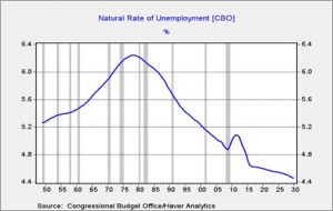
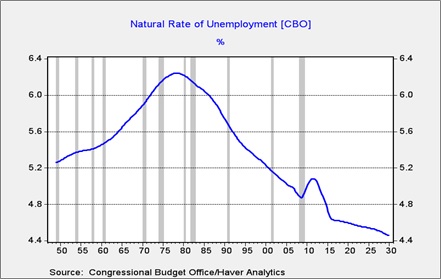
This chart shows the natural rate of unemployment, calculated by the Congressional Budget Office.  As is evident, it has increased and declined over time.

The lack of inflation given the low level of unemployment has led the FOMC to consider if another model might work better.  If the reaction of the economy to low unemployment has changed, then policymakers may need to keep rates lower for longer to avoid the risk of raising rates too soon or too much.  Doing either could needlessly shorten a business cycle.  If inflation reacts more slowly to falling capacity, it might make sense to use a different way to adjust the policy rate to inflation.  Currently, the FOMC uses a 2% target on core PCE inflation.  In other words, based on the yearly change in the core PCE index, the FOMC attempts to keep inflation around a yearly 2% change.  Although the Fed attempts to suggest 2% isn’t a ceiling, it is generally treated as one by the financial markets.

Of the current 17 members of the FOMC, nine are Ph.D. economists.  Of that group, five have advocated for a reexamination of inflation policy.  None of the non-Ph.D. members have advocated for a change.  Thus, the drive to make a change appears to be coming from the “technical” side of the shop.  At present, there are three ideas being explored to address the inflation policy issue.

  1. Raise the inflation target: The official inflation target is relatively new. Although the Fed privately agreed to an inflation target in 1996, Chair Greenspan insisted it was to be kept secret.[1]   It wasn’t until 2012 that the FOMC made the 2% target official.[2]  The working definition of inflation control is a rate low and stable enough that inflation concerns are not part of the economic process.  In other words, if I am buying something, I neither accelerate the purchase (a reaction to higher expected prices) nor wait (a reaction to lower expected prices).  If the interest rate that creates equilibrium has fallen, one way to achieve that rate, on a real basis, is to simply tolerate higher inflation.
  2. Use a moving average of the yearly change in inflation: The use of the core rate, the rate excluding food and energy, is designed to smooth out the changes that can be triggered by weather or geopolitical events. However, even items outside of food and energy can be affected by short-term events.  Changes in tax rates at the state and local level can raise prices for a short time.  In the past, price wars in mobile phone plans led to lower core prices.  If the goal is to control inflation over the medium term, a smoothed series might make more sense.[3]
  3. Target the level of prices, not the rate of change: The FOMC uses the core PCE deflator as its policy tool. Instead of aiming for a 2% rate of change, the committee could target a level instead.  That way, if price levels were above trend for an extended period, monetary policy would be tightened until the index falls back to trend.  In the case of price levels being below trend, the Fed may move slowly to raise rates until prices return to trend.  The advantage of this model is that the FOMC would not have to react to a simple jump in prices after a period of low prices.

All three options have pluses and minuses.  Raising the inflation target is the easiest to understand.  But, there is concern that if the target appears flexible then inflation expectations could become unanchored.  The risk is that once the target is changed, the Fed could find itself facing political pressure to keep rates steady or cut them even with rising inflation to suit short-term political goals.  Moving average models will reduce the likelihood that the Fed would react quickly to inflation impulses and make the policy rate steadier.  However, by design, moving averages will tend to delay easing and tightening.  In the present circumstance, it appears attractive but it will tend to slow rate reductions going into an easing cycle.  Targeting the level of price is attractive in that it takes previous price levels into account, but it will be hard to explain to the public how it works and what to expect.  And, the calculated trend can be sensitive to initial conditions.  In other words, if you start your model in a high inflation period, it can affect the deviation from trend.

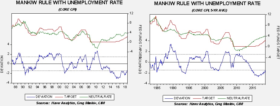
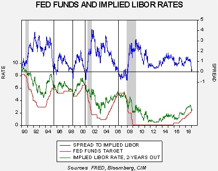
Here is one potential view of the second option.

Using the Mankiw Rule (which uses core CPI instead of core PCE), we take a five-year average of inflation on the model shown on the right.  The model on the right has better performance; during the 1990s, it did a better job of informing policymakers that rate changes were unnecessary and would have told the Bernanke Fed that policy was too tight going into the 2007-09 recession.  Interestingly enough, both versions suggest the Fed is currently too easy.

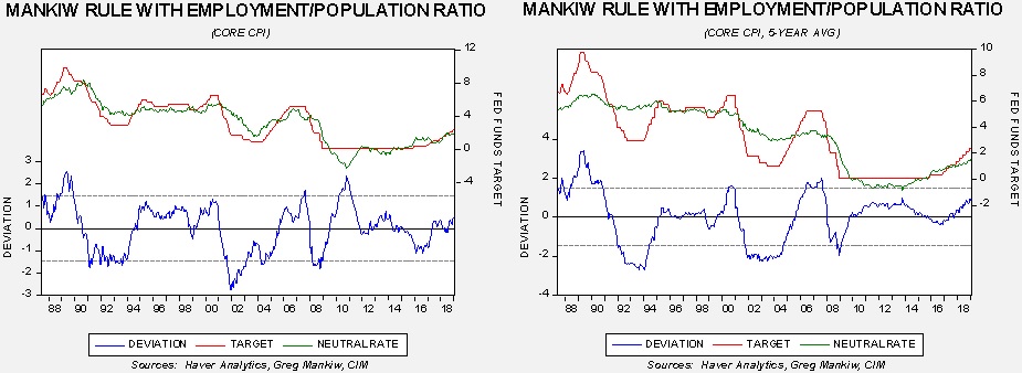
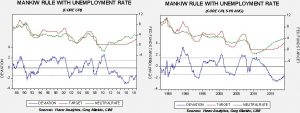
Here is another view using the employment/population ratio as a proxy for capacity.

The moving average model gave clearer signals; it would have told policymakers to ease sooner in 2001 (a recession year) and would have signaled to the Bernanke Fed to begin easing sooner than it did before the 2007-09 recession.  Both suggest the neutral rate is below the current rate but the moving average model suggests policy is tighter than the unadjusted inflation model.  Essentially, these views show that the real issue remains the measure of slack, but adjusting the inflation indicator might mitigate the uncertainty surrounding the capacity issue.

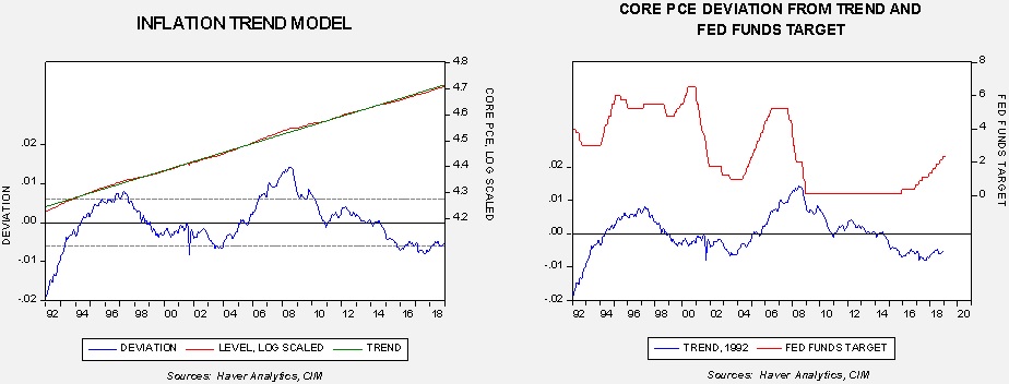
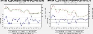
Here is one potential view of the third option.

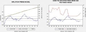
The chart on the left shows the core PCE index, log transformed, regressed against a time trend.  In general, price levels vary to trend.  The chart on the right compares the detrended index to the fed funds target.  Note that the cycles in policy tended to move with price levels except for the current one.  This model would have kept the FOMC from tightening at all in this cycle.

Under current conditions, this reassessment of inflation policy will likely lead to an end of tightening.  Essentially, the considered adjustments will probably discourage further rate hikes by reducing the policy level of inflation.  However, this assessment still depends on the proper measure of slack in the economy, which, so far, has not been resolved by the FOMC.  Nevertheless, we think the proper assessment of this change is dovish for policy.

View the PDF


[1] https://economia.icaew.com/opinion/april-2015/the-federal-reserves-battle-with-price-stability

[2] https://www.federalreserve.gov/monetarypolicy/files/FOMC_LongerRunGoals.pdf

[3] The Bank of England has a sort of smoothing process where it targets a 2% rate with a 1% variance.  If inflation rises or falls outside this band, the bank must explain to the Exchequer why this occurred and what it will do about it.  Thus, if the variance is due to a one-off situation, the bank may do nothing.

Weekly Geopolitical Report – The Irish Question: Part II (March 4, 2019)

by Bill O’Grady

Last week, we examined the geopolitics of Britain and offered an abbreviated history of Irish/British relations.  This week, we will begin by analyzing the Good Friday Agreement, followed by an analysis of Brexit regarding the Irish question.  As always, we will conclude with market ramifications.

The Good Friday Agreement
By the late 1990s, conditions that had led to British colonization of Ireland and the need to maintain some degree of control there had changed.  Britain was no longer a major imperial power and had become a member of the European Union and NATO.  In fact, like the rest of the EU, it was outsourcing its defense to the U.S.  U.K. access to sea lanes had little to do with the power of the Royal Navy; instead, it was dependent on global and regional trade agreements and the U.S. Navy.  Thus, securing its western coast was no longer an imperative.

The three-decade guerilla conflict in Northern Ireland had become a drain on resources.  No longer was Northern Ireland a major industrial center.  Instead, it was a place that required constant support.  At the same time, the long war had steadily undermined the idea among Irish Republicans that unification could occur by force.

Out of these two realizations came the Good Friday Agreement.  There are five key elements to the agreement:

  1. The Status of Northern Ireland was acknowledged. The agreement begins with the claim that the majority of people in Northern Ireland wished to remain part of the U.K.  It also acknowledged that a substantial minority in Northern Ireland and the majority of those in Ireland supported unification.
  2. The Irish Constitution was amended to accept that Northern Ireland was part of the U.K. K. laws were amended to support unification.
  3. Both sides agreed that, at some unspecified point in the future, a referendum on the border would be held. If the majority in Northern Ireland agree on unification then both sides would honor the results of that vote.
  4. Citizens of Northern Ireland could carry passports from both the U.K. and Ireland.
  5. Paramilitary groups on both sides would be disarmed and decommissioned.

View the full report

Asset Allocation Weekly (March 1, 2019)

by Asset Allocation Committee

Our cyclical position on foreign investing remains with a zero allocation; although the committee has not been negative on foreign, our work suggested that the risk/reward compared to small and mid-cap stocks warranted putting more assets in those areas.  However, we are continuing to pay close attention to foreign as an area that may be attractive in the future.

In the past, we have noted that relative performance between foreign developed and U.S. equities is sensitive to the dollar.  In general, during periods of dollar strength, U.S. equities tend to outperform (assuming both are denominated in dollars, which is the case for a U.S. investor).

The blue line on the chart shows the ratio of performance between EAFE and the U.S., rebased to 1970.  When this line is rising, foreign stocks are outperforming.  The red line shows the JPM Dollar Index.  Note that a rising dollar tends to favor U.S. outperformance, while dollar weakness helps foreign market performance.   Although the dollar has remained strong, both on a purchasing power parity basis and a cycle basis, the dollar is extended and should begin to depreciate later this year.

However, in this business cycle, U.S. stocks have generally outperformed even during periods of dollar weakness.  This has led us to look for other factors that might account for this discrepancy.  It appears that the growth/value variation explains at least part of this divergence.

As in the first chart, the blue line shows the relative equity performance.  The red line shows the Russell 3000 Growth/Value divergence; a rising line suggests growth outperformance.  Growth stocks have outperformed in this bull market but are showing signs they may finally be starting to give way to value.  The primary driver of growth/value is the P/E ratio.  Significant multiple expansion isn’t all that likely, although a return to the 18x+ area would not be surprising.

Why would the growth/value divergence affect foreign stocks?  The most likely reason is index construction.  U.S. indices will tend to have a greater weighting toward technology due to the size of that industry in the U.S. economy.  Foreign nations, for the most part, have less dominant tech industries.  With technology being considered a growth sector, a period of strong technology performance would tend to lead to outperformance by growth.  If foreign equity indices have less technology, they would likely underperform.  Consequently, when the growth/value balance shifts to the latter, we would anticipate foreign outperformance.  The table below provides a comparison of sector exposures.

Overall, we continue to monitor the relative performance of foreign compared to other asset classes.  If our risk/reward estimates change later this year, we could consider a return to international.

View the PDF

Weekly Geopolitical Report – The Irish Question: Part I (February 25, 2019)

by Bill O’Grady

As the United Kingdom continues on its path to withdraw from the European Union, a key element that needs to be considered is the border issue in Ireland.  The Northern Ireland/Ireland frontier is the only border that would be directly affected by Brexit.  The rest of the U.K. is an island, although border checks would be required at the Chunnel and at U.K. ports.  However, the Irish border has broader geopolitical implications beyond just a border issue.

In Part I of this report, we will begin by introducing the importance of Ireland to Britain’s geopolitics and how this led to the effective British colonization of Ireland.  A short history of British/Irish relations will follow.  Next week, in Part II, we will examine the Good Friday Agreement and analyze the problems that Brexit brings.  As always, we will conclude with market ramifications.

View the full report

Asset Allocation Weekly (February 22, 2019)

by Asset Allocation Committee

In 2017, we introduced an indicator of the basic health of the economy and added it to the many charts we monitor to gauge market conditions.  The indicator is constructed with commodity prices, initial claims and consumer confidence.  The thesis behind this indicator is that these three components should offer a simple and clear picture of the economy; in other words, rising initial claims coupled with falling commodity prices and consumer confidence is a warning that a downturn may be imminent.  The opposite condition should support further economic recovery.  In this report, we will update the indicator with January data.

This chart shows the results of the indicator and the S&P 500 since 1995.  The updated chart shows that the economy did slip late last year.  We have placed vertical lines at certain points when the indicator fell below zero.  Although it works fairly well as a signal that equities are turning lower, there is a lag.  In other words, by the time this indicator suggests the economy is in trouble, the recession is likely near or underway and the equity markets have already begun their decline.

To make the indicator more sensitive, we took the 18-month change and put the signal threshold at -1.0.  This provides an earlier bearish signal and also eliminates the false positives that the zero threshold generates.  Notwithstanding, we will pay close attention when the 18-month change approaches zero as it did in January.

What does the indicator say now?  The economy has weakened but is not yet at a point where an investor should become defensive.  Breaking below the red line would be our signal to expect a broader downturn.  Most likely, we are going through a period similar to what we experienced in 2016.  If so, and the economic data begins to improve, then we should see equities turn higher in the coming months.

View the PDF

Asset Allocation Weekly (February 15, 2019)

by Asset Allocation Committee

The pullback in equities in Q4 coincided with a sharp drop in long-duration Treasury yields.  However, the recovery seen in early 2019 has not led to a rise in yields.

(Source: Bloomberg)

This chart shows the S&P 500 (left axis) and the 10-year T-note yield (right axis).  Note that yields and the equity markets tended to rise together in the first three quarters of 2018.  More importantly, they tracked each other in the fourth quarter; as equity values fell, yields also declined.  However, as equities have recovered since late December, yields have not rebounded into the range where they were when the S&P was around 2700.

In part, yields are currently running below fair value.

This chart shows our bond model; the core variables are fed funds and the 15-year average of CPI.[1]  In addition to these variables, we add the JPY/USD exchange rate, crude oil prices, German 10-year sovereign yields and the Federal deficit/GDP ratio.  The market would not be “rich” in this model until yields approach 2.17% but they are modestly below fair value after being above fair value for most of last year.

There are thee variables that account for the decline in the 10-year T-note yield, fed funds, German sovereign 10-year yields and oil prices.  In October, the 10-year T-note yield was running around 3.15%.  That level had discounted oil prices at $60 per barrel, German yields at 20 bps and a terminal fed funds rate of 3.25%.  The decline in the fed funds estimate to 2.50% accounted for 30 bps in the decline in yield, while the remaining 3 bps to fair value came from the decline in oil prices to $55 per barrel and German 10-year sovereign yield declines to 14 bps.

The “undershoot” to 2.70, below the fair value of 2.87%, could be achieved with a fed funds of 2.12%.  Given that the actual target is the mid-point between the upper and lower bound of the fed funds target (the announced rate is actually the upper bound), this would imply a rate cut.  Or, a decline in inflation expectations to 1.8% from 2.1% could also account for the undershoot, assuming no change in fed funds.

We suspect the primary reason for the slide is that inflation expectations have probably fallen.  This is because there isn’t much in the data to support the FOMC cutting rates.

This chart compares the fed funds target to the implied three-month LIBOR rate from the two-year deferred Eurodollar futures contract.  History shows that policymakers tend to stop raising rates when the spread between these two rates invert.  As the spread line shows, the spread is near inversion which is consistent with a policy pause but would not be consistent with rate declines.  Policy cuts would be in order if the implied yield were to fall further, but that evidence doesn’t exist for now.

If inflation expectations are leading to the undershoot, then stronger economic growth could trigger a rise in inflation fears.   We would not be surprised to see a modest rise in yields in the coming weeks, but a rise beyond 3.00% on the 10-year T-note yield would likely require a return to policy tightening by the FOMC.  We would not expect such a shift until later this year, if then.

View the PDF


[1] Which is a proxy for inflation expectations.

Weekly Geopolitical Report – The Nigerian Election (February 11, 2019)

by Thomas Wash

(N.B. Due to the President’s Day holiday, the next report will be published February 25.)

On February 16, 2019, Nigeria will hold its sixth presidential election since it ended military rule in 1999. President Muhammadu Buhari, who has been rumored to be in bad health after disappearing from public view for weeks at a time, is facing a serious challenge from the former vice president, Atiku Abubakar. Although there are several other challengers, their chances of winning are slim.

In a country where presidents typically serve two terms, Buhari appears vulnerable to being removed from office after his first. In a word, his first term can be described as turbulent. The economy fell into recession, there were bouts of fuel scarcity and his health troubles sparked rumors that he had been replaced by a Senegalese body double.[1] In 2016, even his wife registered her discontent with his performance by insinuating that she may not support him in his re-election bid. Recent actions by Buhari and his government suggest he has not taken his declining popularity in stride. As a result, there is growing concern that the election could become violent.

Even though the last election saw a relatively peaceful transition of power, historically, elections in Nigeria have been violent. Thus, this election has garnered international attention as it could possibly lead to broader conflict within the region. While we are concerned with the humanitarian aspects of this event, the primary focus of this report will be on how the election could impact financial and commodity markets. We will examine the overall political situation in Nigeria, the issues surrounding recent elections and the potential for unrest following the vote. As always, we will conclude with potential market ramifications.

View the full report


[1] https://www.wsj.com/articles/on-the-issue-of-whether-ive-been-cloned-an-election-gets-weird-1544459732