Asset Allocation Weekly (April 12, 2019)

by Asset Allocation Committee

The employment data is closely watched by financial markets; although the data isn’t necessarily a leading indicator for the economy, it is probably the most important from a political and social perspective.  Weak employment data is a worry for political incumbents and concerning to policymakers.  However, beyond the headline data, there are usually interesting trends worth noting.  In this week’s report, we will examine two trends that have longer term implications.

Career paths were part of corporate culture three decades ago.  Large companies often had junior executive programs, where promising young talent was brought to the firm and would follow a rotation of positions in numerous departments before finding a permanent home.  In other situations, college graduates would join a company and follow a path of positions of increasing responsibility.  However, over the years, outsourcing jobs overseas and increasing industry concentration[1] have probably reduced the number of entry level professional positions in the U.S.  This chart shows the percentage of production and non-supervisory workers compared to total non-farm employment.

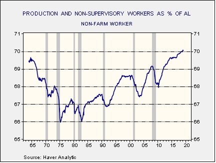
In the 1970s, this percentage declined to a low of 66%.  However, since the early 1980s, the percentage has steadily increased in each business cycle.  This data suggests that an increasing number of jobs are non-management positions.  We suspect that college graduates are being forced to accept non-management positions as fewer of them are available for an increasing number of graduates.  Such disappointment has the potential to cause social unrest.  At the same time, reversing industry concentration would tend to boost the number of management jobs in the economy (every firm needs HR, finance, etc.).  Thus, support for anti-trust actions could become more popular.

Second, initial claims, on a weekly basis, fell to 40-year lows recently.  However, the weekly data is “noisy” and can be affected by floating holidays and weather.  Another way of looking at claims is to scale to the civilian non-institutional population.  This data is at historic lows.

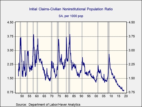
This low level of claims is likely due, in part, to firms holding on to workers because of tight labor conditions.  A rising number of retirees will lift the non-working civilian non-institutional population but fewer workers will tend to depress claims.  In any case, this level of claims compared to the population is remarkably low and would argue that wages should rise.

Overall, these two charts offer insights into longer term issues in the labor market.  They won’t have an immediate effect on financial markets, but both signal potential for further disruption.

View the PDF


[1] https://finance.eller.arizona.edu/sites/finance/files/grullon_11.4.16.pdf

Weekly Geopolitical Report – When Hegemons Fade (April 8, 2019)

by Bill O’Grady

In our Daily Comment report, a section on Brexit has become something of a regular feature.  As part of keeping up with developments, we have commented on nearly every twist and turn (or lack thereof) in the Brexit process.  In a recent WGR series, we discussed the Irish problem[1] and how it relates to Brexit.

As we watch Brexit unfold, one persistent theme has emerged—much of Brexit is about unresolved issues surrounding the end of the British Empire.  Britain was the global hegemon from 1815 to around 1920 (although the nation still thought it was in charge until the end of WWII).  Historians tend to view the shift from one hegemon to another as a clear, abrupt break.  But, in reality, faded hegemons tend to cling to elements of former glory.  Although global influence may have waned, the vestiges of power still affect policy and national self-image.  For example, Spain’s era as global hegemon ended around 1640 after wars with the Dutch exhausted Spain’s power.  Still, Spain held possessions in the Western Hemisphere until the Spanish-American War in 1896-98.  That war finally ended the Spanish Empire.

There is an element of Brexit that is trying to recapture former glory.  Sadly, Brexit may make it clear that Britain is no longer a major global power.

In this report, we will discuss the geopolitics of Europe and Britain.  Using this geopolitical analysis, we will examine the British Empire and how it devolved.  These two analyses will be used to examine the path of Brexit.  As always, we will conclude with market ramifications.

View the full report


[1] See WGRs, The Irish Question: Part I (2/25/2019) and Part II (3/4/2019).

Asset Allocation Weekly (April 5, 2019)

by Asset Allocation Committee

Mortgage-backed securities have rather odd characteristics compared to Treasuries.  At their most basic level, mortgages are bonds—prices are inversely related to yields.  The pricing on mortgages assumes a certain level of refinancing activity.  However, when yields rise, expected mortgage duration tends to extend because mortgage holders are less likely to refinance.  When yields fall, expected duration shortens as mortgage holders replace their existing mortgages with new ones at lower rates.  Usually, mortgage bonds tend to act like options; they act “normal” within a certain range of yields, but duration adjustments occur if yields change above a given range.

Some bond fund managers are required to maintain a given duration level.  If the manager is holding mortgages and refinancing activity rises then the fund’s duration could shorten.  This would require the manager to take steps to re-extend duration.  A fast way to accomplish this goal would be to buy long-duration Treasury futures.  These instruments are liquid and generally have a set duration.

In general, refinancing tends to take place when interest rates fall below the level of the current mortgage, taking closing costs into account.

The chart on the left shows the 10-year T-note yield; we have regressed a time trend through the data.  Clearly, yields have been on a downward path since 1990.  The chart on the right shows the 10-year T-note yield less trend on the lower line and the mortgage refinancing index on the upper line.  Evidently, refinancing activity tends to rise when rates are below trend.  Since 2016, the steady rise in rates relative to trend has depressed refinancing.  However, we have seen a lift in refinancing recently.  On the one hand, the dip in rates doesn’t look like enough to overcome closing costs.  On the other hand, paying a higher rate on a new mortgage may be the only way a homeowner can capture price appreciation.

This chart shows the ratio of the new rate to the old rate.  When the old rate is higher than the new rate, the ratio is less than 1.0.  Note that this ratio is now at a new record high.  Essentially, buyers are refinancing at a less advantageous rate to extract home equity.

We suspect the most important factors of the recent bond rally have been changes in monetary policy expectations and reduced inflation fears.  But, the rise in refinancing has likely played a role as well.  We doubt that the attractiveness of locking in a higher mortgage rate will continue indefinitely, therefore this bullish factor should dissipate in the coming weeks.

View the PDF

Weekly Geopolitical Report – Modern Monetary Theory: Part IV (April 1, 2019)

by Bill O’Grady

In Part III, we examined the role of economic paradigms in the equality/ efficiency cycle.  This week, we conclude this four-part series with a discussion on the flaws of Modern Monetary Theory (MMT) and market ramifications.

The Flaws of MMT
All of the major economic paradigms previously discussed lead to eventual problems.  Capital-friendly policies, such as Classical or supply-side theories, eventually lead to inequality.  Policies less friendly to capital eventually become inflationary.  MMT has a few flaws as well.  Here are the ones we are most concerned about.

View the full report

Asset Allocation Weekly (March 29, 2019)

by Asset Allocation Committee

Long-dated Treasury bonds have enjoyed a strong rally in recent weeks.  Fears about future U.S. economic growth, falling global economic growth and a reversal in monetary policy expectations have all conspired to lower yields.  The question now is whether or not yields have fallen more than is justified by the fundamental factors.

This is our model of the 10-year T-note yield.  Independent variables in the model include fed funds, an inflation proxy,[1] the yen/dollar exchange rate, German 10-year yields, WTI oil prices and the fiscal deficit as a percentage of GDP.  The standard error line is 70 bps; thus, at current fair value, the 10-year T-note yield would be “rich” around 2.15%.

In general, the first two variables have the most explanatory power.  The current yield is well below the fair value of 2.86%.[2]  One way to account for the decline in yields would be if the market was projecting easier monetary policy.  Leaving the rest of the independent variables unchanged, to reach a 2.40% 10-year T-note yield would require fed funds of about 1.50%, or a 100 bps reduction from current levels.  Since such a cut is unlikely in the near term, it is arguable that the 10-year yield has overshot to the downside.

However, another possibility is that inflation expectations are falling.  Inflation expectations have a powerful effect on long-dated debt yields.  Our current inflation proxy puts inflation at 2.10%.  To achieve current yields, inflation expectations would need to fall to 1.41%.  Although inflation expectations are not directly observable, we assume such expectations are slow to change.[3]  Thus, it would be unlikely that a drop in inflation expectations alone would account for the recent decline.  However, inflation expectations falling to 1.8% and fed funds at 2.00% would bring yields close to 1.40%.

It is quite possible that falling inflation expectations and forecasts of easier monetary policy can justify the current 10-year yields.  The risk is that the FOMC keeps policy steady and inflation eventually surprises to the upside.  Thus, we would not see the current environment as conducive for extending duration. 

View the PDF


[1] We use a 15-year moving average of the yearly change in inflation for inflation expectations.

[2] We use monthly averages in the above model; thus, the March yield is 2.63%.  The April yield will be much less.

[3] Milton Friedman assumed such expectations were built over a long period of time, perhaps two decades or more.

Weekly Geopolitical Report – Modern Monetary Theory: Part III (March 25, 2019)

by Bill O’Grady

In Part II, we discussed the principles and consequences of Modern Monetary Theory (MMT).  This week’s installment will be devoted to the importance of paradigms.  Next week, we will conclude the series with a discussion on the potential flaws of MMT along with market ramifications.

The Importance of Paradigms
Every major shift in the efficiency/equality cycle has coincided with a favored economic theory to promote the change.  The following chart from Peter Turchin shows his take on inequality and wellbeing cycles in U.S. history.  Although Turchin doesn’t fit his pattern to Arthur Okun’s equality and efficiency tradeoff,[1] we see a strong match between this tradeoff and Turchin’s wellbeing and inequality cycles.  During periods where Turchin’s wellbeing line is rising and inequality is falling, the economy is going through an equality cycle.  Equality cycles are sometimes characterized by policies that favor labor (which may include high marginal tax rates, easy monetary policy, policies that favor unions and social mores that promote “the common man”[2]).

Usually, equality cycles end when the economy needs to build productive capacity to reduce inflation and thus needs to increase efficiency.  These are policies that favor capital, which may include low or non-existent tax rates, reduced regulation, anti-organized labor policies and social mores that lionize wealth.[3]

(Source: Peter Turchin[4])
Our historical analysis suggests there have been four shifts in equality and efficiency and each has been supported by an economic theory that gave intellectual credence to the shift.

View the full report


[1] Okun, Arthur. (1975). Equality and Efficiency: The Big Tradeoff. Washington, D.C.: The Brookings Institution.

[2]https://en.wikipedia.org/wiki/You_Can%27t_Take_It_with_You_(film)

[3]https://www.youtube.com/watch?v=VVxYOQS6ggk

[4] http://peterturchin.com/cliodynamica/the-double-helix-of-inequality-and-well-being/

Asset Allocation Weekly (March 22, 2019)

by Asset Allocation Committee

One factor we have been tracking is the recent behavior of retail money market funds.  We have noted that households began building money market funds about the time that the equity market peaked and U.S. trade policy began to turn toward protectionism.  In the coming months, money market funds continued to rise even as the S&P 500 made new highs.  However, as equity markets fell in Q4, money market funds rose rapidly, with the pace of the increase rivaling what we saw in 2007-08.

This chart shows retail money market funds and the S&P 500.  The gray shaded area shows the 2007-09 recession.  The orange shaded areas show periods when money market funds fell below $920 bn.  When money market funds fell to those levels, equities tended to stall.  In recent weeks, the pace of increases in retail money market funds has slowed but still continues to rise, even with the market’s recovery.  It may be difficult for equities to move much higher without retail participation.

In light of this analysis, which we have been discussing on a regular basis, another thought emerged—what is the role of cash in a portfolio?  To examine this issue, we decided to look at cash instruments in the holdings of households.

It turns out that cash has a complicated history.

This chart shows the percentage of deposits in household financial assets.  From the early 1950s into the early 1980s, the level of deposits generally rose.  This rise was probably due to a number of factors.  During this period, there was a steady rise in household income; at the same time, the financial system was heavily regulated.  Regulations limited households’ flexibility in investing.  However, by the mid-1980s, Regulation Q, which put caps on deposit rates, was removed.  And, the financial services industry greatly expanded the products available and improved the logistics of investing.  Financial deregulation increased the access to borrowing for households; thus, the need to save for purchases diminished.  Income inequality also rose after 1979, which likely concentrated saving into fewer households.  With more liquidity, these high income households were more likely to look for other investment opportunities.  Essentially, the bull market in stocks that began in the early 1980s and ended in 2000 was supported by a more than 10% point decline in the share of deposits in household accounts.

Household deposits function as an investment, a way to smooth out spending and a flight to safety instrument.  Thus, one would expect there to be a close relationship between consumption and deposits and a rise in deposits relative to consumption during periods of crisis.  In fact, these features do exist, but there was a significant break in the relationship starting in 1990.

The chart on the left shows the time series of personal consumption and household deposits; the one on the right shows a scatterplot with regression lines.  Note that after 1990, the relationship curve shifted to the right, meaning that fewer deposits were required to support consumption.  Deposits rose sharply in 2005, even faster than consumption.  That was when the housing crisis began and there was clearly a flight to safety.

Since 2005, there has been a steady increase in deposits relative to consumption, which would suggest a generalized increase in fear relative to the period from 1995 to 2005.

This chart shows the ratio of deposits to consumption.  In 2000, deposits fell below 70% of consumption. The ratio rose after that and has currently reached 90%.  Note how fast the ratio rose after housing peaked in 2005—there was a clear flight to cash that culminated in the Great Financial Crisis.  That level of fear has persisted, shown by the high level of deposits relative to consumption.

In conclusion, as the first chart shows, we have seen a lift in money market funds.  This does suggest an elevated level of fear in financial markets.  However, the recent rise should be viewed within the context of overall cash holdings in households.   Essentially, households are holding high levels of deposits relative to consumption, suggesting rather high levels of caution already.  We still believe that retail money market funds need to decline in order to see equities rise this year; however, it also seems that households are not as complacent as they were in 2005 and therefore the likelihood of a financial crisis is probably not very high.

View the PDF

Quarterly Energy Comment (March 21, 2019)

by Bill O’Grady

The Market
Oil prices have been volatile over the past few months.

(Source: Barchart.com)

In October, OPEC producers increased output in anticipation of U.S. sanctions on Iran.  However, the Trump administration granted more waivers for Iranian exports than anticipated, leading to more oil supply.  As the above chart shows, prices plunged, falling from $78 per barrel to near $42 per barrel.  OPEC + Russia have since taken barrels off the market in a bid to boost prices.  Thus far, they have had some success in this effort but, clearly, we have not seen a full recovery in prices.

Prices and Inventories
Inventory levels remain below their 2017 peak but are still above what we would consider normal levels, below 400 mb.  Oil inventories rose sharply in 2015 as U.S. output rose due to shale production.  Unfortunately, the U.S. had regulations in place that limited oil exports to Canada and Mexico.  As these regulations were lifted, allowing for expanded oil exports, stockpiles have declined.

View the complete PDF

Weekly Geopolitical Report – Modern Monetary Theory: Part II (March 18, 2019)

by Bill O’Grady

In Part I of this four-part series, we introduced this report and discussed the origin narratives of Modern Monetary Theory (MMT).  This week, we will examine the principles and consequences of the theory.

Principles of MMT[1]
MMT begins its analysis with a focus on macroeconomic identities and flows.[2]  The theory states that the creation of money begins with government.  The government buys goods and services and injects money into the economy.  That money goes into the private sector through the banking system and is either spent or saved by households and firms.  To prevent the money supply from becoming excessive, the government taxes households and businesses or issues bonds that absorb cash and, in return, become financial assets.

These macroeconomic identities all balance to zero, as referenced below in our WGR series from May 2017.

View the full report


[1] Although the purpose of this report is to examine MMT, our focus is more on the ramifications of the theory on hegemonic policy and exchange rates. For those interested in studying the theory more fully, see op. cit., Wray, or a simplified video is available:  https://modernmoney.wordpress.com/2014/02/10/mmt-nutshell-diagrams-and-dollars/

[2] For a deeper discussion of macroeconomic identities and flows, see WGR series, Reflections on Trade: Part I (5/1/2017); Part II (5/8/2017); Part III (5/15/2017); and Part IV (5/22/2017).