Asset Allocation Weekly (May 29, 2020)

by Asset Allocation Committee

The recent strong rally in equities has befuddled investors—how can equities rally with such vigor when the economy is historically weak?  We suspect there are two reasons for this recovery:

  1. Although the drop in economic activity is deep, it will likely be short.
  2. Supportive monetary policy is a powerful elixir for equities.

Equity markets are forward-looking; investors put their money to work on expectations of future economic conditions and earnings, not based on what is occurring today.  The current downturn is historic.  The decline in the economy has been very fast and deep, but it will likely be short.  In fact, the recovery should begin by midsummer at the latest.  We use these words to mean something specific.

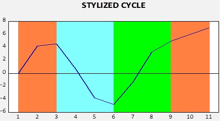
This chart shows a stylized path of the business cycle.  Orange represents expansion, when the economy is making new peaks in an indicator.  This can be GDP, industrial production, coincident indicators, etc.  Blue is recession and is measured from peak to trough.  Green is recovery, which lasts from trough until a new peak occurs.  Finally, once a new peak is made, a new expansion is underway.

We expect this recession to end quickly because the trough will probably occur in Q2.  However, the recovery will be long and likely dictated by the path of the virus.  We currently estimate the new expansion will start in H2 2021.

(Data source: Haver Analytics)

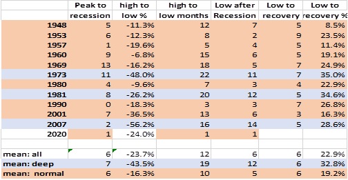
This table shows the declines in the S&P 500 for the postwar recessions.  On average, equities tend to peak about six months before the onset of the economic downturn, while the low occurs about six months after the peak in economic activity.  From the market low to recovery, the S&P 500 usually rebounds by about 20%.  But, notice from deep recessions that the rebound from the low is about 33%.  The rebound we have witnessed thus far is in line with a deep downturn, but it appears unusual due to the compressed nature of the current recession.

Also noted above are the aggressive actions taken by the FOMC.  Below is a chart that will be familiar to regular readers.

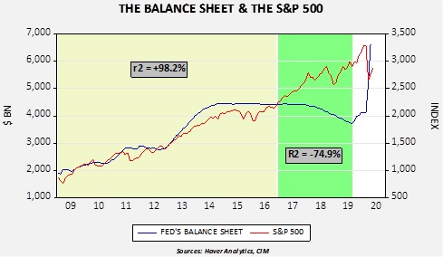
From early 2009 until November 2016, the path of the S&P 500 closely matched the Fed’s balance sheet.  There was always concern that the relation was a spurious correlation, and the behavior from December 2016 into August 2019 suggested it was.  However, it is important to note that equities were buoyed by expectations of a massive corporate tax cut.  Taking the balance sheet and incorporating the tax cut gives us a model that offers some insight into the impact of current monetary policy.

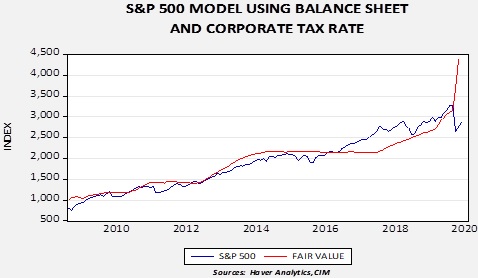
Fair value is derived from smoothing the higher marginal rate of the corporate tax and the balance sheet.  Adding the impact of the tax cut accounts for some of the rally in equities.  The sharp rise in the fair value in recent months reflects the massive expansion of the balance sheet.

This is not our forecast for the S&P 500, but it does offer some insight into how powerful the Fed’s actions have been.  We doubt the equity index will track this model due to the level of uncertainty surrounding the path of the economy.  Nevertheless, a projected short, sharp downturn coupled with the most rapid increase in the balance sheet since WWII have created strong support for equities that will likely prevent significant corrections, barring a major policy error or an unexpected negative turn in the toxicity of the virus.

View the PDF

Weekly Energy Update (May 29, 2020)

by Bill O’Grady, Thomas Wash, and Patrick Fearon-Hernandez, CFA

Due to the Memorial Day holiday, the DOE data was delayed until yesterday.  Thus, our report was delayed as well.  Here is an updated crude oil price chart.  The oil market continues to recover after April’s historic collapse.

(Source: Barchart.com)

Crude oil inventories surprised the markets for the third straight week but this time by rising 7.9 mb compared to forecasts of a 2.5 mb draw.

In the details, U.S. crude oil production fell 0.1 mbpd to 11.4 mbpd.  Exports were unchanged, while imports rose 2.0 mbpd.  Refining activity rose 1.9%, above expectations.  As we saw last week, there was another jump in unaccounted-for crude oil.

Unaccounted-for crude oil is a balancing item in the weekly energy balance sheet.  To make the data balance, this line item is a plug figure, but that doesn’t mean it doesn’t matter.  This week’s number of -999 kbpd is the largest negative number on record.  For the third week in a row, this number is running nearly 1.0 mbpd.  It may mean that in the scramble for finding storage, some oil is being inventoried outside the survey system.  In other words, over the week, some 6.9 mb of crude oil went into storage somewhere, just not where it can be recorded.  Or, production is falling much faster than the DOE estimates are capturing so there aren’t any missing barrels; simply put, production is cratering.  We still don’t know which thesis is correct.  Given that imports rose this week, some of the unaccounted-for crude oil may be in storage floating on the ocean and prices have reached a point where some of it is coming ashore.  Nevertheless, it is still quite possible that production is falling faster than estimated.[1]  The second factor is that the SPR rose 2.1 mb as some of the oil went into the strategic reserve.

(Sources: DOE, CIM)

The above chart shows the annual seasonal pattern for crude oil inventories.  This week’s data showed a rebound in crude oil stockpiles.  We are getting close to the beginning of the seasonal draw for crude oil.  If inventories don’t decline in the coming weeks, oil prices would be vulnerable to a correction.

Based on our oil inventory/price model, fair value is $28.43; using the euro/price model, fair value is $44.74.  The combined model, a broader analysis of the oil price, generates a fair value of $36.10.  As we have noted recently, the model output is less relevant as there is a non-linearity tied to the loss of storage capacity that cannot be fully captured with these models.  At the same time, if storage remains available, the models would suggest further upside for oil prices.

Although consumption remains depressed, there are reports that driving is starting to recover as lockdown rules ease.  The gasoline supplied data on the chart below also continues to show improvement.  Some data tracking does suggest an upswing in driving activity.

Another way of looking at gasoline is comparing inventories to consumption and calculating how many days of inventory are available at current consumption rates.

The current level is about 10 days above average.  An interesting sidelight is that the drop in gasoline demand has led to a drop in ethanol demand as well.  We get carbon dioxide from processing corn for ethanol which is sold to make fizzy drinks, dry ice, etc.  The price of CO2 is rising.

In market news, the IEA warned that shale investment would likely halve in 2020.  Venezuela received a shipment of gasoline from Iran.  Both nations violated U.S. sanctions; so far, there hasn’t been a notable response from the U.S.

View the PDF


[1] The weekly production numbers are estimates.  The official data comes with a two-month lag.  The DOE data for April indicates that production was 12.7 mbpd…but even that was an estimate.

Business Cycle Report (May 28, 2020)

by Thomas Wash

The business cycle has a major impact on financial markets; recessions usually accompany bear markets in equities.  The intention of this report is to keep our readers apprised of the potential for recession, updated on a monthly basis.  Although it isn’t the final word on our views about recession, it is part of our process in signaling the potential for a downturn.

In April, the diffusion index fell into recession territory for the first time since the financial crisis. Last month, the nationwide shutdown led to the sharpest decline in employment payrolls in the country’s history, while initial claims remain elevated at all-time highs. The financial markets showed some signs of revival as equities rallied the most in history in a month and bond prices rose due to heightened demand for U.S. Treasuries as investors flocked to safety while lockdown orders remained in place globally. Additionally, manufacturing production in certain industries has continued, in spite of the shutdown, to address supply shortages. However, the pandemic continued to weigh heavily on both investor and consumer confidence as there are growing concerns that the impact could continue even after the economy reopens. As a result, seven out of the 11 indicators are in contraction territory. The reading for April fell to +0.030 from +0.393 the previous month, below the recession signal of +0.250.

The chart above shows the Confluence Diffusion Index. It uses a three-month moving average of 11 leading indicators to track the state of the business cycle. The red line signals when the business cycle is headed toward a contraction, while the blue line signals when the business cycle is headed toward a recovery. On average, the diffusion index is currently providing about six months of lead time for a contraction and five months of lead time for a recovery. Continue reading for a more in-depth understanding of how the indicators are performing and refer to our Glossary of Charts at the back of this report for a description of each chart and what it measures. A chart title listed in red indicates that indicator is signaling recession.

View the complete PDF

Asset Allocation Weekly (May 22, 2020)

by Asset Allocation Committee

Beginning in the late 1990s and becoming an even bigger issue after Dodd-Frank regulations were imposed following the Great Recession, many market participants worried that bond market liquidity would be absent in the face of a crisis.  Strict regulations discouraged banks and brokerage firms from holding large inventories of corporate bonds, thereby precluding them from their former role as willing buyers in the face of a wave of selling by investors.  Compounding the concerns were the sheer size of flows into traditional open-end and ETF bond portfolios.  Over the 10-year period from 2009 through 2019, a total of $2.7 trillion flowed into these instruments, almost a third of which were in ETFs.  Entering the fray was the popularity of risk parity funds that levered their bond holdings.  Though each risk parity scheme has a nuanced approach, they all act in a similar fashion.  The concerns were that when risk parity funds and individual investors rushed to exit their bond holdings, market liquidity would be absent, particularly for corporate bonds.  Numerous studies and articles appeared over this time frame warning of dire consequences for bond investors, notably violent price movements due to the fact that banks and brokerage firms were no longer participating to a significant degree to assist in maintaining order to the bond market.

In March, the veracity of these concerns was tested as the bond market worked its way through the financial stress triggered by the pandemic.  During this episode, ETFs proved their endurance by moving into the void and providing the necessary stabilization of the market.  The use of creation/redemption units on the part of Authorized Purchasers [APs] mitigated the severity of the downturn, especially among investment-grade corporate bonds.  As the accompanying chart illustrates, spreads for BBB/Baa-rated corporates relative to the 10-Year Treasury gapped to their widest level since the Great Financial Crisis, yet quickly repaired.

An examination by Blackrock of the trading during this critical period in its largest corporate bond ETF, the iShares iBoxx Investment Grade Bond ETF [LQD], provides evidence that not only did the activities of the APs aid in maintaining market liquidity, but the market price of LQD actually led the price discovery process.  In other words, rather than the market price exacerbating the premium/discount to net asset value [NAV], the market price was the precursor of the daily NAV print.  Moreover, the direction of the market price of LQD often preceded the direction of LQD’s indicative value [IV], which is the real-time estimate of its fair value, based on the most recent prices of its underlying bonds.  Since LQD’s 2,169 underlying bonds trade over the counter, and therefore many may contain stale pricing, the price discovery proved invaluable to market functioning.  After the dust settled, it was evident that LQD and other bond ETFs provided market pricing that was at least as good as, and oftentimes better than, individual bonds.


As of 4/8/2020.  (Sources: BlackRock, Bloomberg and Refinitiv)

Although the market function provided by LQD during the period is not necessarily indicative of every bond ETF in each bond sector, it does underscore the notion that ETFs can provide the necessary liquidity during a period of crisis.  The creation/redemption mechanism of ETFs allow for arbitrage opportunities and allow the supply/demand of the ETFs to achieve equilibrium with the value of the underlying bonds.  In essence, ETFs are now creating most (if not more) of the liquidity previously provided by banks and brokerage firms, often doing so with greater efficiency.

View the PDF

Weekly Energy Update (May 21, 2020)

by Bill O’Grady, Thomas Wash, and Patrick Fearon-Hernandez, CFA

Here is an updated crude oil price chart.  The oil market continues to show signs of recovery.

(Source: Barchart.com)

One interesting development has been in open interest.  Open interest is the number of open contracts in a futures market.  Most of the time, the highest open interest in the calendar of contracts is the nearby or the second nearby, when the first nearby is near expiration.  However, currently the contract with the highest open interest is for December delivery.  Investors are taking the stance that oil prices are likely to rise in the future due to the combination of improving economic growth and falling output.  However, as the debacle recently witnessed in the oil ETFs showed, the nearest contracts are subject to wild price swings due to the lack of storage.  Thus, it appears speculators and investors are moving to the longer-dated contracts to execute positions to avoid the problems inherent in the nearby contracts.  The drawback with this strategy is that, under conditions of contango, the deferred prices are higher than the nearby.  However, this disadvantage has narrowed recently.  As the chart below shows, the July/December spread fell to nearly -10.00 per barrel in late April; it has narrowed to under -2.00 per barrel recently.  Thus, the carrying cost of holding the deferred contract has become less onerous.

Crude oil inventories surprised the markets for the second straight week by falling 5.0 mb compared to the forecast rise of 2.0 mb.

In the details, U.S. crude oil production fell 0.1 mbpd to 11.5 mbpd.  Exports fell 0.3 mbpd, while imports fell 0.2 mbpd.  Refining activity rose 1.5%, in line with expectations.  As we saw last week, there was another jump in unaccounted-for crude oil.

Unaccounted-for crude oil is a balancing item in the weekly energy balance sheet.  To make the data balance, this line item is a plug figure; but that doesn’t mean it doesn’t matter.  This week’s number of -998 kbpd is the largest negative number on record.  It may mean that in the scramble for finding storage, some oil is being inventoried outside the survey system.  In other words, over the week, some 6.9 mb of crude oil went into storage somewhere, just not where it can be recorded.  Or, production is falling much faster than the DOE estimates are capturing so there aren’t any missing barrels; simply put, production is cratering.  We are leaning toward the first explanation, but if inventories don’t rise in the coming weeks the second theory would become more plausible.  The second factor is that the SPR rose 1.9 mb as some of the oil went into the strategic reserve.

(Sources: DOE, CIM)

The above chart shows the annual seasonal pattern for crude oil inventories.  This week’s data, with the caveats expressed in the discussion about the unaccounted-for crude oil, suggests the worst of the inventory accumulation is behind us.

Based on our oil inventory/price model, fair value is $30.89; using the euro/price model, fair value is $44.26.  The combined model, a broader analysis of the oil price, generates a fair value of $36.88.  As we noted recently, the model output is less relevant as there is a non-linearity tied to the loss of storage capacity that cannot be fully captured with these models.  At the same time, if storage remains available, the models would suggest further upside for oil prices.

Although consumption remains depressed, there are reports that driving is starting to recover as lockdown rules ease.  The gasoline supplied data on the chart below also continues to show improvement.  Some data tracking does suggest an upswing in driving activity.

The market news for the week was mixed.  As we noted above, demand does appear to be improving, but prices remain depressed and production will likely continue to fall.  The Dallas FRB has produced research suggesting the net effect of the oil bear market has been negative for the economy, a major reversal from past years, reflecting the growing importance of oil production to the overall economy.  Meanwhile, it is possible the U.S. will restrict Chinese oil firms from buying U.S. oil companies.  And, in a first, the U.S. is on track to generate more electricity from renewables compared to coal.

On the geopolitical front, we are seeing the U.S. and Iran ease tensions.  Washington appears to be ignoring Iran’s trading with Venezuela, for example.  We suspect Tehran does not want to trigger a conflict before the election, a move that might actually boost support for President Trump.  Saudi Arabia is trying to balance the goals of economic restructuring with the loss of revenue due to falling oil pricesArgentina has set a domestic price of $45 per barrel to protect domestic producers.

View the PDF

Weekly Geopolitical Report – The Geopolitics of the 2020 Election: Part I (May 18, 2020)

by Bill O’Grady | PDF

(NB:  Due to the Memorial Day holiday, the next report will be published on June 1.)

In our geopolitical outlook for 2020,[1] our most important issue was the 2020 elections.  In general, U.S. presidential elections are geopolitical issues because of America’s hegemonic status.  In an era where the U.S. is changing its position on hegemony, who resides in the White House may be unusually important.  Therefore, foreign governments have an incentive to affect the outcome in November.

Due to the importance of this issue, we have written a five-part report, broken into nine sections.  The sections are as follows:

  1. The Basics of Public Finance: We look at the economics of public goods, the problem of free-riding and the role of the political process in allocation costs and benefits.
  2. Understanding the Electorate: We examine the intersection of identity and class, which create groups, and introduce the Zeihan Grid to graphically show how they interact.
  3. Party Coalitions: In a two-party system, parties are essentially coalitions of groups that change over time.
  4. The Incidence of Current Policy: We show how the policies designed to dampen inflation have acted to harm the lower income classes.
  5. The Role of Social Media: Media is always important to the political process and social media has changed how the parties act.
  6. Who will win? We handicap the race between President Trump and VP Biden (spoiler alert—we are leaning toward Biden due to the current recession).
  7. Foreign Behavior: This section examines the capabilities and leanings of major foreign nations with regard to swaying the election.
  8. The Base Cases: We consider the outcome based on who wins the election.
  9. Ramifications: We conclude with the likely market effects from the election.

Read the full report


[1] The 2020 Geopolitical Outlook, 12/16/19

Asset Allocation Weekly (May 15, 2020)

by Asset Allocation Committee

As the Federal Reserve expands its balance sheet and the federal deficit balloons, there is a legitimate concern about the potential for inflation.  In this week’s report, we will examine inflation from a theoretical perspective.

There are two simple tools we use to discuss inflation, the equation of exchange and the intersection of aggregate supply and demand.  To start, this is the equation of exchange:

MV=PQ

M is the money supply and V represents the speed at which it is spent; on the other side of the equation is P, the price level, and Q, output.  In the calculation of the variables, the right side of the equation is nominal GDP and M is one of the various formulations of the money supply.  However, the power of the equation, in our opinion, comes from what the variables represent.  For example, Q is best thought of as the productive capacity of the economy, the ability of an economy to procure goods and services.  It would include not just actual production, but also excess capacity.  And V isn’t just a residual; it can tell us the effectiveness of money policy.

The classical economists assumed that V and Q were fixed; V represented the institutional structure of money demand and thus only changed when spending and income patterns were adjusted.  Since prices were flexible, Q was always at full employment and thus didn’t change.  If these assumptions were true, any increase in M would lead to a proportional rise in P.  However, it turns out neither V nor Q were fixed; in some periods, increasing M led to higher price levels, but in others, it did not.

In the last episode of the Federal Reserve balance sheet expansion, velocity fell, leaving prices and quantity mostly unchanged.

This chart shows calculated velocity and the Fed’s balance sheet.  The gray shaded areas indicate periods of official QE.  Note that there is a strong inverse correlation between velocity and the balance sheet expansion, suggesting that households and businesses are not demanding the funds being provided to the banking system.  Thus, the inflationary impact of expansionary monetary policy has been reduced.  Given current risks in the economy and markets, we would expect the current balance sheet expansion to lead to a similar result in the short run—another decline in velocity.

The second tool is aggregate supply and aggregate demand.  Although neither of these can be calculated with any degree of confidence, we can use the tools for illustration.

The key point to this schematic lies in the supply curves, labeled S, S1 and S2.  The latter is what we believe is our current supply curve; demand has shifted from D to D1.  One of the consequences of COVID-19 is that we expect the trend toward deglobalization to accelerate, which would likely mean a shift in the supply curve from S2 to S1.  As deglobalization is eventually tied to reregulation of the economy, we will shift to S.  Of course, the key to rising prices will be the path of demand.  The longer it takes for demand to recover, the less likely it is that inflation will return with any significance.  However, when demand returns, we will likely see upward price pressures; if rising demand coincides with the eventual shift to the terminal supply curve S, the markets could be in for a notable inflation surprise.  We don’t expect this terminal shift to occur in the next three years, but it is highly likely in the latter half of the decade.

Tying this back to the equation of exchange, the supply curves above are represented by Q.  So, as supply becomes increasingly constrained, velocity will need to fall further in order for prices to remain steady as the money supply rises.  If inflation expectations change, it would be reasonable to expect velocity to increase, which would tend to lead to higher inflation.  The key points from this analysis are that (a) Fed policy actions, in isolation, are not necessarily inflationary, and (b) constraining supply, which is an element of deglobalization, could lead to higher price levels once demand recovers.

View the PDF

Weekly Energy Update (May 14, 2020)

by Bill O’Grady, Thomas Wash, and Patrick Fearon-Hernandez, CFA

Here is an updated crude oil price chart.  The oil market continues to show signs of recovery.

(Source: Barchart.com)

Crude oil inventories surprised the markets by falling 0.7 mb compared to the forecast rise of 5.0 mb.

In the details, U.S. crude oil production fell 0.3 mbpd to 11.6 mbpd.  Exports were unchanged, while imports fell 0.3 mbpd.  Refining activity fell 2.6%, when a modest rise was expected.

So, why the unexpected inventory draw?

Unaccounted for crude oil is a balancing item in the weekly energy balance sheet.  To make the data balance, this line item is a plug figure; but that doesn’t mean it doesn’t matter.  This week’s number of 914 kbpd is the largest negative number on record.  It may mean that in the scramble for finding storage, some oil is being inventoried outside the survey system.  In other words, over the week, some 6.4 mb of crude oil went into storage somewhere, just not where it can be recorded.  This explanation would be consistent with the build seen in the API data.  Or, production is falling much faster than the DOE estimates are capturing so there aren’t any missing barrels; simply put, production is cratering.  We are leaning toward the first explanation, but if inventories don’t rise in the coming weeks the second theory would become more plausible.  The second factor is that the SPR rose 1.9 mb as some of the oil went into the strategic reserve.

(Source: Barchart.com)

The above chart shows the annual seasonal pattern for crude oil inventories.  This week’s data, with the caveats expressed in the discussion about the unaccounted-for crude oil, suggests the worst of the inventory accumulation is behind us.

Based on our oil inventory/price model, fair value is $29.17; using the euro/price model, fair value is $44.14.  The combined model, a broader analysis of the oil price, generates a fair value of $36.98.  As we noted recently, the model output is less relevant as there is a non-linearity tied to the loss of storage capacity that cannot be fully captured with these models.  At the same time, if storage remains available, the models would suggest upside for oil prices.  We also note that the Eurozone could be roiled by German court decisions that might limit the flexibility of the ECB to support the Eurozone economy.  This outcome would be bearish for the euro and may weaken it further, which would be bearish for oil prices.

Although consumption remains depressed, gasoline data does show improvement.  Some data tracking does suggest an upswing in driving activity.

The news for the week was mixed.  On the positive side for oil prices, the UAE announced production cutbacks.  The DOE’s short-term forecast indicated that demand should start to recover and supplies should fall as the year progresses.  On the negative front, OPEC cut its crude oil demand forecast for 2020 by 2.0 mbpd.  Oil CEOs are warning that oil may be witnessing peak demand.

On the geopolitical front, Iran’s Khuzestan province is implementing social distancing to thwart a rise in COVID-19 infections.  Iran has been breaking U.S. sanctions, sending oil to Syria and oil equipment to Venezuela.  U.S. sanctions are reducing funding for Iranian proxies and forces in Syria.  Saudi Arabia is being forced to implement austerity measures to deal with the drop in oil prices.  Finally, the U.S. has pulled Patriot missile batteries from Saudi Arabia.

View the PDF