by Bill O’Grady, Thomas Wash, and Patrick Fearon-Hernandez, CFA | PDF
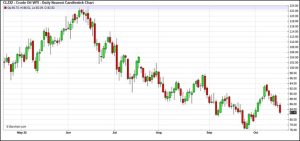
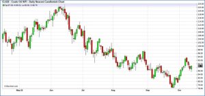
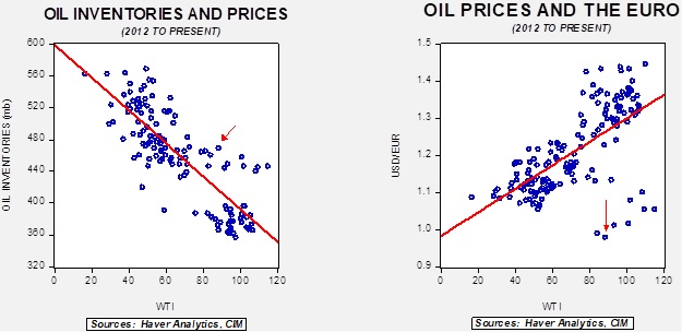
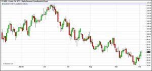
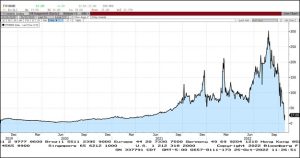
Crude oil prices appear to be building in a base in the mid-$80s.
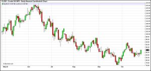
(Source: Barchart.com)
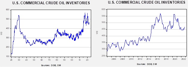
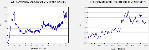
Crude oil inventories rose 2.6 mb compared to a 1.5 mb build forecast. The SPR declined 3.4 mb, meaning the net draw was 0.8 mb.
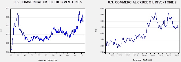
In the details, U.S. crude oil production was steady at 12.0 mbpd. Exports rose 1.0 mbpd, while imports rose 0.3 mbpd. Refining activity fell 1.8% to 88.9% of capacity. We are approaching the end of refinery maintenance season, which means oil demand should begin to rise soon.
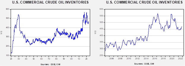
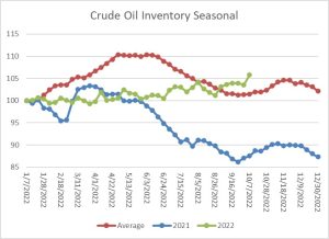
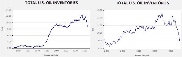
(Sources: DOE, CIM)
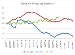
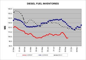
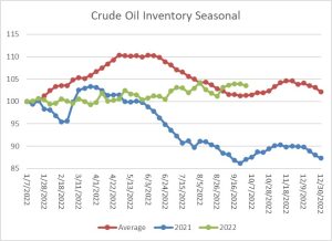
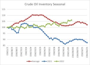
The above chart shows the seasonal pattern for crude oil inventories. As the chart shows, we are past the seasonal trough in inventories. The build seen from October into November is usually strong due to the end of refinery maintenance. With the SPR withdrawals continuing, the seasonal build has been exaggerated this year.
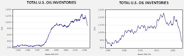
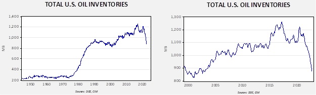
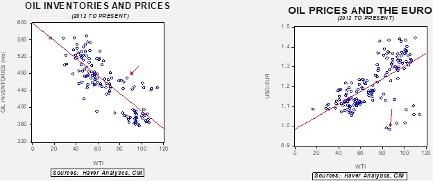
Since the SPR is being used, to some extent, as a buffer stock, we have constructed oil inventory charts incorporating both the SPR and commercial inventories.

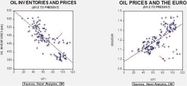
Total stockpiles peaked in 2017 and are now at levels last seen in 2003. Using total stocks since 2015, fair value is $106.28.
The Emergence of Zero: Since the onset of the war in Ukraine, Europe has been dealing with a natural gas crisis. Between sanctions and Russia’s actions to reduce exports to the EU, natural gas prices have been on a tear.[1]
(Source: Bloomberg)
As the previous chart shows, natural gas prices from prompt delivery reached €300 per megawatt hour.[2] However, a truism of markets is that prices engender a reaction. Consumption has fallen and high prices have attracted LNG flows, leading to nearly full inventory levels. With commodities, in general, but natural gas, in particular, once storage is maximized, there is really no place for the gas to go. With liquid fuels, there is often some storage at the tertiary level. With gasoline, for example, some can be stored in cars and at service stations, and this isn’t counted in national data. With a gas, however, the ability to store is limited and because temperatures have been unusually mild in northern Europe, consumption for home heating has declined. This week, prices actually went negative.
(Source: Bloomberg)
This situation is unlikely to last. The current problem is that there is nowhere for the current flows of gas to go, but once temperatures fall, prompt supply plus inventory will be necessary. What must be remembered about natural gas inventory is that most facilities cannot store gas indefinitely as gas goes into the facility and out of the facility at roughly a steady rate. In the U.S., storage injections usually end in November and then the gas must be moved into the market whether it is needed or not. This is why the lowest natural gas futures prices have occurred in January. If temperatures are warm, prompt supplies are combined with inventory disgorgement, leading to a collapse in prices.[3]
The Passive Investment Problem: Academic finance has floated a theory called “common ownership.” It goes like this: an active investor will select stocks within an industry, but a passive investor buys an index that represents the entire industry. The active investor, as an owner, has different goals than the passive investor. The active investor may support an individual company’s investment, or pricing policy, which would be designed to improve the profitability or the market power of that individual company. However, if all the companies in that industry engage in similar behavior, the collective outcome may not be positive for the investors in the individual companies. On the other hand, the passive investor, because they own the entire industry, would tend not to support actions by companies, for example, to lower prices to gain market share or expand investment to do the same. Instead, the passive investor should support industry concentration and market power that enhance returns to shareholders. Simply put, the passive investor has no interest in companies actually competing. As passive investment begins to dominate, the cost to society may be less production and higher prices, and some have even argued that passive investment is “worse than Marxism.”
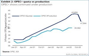
Obviously, this theory is highly controversial. Anti-trust authorities are examining it, the passive industry suggests it doesn’t exist, and the pushback against ESG raises concerns about investment concentration. What caught our attention is the notion that the common ownership problem may be contributing to the disconnect between commodity prices, in this case oil and gas, and the lack of a supply response. In other words, we haven’t seen oil investment and production rise despite elevated oil and gas prices. Although ESG has been blamed for this disconnect, the Dallas FRB survey suggests investor pressure was more important.
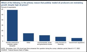
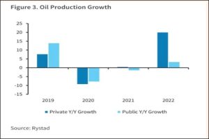
Recent data shows that oil production growth is overwhelmingly coming from private companies, since publicly traded companies are refraining from boosting output.
Currently, it is estimated that passive funds hold about 30% of the publicly traded universe of stocks. That’s up from 10% in 2010. In a sense, passive investment becomes a form of tacit collusion. In a classic prisoner’s dilemma, both parties defect, leading them to longer prison sentences than if they both stayed quiet. This outcome assumes a lack of coordination. In economic terms, the decision matrix could be invest/don’t invest. If both parties don’t invest, they receive higher profits, but if one company invests and the other doesn’t, the investing company is better off. However, if both invest, production expands and prices fall, leading to a worse outcome for the businesses but a better outcome for society (greater supply, lower prices). Last week, we reported on Harold Hamm’s quest to take Continental Resources (CLR, $73.67) private in order to free his company to boost production and release the firm from the clutches of the indexers.
President Biden is pressing the industry to boost output. Maybe the solution is to address passive investing instead.
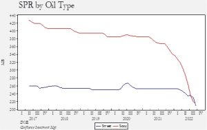
Policy: Last week, we discussed the situation with SPR policy and what appears to be the evolution toward using the reserve as a buffer stock. Although the White House continues to argue that the releases are not politically motivated, it is hard not to observe that the releases are occurring before the midterm elections.
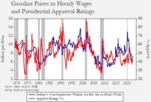
This chart overlays how many gallons of gasoline can be purchased at the current average U.S. gasoline price and the hourly wage for non-supervisory workers. The higher the number, the better off the gasoline purchaser’s position. Since 1996, when the gallon per hour measure is less than eight, the presidential approval rating averages 42.8%, while measures higher than eight average a 54.7% approval rating. Lower gasoline prices don’t always help approval ratings (they didn’t do much for President Trump), but it is pretty obvious that they are having an impact now.
The SPR has seen the steepest decline in its history. We note media sources are suggesting that there is still plenty within the reserve for emergencies. That is only partially true as these comments ignore the fact that we have seen a larger decline in sour crude, which is preferred by U.S. refineries. Although sweet crude is usable, it is more likely to be exported. Thus, if the goal is the optimization of protecting Americans from a supply outage, it would make more sense to export sweet crude to lower global prices. The fact that sour crude was drawn suggests that the primary goal is to lower gasoline prices.
As we have noted, the White House is promising to keep draining the reserve, but it is also promising to start buying crude oil in the $72 to $67 range. We harbor serious doubts this buying will ever occur, as does the industry, but that promise is in the public record and could affect prices.
Finally, one of the overlooked elements of the SPR’s release was that cars don’t use crude oil; rather, they use gasoline (and a few use diesel). Refining capacity has been constrained for some time, and industry officials told the energy secretary that recently shuttered refineries are unlikely to reopen.
Market News:
- The IEA is warning that the current situation is the first actual global energy crisis.
- Germany is reluctant to support a price cap for natural gas, fearing that if the price is set too low, it could lead to shortages. EU industries are heavy users of natural gas, and if prices remain elevated, it is unclear if European industrial production can be maintained. For example, BASF (BASF, $11.38) announced it will “permanently downsize” its operations in Europe due to high energy prices. Petrochemicals are dependent on natural gas for feedstock, meaning that the loss of Russian gas makes operations in Europe tenuous.
- Although EU gas inventories are near capacity, the interconnectedness of the system has never been tested with this degree of stress before. If all works perfectly, flows must cross national borders. If nations decide to hoard gas to protect their own markets, shortages may emerge even with ample inventories.
- Germany and Spain are at odds with France over a pipeline proposal that would expand capacity from the Iberian Peninsula to Germany. France opposes the pipeline for economic and environmental reasons.
- France’s nuclear power industry has suffered a spate of maintenance issues. Currently, 26 of its 56 reactors are offline due to problems ranging from basic maintenance to corrosion issues. If these issues are not resolved soon, it could mean higher demand for natural gas, fuel oil, and coal.
- In eastern Europe, households are scrambling to heat their homes by using lignite, wood, or even trash.
- Although the U.S. is a net exporter of natural gas, the transportation system for gas (in the domestic U.S., most gas moves by pipeline) creates situations where some parts of the country require imports to meet demand. New England requires LNG imports to balance the market and is facing tight supplies as it competes with Europe for available supplies.
- Turkey has been straddling the conflict in Ukraine since it began. For example, it provided drones to Ukraine early in the conflict. It has also engaged in talks with Russia about becoming a natural gas hub. Turkey is already a transit state for oil from Iraq and Azerbaijan. Iran is planning on expanding natural gas exports to Turkey, and we would expect these flows to be eventually destined for Europe.
- A rise in COVID-19 cases in China’s coal-producing areas could lead to constrained supplies.
- Slow Chinese growth is freeing up product supplies for export. China’s September diesel exports rose to their highest level since July 2021.
- The U.S. will hold an auction for offshore oil development in March. This auction was part of the Inflation Reduction Act.
- China has made a large shale gas find in the Sichuan Basin.
- Shell (SHEL, $53.32) has announced its participation in a Qatar natural gas development.
Geopolitical News:
- The EU has announced sanctions on Iran due to Tehran’s decision to provide drones to Russia. Protests continue in Iran, and this article provides an anecdotal “feel” for how the protests appear on the ground. One of the more interesting quotes discusses the worries of the government: “They are really worried that Iran will become like Syria.” We suspect the market’s take on the protests is that if the government falls, it will be bullish for oil. However, if the end of the regime results in chaos, we could have a situation similar to Libya, where oil flows, even if permitted, become intermittent due to internal power struggles.
- Protest participants are moving beyond students and women to the labor movement. The security forces are cracking down with increasing ferocity, leveling charges against hundreds.
- Two Iranian Revolutionary Guard Corps members, including one colonel, were assassinated in the Baluchestan province. This area has always been difficult for Iran to control, but unrest has been rising along with tensions elsewhere.
- Tehran is moving more deeply into Russia’s camp.
- One of the reasons OPEC+ announced target cuts was to counteract the U.S.-sponsored price cap. The White House has countered that the cartel wasn’t the target of the measure; perhaps that is true, but the cap does create a mechanism that could be used against oil producers.
- Sources claim that Russia can probably evade the price cap and sanctions, although it would require ports and canals to accept Russian insurance. India and China continue to flout Western sanctions.
- According to reports, the Kingdom of Saudi Arabia (KSA) pressured other members of OPEC+ to publicly support the recent target cuts so that the U.S. couldn’t isolate the KSA for criticism.
- The Biden administration has not decided how to “recalibrate” its relations with the KSA. Clearly relations have deteriorated, but the White House seems to want to move slowly on a complete break. Conditions are so bad that the KSA had to issue a statement saying that the crown prince didn’t privately disparage President Biden. The NYT has reporting that suggests the administration thought it had a “secret deal” to raise production and thus was caught by surprise over the OPEC+ decision to reduce output. It appears to us that relations between the two countries have sunk to a new low, in part because Crown Prince Salman is charting a new foreign policy path that won’t be as dependent on the U.S. That decision will further disrupt trading patterns that have been in place for decades.
- We have observed that there is often a divergence between the business community and national security policy. For example, tech firms are often at odds with Washington over China policy. As the U.S. begins to distance itself from the KSA, we note that financial firms are apparently still on board with Riyadh.
- Although the U.S. has accused the KSA of siding with Russia, perhaps a more important trend is the Saudis’ engagement with China. The KSA has a long history of building relations with oil importers, so when the U.S. was a major oil importer, the KSA aggressively defended its market share to the U.S. Now that the U.S. is a less important importer, it would be consistent policy for Riyadh to improve relations with Beijing. However, this policy direction could put Saudi Arabia in direct conflict with the U.S. as relations with Washington and Beijing continue to sour.
- Norway is worried that Russia will sabotage its energy infrastructure. According to reports, unidentified drones, presumably Russian, have been buzzing Norwegian offshore oil and gas platforms. Norway has become a critical natural gas supply source for Europe, so any disruptions could be a major problem for natural gas supplies.
- Despite numerous investigations, there has been no official announcement on who sabotaged the Nord Stream pipelines.
- The Venezuelan opposition is contemplating ending its “interim government” claim, which would be a step toward allowing the U.S. to normalize relations with Caracas.
- The new left-wing government in Colombia is at odds with its energy industry. The Petro administration is raising taxes on the coal and oil sector and looking to curtail investment to back climate change reform.
Alternative Energy/Policy News:
- The SEC appears to be rethinking its proposal to make firms disclose carbon emissions. It is unclear what is causing this reversal, although we suspect some of it is due to the costs of compiling the data.
- Hyundai (HYMTF, $27.10) has started construction on an EV plant in Georgia.
- Climate issues continue to affect a wider circle of issues. The latest labor demand is for formalized time off to address local destruction caused by weather events.
- Although China continues to dominate battery production, the U.S. is seeing a surge in investment and a buildout of a “battery belt” across the lower 48. Meanwhile, U.S. battery infrastructure is at risk for siting constraints.
- Carbon capture is one way fossil fuel companies can address climate change issues. As CO2 is generated by burning fossil fuels, capturing that gas and storing it would allow for continued consumption. As investment grows, we should see in the next few years if such projects actually work.
- Climate change remains controversial, and last week we noted that the insurance industry is moving to factor this concern into policies. The survey from the insurer AXA (AXA_SA, $24.61) indicates that climate change is the primary concern of insurers.
[1] So much so that U.S. exports of fertilizer to the EU have soared, taking advantage of lower relative natural gas prices.
[2] That’s over $1,000 per MMBtu.
[3] There are some natural gas prices in the Permian that are approaching zero due to the lack of takeaway capacity.