Asset Allocation Weekly (June 29, 2018)

by Asset Allocation Committee

With the recent narrowing of the yield curve, we have been receiving a number of questions about the impact of inversion.  Defined, yield curve inversion is when short-duration interest rates rise above long-duration interest rates.  The yield curve is arguably the single best indicator of recession.  Therefore, with various calculations of the yield curve narrowing, we want to examine the impact of inversion.

The first problem one confronts during this analysis is defining which rate spread constitutes the most appropriate yield curve to monitor.  The Conference Board, in its calculation of leading economic indicators, uses the 10-year T-note yield less fed funds.  This spread compares a market yield (the 10-year T-note) with a policy rate (fed funds); given that the latter is mostly in control of the Federal Reserve, this measure of the yield curve is the clearest indication of policy intentions.  In other words, when the FOMC allows the policy rate to exceed long-duration yields, it clearly believes that the threat of inflation outweighs the potential costs of recession.  The problem with this yield curve is that one part of it is directly under the control of policymakers and thus can be manipulated.  The other popular measure is the 10-year T-note less the two-year T-note.  Because the rates are mostly set by the market, this spread represents the market’s estimate of the potential of recession.

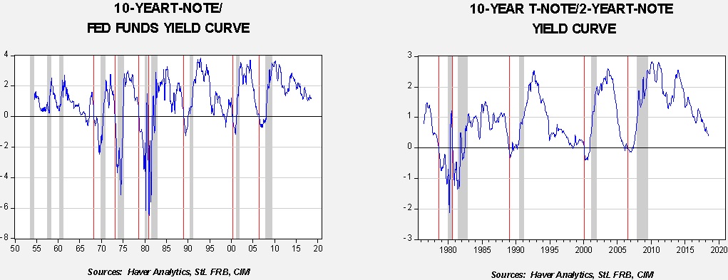
The above graphs show both of the aforementioned yield curves.  Recessions are shown by gray bars; the red vertical lines indicate the month of yield curve inversion prior to a recession.  We have a longer history for fed funds compared to the two-year T-note, but the results are similar.  The fed funds version inverts, on average, 14 months before the onset of recession.  The shortest lead was nine months, while the longest was 20 months.  For the two-year T-note version, the average from inversion to recession was 15 months, with the shortest lead at 10 months and the longest at 18 months.  The fed funds version did produce two false positives, in 1966 and 1998, while the two-year T-note version had one, in 2006.  But, as business cycle indicators go, either version of the yield curve is very reliable and gives sufficient warning.

So, if the yield curve inverts, what should investors do?

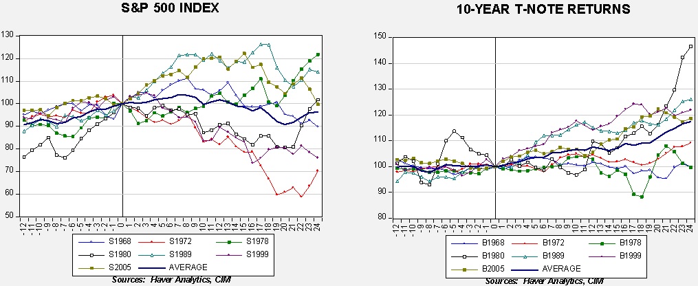
These two charts show equities (the S&P 500) and long-duration bonds (10-year T-notes total return index), indexed to the yield curve inversion (shown as a vertical line on the chart).  We looked at the data 12 months before the inversion and 24 months after the inversion.  We also calculated the average for the seven events.  The data show that these financial markets don’t always treat inversions as bearish.  Under low inflation conditions, long-duration interest rates tend to perform well.  Equities decline about 10% or less after inversion the majority of the time; however, in three cases, they actually continued to rise.  Furthermore, during the 2005 inversion the real bear market didn’t start until two years after the yield curve turned negative.

We are paying very close attention to the yield curve but it should be noted that it may take a few months before equity markets peak even after inversion takes place.  Thus, investors should not necessarily exit equities but should be prepared to reduce exposure.  On the other hand, inversion is a reasonably reliable signal that extending duration in fixed income should be considered.

View the PDF

Weekly Geopolitical Report – The Mid-Year Geopolitical Outlook (June 25, 2018)

by Bill O’Grady

(Due to the Independence Day holiday, the next report will be published July 9.)

As is our custom, we update our geopolitical outlook for the remainder of the year as the first half comes to a close.  This report is less a series of predictions as it is a list of potential geopolitical issues that we believe will dominate the international landscape for the rest of the year.  It is not designed to be exhaustive; instead, it focuses on the “big picture” conditions that we believe will affect policy and markets going forward.  They are listed in order of importance.

Issue #1: America’s Evolving Hegemony

Issue #2: Rising Western Populism

Issue #3: Rising Authoritarianism

View the full report

Asset Allocation Weekly (June 22, 2018)

by Asset Allocation Committee

Cycle studies are common in analyzing markets.  Such studies can be quite useful in some markets that are affected by seasonal factors, such as commodities.  We all know it gets cold in the winter and rains in the spring, and measuring the timing of when market participants discount these events can offer insights into market behavior.  In general, the more regular and reliable the factors are that cause the cyclicality, the more trustworthy the analysis.  Seasonal cycles tend to be consistent and thus are heavily used in commodity analysis.  Of course, once a pattern has been discovered, traders attempt to position in front of the expected price cycle.  Commodity analysts will note that price patterns still work but they often start sooner.

Human cycles tend to be much less reliable.  Usually, these cycles occur because of the structure of regulation; one example is tax selling, which sometimes weakens equity prices in late Q3.  It doesn’t always work because (a) tax laws change, or (b) sometimes investors don’t have a lot of losses to “harvest.”  Market research is full of examples that “used to work.”  Often, once analysts notice a cycle, there is a temptation to publish it, in part for reputational enhancement.  However, publishing makes the cycle better known and will often render it useless.

Elections in democracies create cycles with some degree of regularity.  In the U.S., elections are not called, as is common in a parliamentary system, but occur on schedule.  Policymakers are aware of elections and want to manipulate the economy in ways that improve their chances of re-election.  For example, presidents have an incentive to implement painful policies during the first two years of their term with the hopes of an economic rebound in the last two years.  That pattern usually means the mid-terms hurt the party of the president.  At the same time, a president is at the peak of his political capital at inauguration.  That capital erodes with time and thus if one is going to do something “big” the best chance is in the first 18 months of the presidency.  By around May of the second year, the initial political capital is mostly exhausted, meaning little new accomplishments are enacted.  In the third year, the president tries to implement policies that support growth to increase the chances of re-election and Congress often participates for the same reason.

To measure these effects, we created a database using the Friday close of the S&P 500, beginning in 1928.  We indexed each four-year cycle at the beginning of the election year.  Thus, we ended up with 22 cycles, excluding the current one, which began in 2016.  Here is what the patterns indicate:

The blue line on the chart shows the long-term average of all cycles.  The green line shows the pattern for a newly elected Republican president and the red line shows the current administration.  The pattern suggests that equities tend to favor the GOP, at least for the first 18 months of the cycle.  The two average lines converge by Q4 of the first full year.  The second full year tends to be the most disappointing for equities, on average, although a strong rally from the mid-terms into the year prior to the next election usually develops.

President Trump’s first term was closely tracking an average new Republican president until it became clear that the tax law changes were going to pass.  This led equities to rise sharply.  However, in the aftermath of the tax changes, equities have moved sideways, which is consistent with the second full-year pattern but, in this particular case, from a much higher level.  The usual pattern could be indicating one of two outcomes.  First, equities will likely struggle into Q4 and then stage their usual third-year rally.  Or, second, we have already had the “Trump bull market” and the rest of his first term will be “churn,” leaving us about where we would be without the tax-driven lift in markets.

Although either scenario is possible, we tend to expect the first is more likely.  There is little evidence that the economy is near recession, which is the primary cause of cyclical bear markets.  While earnings growth will likely slow next year, the tax law changes should keep the level of earnings elevated.  In fact, the recent weak performance in equities is due to multiple contraction, most likely due to fears surrounding trade conflicts.  If the administration can resolve these issues without serious incident, it would bolster the case for a rally next year.  On the other hand, if trade issues escalate, the second scenario is more likely, which would be no major pullback in equities but a long-term sideways market.

Clearly, other factors will play a role and these cyclical studies are not definitive.  Nevertheless, they do offer some insight into the normal policy cycle, which the current presidency was tracking until November.  For now, we consider a trade war the most near-term serious threat to equities.

View the PDF

Weekly Geopolitical Report – China’s Foreign Reserves: Part III (June 18, 2018)

by Bill O’Grady

This week, we will conclude our study on China’s foreign reserves.  In Part I, we discussed the evolution of foreign reserves from gold to the dollar, with a historical focus.  In Part II, we used the macroeconomic saving identity to analyze the economic relationship between China and the U.S.  This week, using this analysis, we will discuss the likelihood that China will “dump” its Treasuries and the potential repercussions if it were to do so.  From there, we will examine the impact of such a decision by China to reallocate its reserves.  Finally, we will conclude with market ramifications.

What if China decides to dump its reserves?
So, finally, we come to the issue at hand.  Are China’s foreign reserves a real threat to the U.S. economy?  Are the reserves a viable financial weapon?  China occasionally suggests they are.[1]  However, a weapon is only credible if the blowback isn’t significant.  It appears that the costs to China of dumping its U.S. Treasury bond positions would be considerable.

What would happen to the value of China’s reserves?  A common problem with holding concentrated positions is retaining value while exiting the position.  If China began aggressively selling its position, the value of its reserves would decline as well.  If yields rose by 100 bps, to 4%, we estimate the yearly return would drop by approximately 7.9%.[2]  China’s total foreign reserves are around $3.2 trillion; as mentioned in Part II, it’s a state secret as to the allocation but if we assume Treasuries represent 70% then a 7.9% decline would cause a capital loss of $152 bn.  Obviously, a 10-year T-note rate of 4% would likely trigger a U.S. recession but the costs to China would be significant as well.  It is also important to note that this calculation doesn’t take into account the impact on the dollar’s exchange rate.  But, mostly certainly, the dollar would depreciate, causing even greater losses to China’s dollar foreign reserve holdings.

View the full report


[1] https://www.telegraph.co.uk/finance/markets/2813630/China-threatens-nuclear-option-of-dollar-sales.html

[2] This is calculated with a regression of total return on the 10-year T-note against the (a) yearly change in 10-year yields, and (b) the level of interest rates on the 10-year T-note.

Asset Allocation Weekly (June 15, 2018)

by Asset Allocation Committee

The last topic in our series on secular trends is the dollar.  It is arguable as to whether or not exchange rates are actually an asset class.  In our asset allocation, we don’t treat it as one.  On the other hand, the behavior of the dollar affects most of the other asset classes.  There is a clear inverse correlation between the dollar and commodities.  Since most commodities are priced in dollars, a weaker dollar is a price cut for non-dollar buyers.  The increase in demand will usually lead to higher prices for commodities when the dollar dips.  Foreign equities to U.S. investors are directly affected by the dollar’s exchange value.  In general, foreign equities tend to outperform during periods of dollar weakness because, for a dollar-domiciled investor, appreciating foreign currencies act as a tailwind for foreign assets.  Of course, if foreign currencies become too strong, it adversely affects the foreign economy and can become too much of a good thing.  Even domestic equities are affected.  A weaker dollar tends to support large cap stocks relative to small caps because the latter are less globalized.  And, an excessively weak dollar can foster tighter monetary policy as a very strong dollar can prompt the Federal Reserve to ease credit.

The dollar is the nexus of most foreign exchange transactions.  Although there is a market for cross rates in the major currencies, most transactions are into and out of dollars.  That way dealers don’t have to make markets in thousands of currency permutations.  Because of the widespread use of the U.S. dollar, it is the global reserve currency; when nations accumulate foreign reserves, the currency of choice is mostly the greenback.  About 63% of official foreign reserves are in dollars, with the next closest competitor, the euro, at 20%.[1]  The dollar represents 88% of all forex turnover.[2]  Thus, the dollar’s exchange rate against various currencies deviates from classic textbook valuation measures because there is a natural demand for transaction and reserve purposes.

However, even with that caveat, some opinion on the direction of the dollar is critical because, as noted above, it affects numerous markets.  In our observation, the dollar’s path tends to be driven by “flavor of the month” factors.  During various periods, markets focus on the trade deficit, relative productivity, interest rate differentials and monetary policy divergences, to name a few.  In other words, there hasn’t be a consistent variable that has affected the dollar’s exchange rate in all markets.  Here are the variables we use when examining the greenback.

First, history shows a cycle to the dollar.

To measure the general value of the dollar, we use the JP Morgan real effective dollar index, which adjusts the dollar for relative inflation and trade.  We note that the dollar tends to peak about every 15 to 17 years.  There is always a danger in such observations…it’s a bit of the correlation/causality problem.  Just because something has followed a pattern for a long time doesn’t mean it will do so in the future.  This cycle does “rhyme” with relative growth; the dollar tends to strengthen when U.S. economic growth exceeds the rest of the world.  However, the important market takeaway from this chart for long-term investors is that exchange rates probably don’t matter if one holds a position for around 15 years.  And, dollar bear markets tend to last longer than dollar bull markets.

Second, for long-term valuation purposes, we use purchasing power parity.  This theory of currency valuation argues that exchange rates should adjust to equalize prices across countries.  A nation with higher price levels should have a weaker currency, which would equalize the prices of a lower inflation country.

This chart shows the calculation of parity for four currencies, the euro, yen, Canadian dollar and British pound.  Deviations from the model’s fair value forecast are wide but, at extremes, the model does suggest reversals are more likely.  Currently, the dollar is richly valued compared to these four currencies.

What about other models?  Relative growth between Europe and the U.S. yields a similar fair value.  Interest rate differentials clearly favor the greenback but the relationship isn’t all that strong either.

This chart shows the spread between U.S. and German two-year sovereigns and the EUR/USD exchange rate.  Although the rate spread is historically wide, in the last tightening cycle in 2004-06 the dollar faded shortly after the tightening cycle ended.

Perhaps the most important issue facing the dollar is the future of American hegemony.  If the world loses faith in the dollar’s reserve value, we would expect a profound bear market to develop.  At this point, there is no obvious rival to the dollar.  However, one of the reasons no rival exists is that no other nation with a reasonably attractive currency is willing to run persistent trade deficits.  The Trump administration is trying to adjust or reverse America’s importer of last resort role which is part of being the reserve currency provider.  If the U.S. puts up trade barriers, we would expect the dollar to appreciate as long as reserve demand remains.  But, if the world decides the U.S. is no longer a reliable provider of the reserve currency, even if no obvious replacement exists, the dollar will almost certainly decline.  Reserve currency changes don’t occur very often; we have only had two reserve currencies over the past two centuries, the British pound from 1815 to 1920 and the U.S. dollar from 1920 to the present.  With events that occur so rarely, it is difficult to determine the path of the greenback but it does appear we are moving into an era of significant change.  This is a factor we will be closely monitoring in the coming months and years.

View the PDF


[1] https://en.wikipedia.org/wiki/Reserve_currency

[2] https://www.bis.org/statistics/d11_3.pdf

A Primer on Fiscal Policy, Government Debt and Deficits (June 13, 2018)

by Bill O’Grady & Mark Keller | PDF

In our travels we are almost always asked about the government debt and deficits.  If there is any area of confusion and misunderstanding, public finance could easily top the list.  In response to these persistent questions, we are publishing this Frequently Asked Questions paper to address some of those concerns.

#1.  I don’t see how the government can continue to borrow money and not go broke.  I can’t do that; my company can’t either.  Won’t the government eventually go broke, too?

No entity can borrow an infinite amount of money without repercussions.  However, the repercussions for central governments are different than those for households, businesses or even state and local governments.  The two key differences are:

  1. Central governments borrow in their own sovereign currency. Thus, the debt they create can be serviced by simply printing money.  This is only true for governments that borrow in their own currency.
  2. Legitimate governments have a monopoly on violence. It is the only entity to which the people grant the power to use deadly force to enforce peace and order.  All other entities in society are restricted to use force in cases of self-defense.

What this means is that a central government can (a) print money to service its debt, and (b) use force to collect money from citizens to service its debt.  Thus, the potential fallout from government borrowing isn’t default but inflation.

It should be noted that state and local governments are not in the same position.  Although they do have similar coercive powers of the central government, they don’t issue their own currencies.  Thus, they can “run out of money” and default.

Read the full report

Weekly Geopolitical Report – China’s Foreign Reserves: Part II (June 11, 2018)

by Bill O’Grady

In the first part of this report, we discussed the evolution of foreign reserves from gold to the dollar, with a historical focus.  This week, we will use the macroeconomic saving identity to analyze the economic relationship between China and the U.S.  Next week, using this analysis, we will discuss the likelihood that China will “dump” its Treasuries and potential repercussions if it were to do so.  From there, we will examine the impact of such a decision by China to reallocate its reserves.  Finally, as always, we will conclude with market ramifications.

The Macroeconomic Identities
Here is the basic macroeconomic identity—Gross Domestic Product (GDP) is equal to consumption (C), investment (I), government spending (G) and net exports (X-M):

GDP = C + I + G + (X-M)

All things produced must fall into the above equation’s components—everything produced is either consumed by households, represents investment for firms, consumed by the government or consumed by foreigners via exports.  But, from the uses perspective, the economy comprises consumption (C), saving (S) and taxes (Tx).  In other words, the funds for investment come from saving from current consumption.  Consumption is further reduced to supply the government with funding.

GDP = C + S + Tx

So, by equating these two together, we get the following:

C + S + Tx = C + I + G + (X-M)

Rearranging again gives us this identity:

S + Tx + M = I + G + X

Simplifying and rearranging again:

(M-X) = (I-S) + (G-Tx)

This identity means that the private investment/savings balance (I-S) plus the public spending balance (G-Tx) is equal to the trade account.  This is true in the same way a balance sheet is true—the numbers will simply add up that way.  However, it doesn’t tell us the direction of causality!

View the full report

Asset Allocation Weekly (June 8, 2018)

by Asset Allocation Committee

This week, we examine commodities in our fourth installment on secular trends.

Commodity prices challenge the notion of “secular.”  This chart shows a trend model for real (inflation-adjusted) commodity prices, represented by the Commodity Research Bureau (CRB) commodity index, deflated by CPI.  We prefer this commodity index for its long history (over 103 years) and the fact that it’s a balanced index, giving relatively equal weights to each major group.  As the chart shows, on a really long-term basis, commodity prices tend to decline relative to inflation.  This is one of the triumphs of capitalism; firms operating under markets have an incentive to constantly produce and use raw materials more efficiently.  This includes commodity producers themselves, who are always trying to improve their productivity.  So, over time, farmers, miners, drillers and ranchers are working to get more output with less input.  And, on the demand side, firms are constantly trying to use less raw materials in production.  And so, over time, commodity prices tend to lag overall consumer prices.

The lower line on the chart de-trends the data and it’s worth noting that there have been four occasions when commodity prices were well above trend.  These coincide with war or periods of great financial distress.  Thus, we see a spike during WWI, WWII, Korea and the 1970s.  The first three events saw commodity prices jump due to the increase in wartime demand and supply interruptions.  War not only increases demand for wartime production, but it is not uncommon in mass mobilization war for combatants to try to deny their enemies key commodities.  Part of the reason Imperial Japan bombed Pearl Harbor was due to a U.S. oil embargo.  Japan decided to invade the Dutch East Indies but needed to eliminate the U.S. Navy as a threat to these plans.  Attacking supply chains leads to hoarding of key commodities and higher prices.

The 1970s bull market was more due to a currency crisis.  The decision by President Nixon to close the gold window and the subsequent drop in the dollar’s exchange rate led to a rapid increase in inflation expectations.  These expectations were bolstered by a regulatory regime better suited for a Bretton Woods world.  Oil prices spiked due to the Arab Oil Embargo; regulations on pricing and job protection allowed firms to rapidly pass cost increases on to the final product.  Rising inflation led investors to search for inflation hedges and commodities were a popular option.  This commodity bull market collapsed in the face of Paul Volcker’s rapid increase in interest rates, which boosted the dollar and began the process of dampening inflation expectations.

We did see a minor bull market in commodities from 2002 into 2007 that was almost completely caused by Chinese demand.  China was growing at a rapid clip and the impact was significant given the size of its economy.  However, compared to previous bull markets, the price increases were rather constrained.  The lack of mass mobilization war and expectations that deregulation and globalization would remain in place in the developed world, along with central bank policies that targeted manageable inflation, kept commodity prices mostly under control.  Chinese demand did buoy commodity prices after the 2008 Financial Crisis but only kept commodity prices on trend.  As China attempts to restructure, commodity prices have come under further pressure.

As long as deregulation, globalization and central bank independence remain in place, it’s hard to make a case for a major inflation event.  However, the political consensus that has supported these societal trends is now coming under attack.  Rising populism in the West, which opposes globalization and is beginning to push back against the unfettered introduction of new technology, could weaken the disinflationary consensus that has dominated Western policy since the late 1970s.  If trade impediments are implemented and job-eliminating automation is curtailed then the central banks are the only bulwark against rising inflation.  And, as a matter of course, central banks are independent only with the consent of legislatures.  Under populist regimes, it isn’t hard to imagine central banks being forced to support growth and tolerate higher inflation.

Although indicators suggest we are early in the process of reflation, populist governments are popping up in Europe, Brexit has occurred and populist parties are gaining strength even in nations where the establishment holds the government.  President Trump is clearly populist and is in the process of disrupting the global trading system.  Technology firms are becoming pariahs.  All these factors suggest that the Reagan/Thatcher policies that brought inflation under control are under threat.  As these trends play out, commodities should become increasingly attractive to investors.   The Asset Allocation Committee continues to monitor these trends.

View the PDF

Weekly Geopolitical Report – China’s Foreign Reserves: Part I (June 4, 2018)

by Bill O’Grady

We often get questions about China’s foreign reserves.  The fear is that China’s massive “pile” of foreign exchange reserves is a risk factor for U.S. markets.  In the first part of this report, we will discuss the evolution of foreign reserves from gold to the dollar, with a historical focus.  In Part II, we will use the macroeconomic saving identity to analyze the economic relationship between China and the U.S.  In Part III, using this analysis, we will discuss the likelihood that China will “dump” its Treasuries and potential repercussions if it were to do so.  From there, we will examine the impact of such a decision by China to reallocate its reserves.  Finally, as always, we will conclude with market ramifications.

Foreign Reserves
Until August 15, 1971, the foreign financial system rested, to varying degrees, on gold.  However, the gold standard had been eroding since the end of WWI.  Political philosophers such as David Hume noted the “price-specie” relationship; essentially, wealth didn’t necessarily reside in the accumulation of gold.  In nations that acquired gold from American colonies, the end result was mostly higher prices.  As the money supply rose, if there wasn’t a commensurate rise in the supply of goods, the end result was inflation.

View the full report