by Asset Allocation Committee | PDF
Although U.S. equity markets appear richly valued based on historical metrics, relative to interest rates, current values of relative earnings or sales are not extreme. Thus, the direction of interest rates and, more specifically, the direction of monetary policy, is a key element in equity values going forward. In other words, when does the Fed raise rates?
Over the past year, the FOMC has changed its reaction function. Since Volcker, the Fed has tended to tighten policy before full employment is achieved to “preempt” potential inflation. This policy has led analysts to focus on various forms of the “Taylor Rule,” which attempts to calculate the neutral rate of interest given the level of current inflation, the inflation target, and the level of slack in the economy. That policy has ended and has been replaced with a policy that promises to keep rates low until price levels above 2% annual growth are sustained.
Of course, the actual path of policy will be determined by the “buy-in” from the members of the FOMC. Although Chair Powell’s comments suggest he is fully committed to the new policy, it is not clear if it has universal acceptance. At this juncture, there are no dissents, but if inflation starts to rise, we could see some of the more traditional hawks grow uncomfortable with ZIRP. Since an uptick in inflation in 2021 is possible, given base effects alone, it does raise the question—will the Fed stay committed to low rates?
Obviously, it would be foolhardy to claim that rates will stay near zero forever, but it would make sense to have some idea of how long we can comfortably expect ZIRP to remain in place. First, for 2021, based on the composition of the FOMC, we can reasonably expect steady policy.
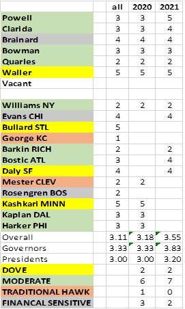
The above table shows the current members of the FOMC. The committee consists of seven governors and 12 regional Fed bank presidents. The governors are permanent voters as is the president of the New York FRB. Each year, four regional bank presidents also formally vote on policy. Our table shows the current governors on top and the regional presidents below. We rate each on our “hawk/dove” scale and have also categorized them by policy inclination. Moderates and Traditional Hawks rely on standard economic measures to set policy; the Hawks are more inclined to raise rates preemptively, whereas the Moderates tend to have higher tolerance for inflation uncertainty. Doves tend to only raise rates if the evidence is overwhelming for inflation. The Financial Sensitives will entertain rate hikes or other austerity measures when financial markets appear to be overheating. Otherwise, they tend to side with the Doves. We have also updated our estimates, with Powell and Clarida becoming more dovish. The addition of Governor Waller and the current roster of regional FRB presidents make it clear that the new FOMC is much more dovish than in 2020. That would suggest policy will remain steady with a bias for additional easing.
The other factor of note we find important is the relationship of the two-year deferred Eurodollar futures relative to fed funds. The current implied yield of the deferred Eurodollar futures suggests the market expects steady policy for the next 18 to 24 months.
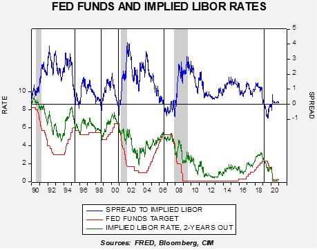
Under normal circumstances, the implied deferred yield is higher than fed funds. In periods where the implied yield falls below fed funds, shown by a vertical line, policy easing tends to occur shortly thereafter. From 2007 into 2013, the level of the implied yield remained stubbornly elevated relative to the fed funds target, suggesting the financial markets didn’t trust the promises of Chair Bernanke to keep rates low. It wasn’t until early 2013 that markets finally accepted that policy would stay steady (and then Bernanke blew it up by announcing the slowing of the balance sheet expansion in 2013). Note the current level of the fed funds target and the implied LIBOR rate. The market completely believes the Fed will keep rates low for at least the next 18 to 24 months.
Overall, with equity valuations high, the key to maintaining these lofty expectations is the level of interest rates. As long as dovish expectations for monetary policy remain in place, these valuations will likely persist.