Business Cycle Report (May 28, 2020)

by Thomas Wash

The business cycle has a major impact on financial markets; recessions usually accompany bear markets in equities.  The intention of this report is to keep our readers apprised of the potential for recession, updated on a monthly basis.  Although it isn’t the final word on our views about recession, it is part of our process in signaling the potential for a downturn.

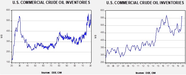
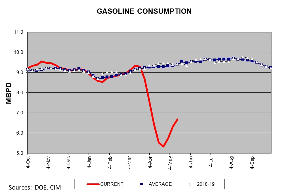
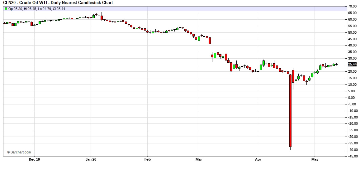
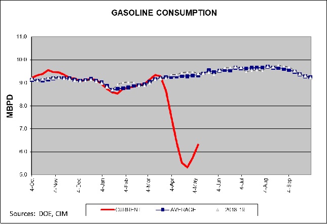
In April, the diffusion index fell into recession territory for the first time since the financial crisis. Last month, the nationwide shutdown led to the sharpest decline in employment payrolls in the country’s history, while initial claims remain elevated at all-time highs. The financial markets showed some signs of revival as equities rallied the most in history in a month and bond prices rose due to heightened demand for U.S. Treasuries as investors flocked to safety while lockdown orders remained in place globally. Additionally, manufacturing production in certain industries has continued, in spite of the shutdown, to address supply shortages. However, the pandemic continued to weigh heavily on both investor and consumer confidence as there are growing concerns that the impact could continue even after the economy reopens. As a result, seven out of the 11 indicators are in contraction territory. The reading for April fell to +0.030 from +0.393 the previous month, below the recession signal of +0.250.

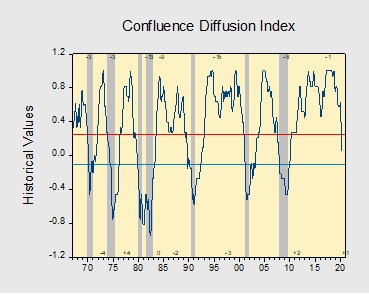
The chart above shows the Confluence Diffusion Index. It uses a three-month moving average of 11 leading indicators to track the state of the business cycle. The red line signals when the business cycle is headed toward a contraction, while the blue line signals when the business cycle is headed toward a recovery. On average, the diffusion index is currently providing about six months of lead time for a contraction and five months of lead time for a recovery. Continue reading for a more in-depth understanding of how the indicators are performing and refer to our Glossary of Charts at the back of this report for a description of each chart and what it measures. A chart title listed in red indicates that indicator is signaling recession.

View the complete PDF

Asset Allocation Weekly (May 22, 2020)

by Asset Allocation Committee

Beginning in the late 1990s and becoming an even bigger issue after Dodd-Frank regulations were imposed following the Great Recession, many market participants worried that bond market liquidity would be absent in the face of a crisis.  Strict regulations discouraged banks and brokerage firms from holding large inventories of corporate bonds, thereby precluding them from their former role as willing buyers in the face of a wave of selling by investors.  Compounding the concerns were the sheer size of flows into traditional open-end and ETF bond portfolios.  Over the 10-year period from 2009 through 2019, a total of $2.7 trillion flowed into these instruments, almost a third of which were in ETFs.  Entering the fray was the popularity of risk parity funds that levered their bond holdings.  Though each risk parity scheme has a nuanced approach, they all act in a similar fashion.  The concerns were that when risk parity funds and individual investors rushed to exit their bond holdings, market liquidity would be absent, particularly for corporate bonds.  Numerous studies and articles appeared over this time frame warning of dire consequences for bond investors, notably violent price movements due to the fact that banks and brokerage firms were no longer participating to a significant degree to assist in maintaining order to the bond market.

In March, the veracity of these concerns was tested as the bond market worked its way through the financial stress triggered by the pandemic.  During this episode, ETFs proved their endurance by moving into the void and providing the necessary stabilization of the market.  The use of creation/redemption units on the part of Authorized Purchasers [APs] mitigated the severity of the downturn, especially among investment-grade corporate bonds.  As the accompanying chart illustrates, spreads for BBB/Baa-rated corporates relative to the 10-Year Treasury gapped to their widest level since the Great Financial Crisis, yet quickly repaired.

An examination by Blackrock of the trading during this critical period in its largest corporate bond ETF, the iShares iBoxx Investment Grade Bond ETF [LQD], provides evidence that not only did the activities of the APs aid in maintaining market liquidity, but the market price of LQD actually led the price discovery process.  In other words, rather than the market price exacerbating the premium/discount to net asset value [NAV], the market price was the precursor of the daily NAV print.  Moreover, the direction of the market price of LQD often preceded the direction of LQD’s indicative value [IV], which is the real-time estimate of its fair value, based on the most recent prices of its underlying bonds.  Since LQD’s 2,169 underlying bonds trade over the counter, and therefore many may contain stale pricing, the price discovery proved invaluable to market functioning.  After the dust settled, it was evident that LQD and other bond ETFs provided market pricing that was at least as good as, and oftentimes better than, individual bonds.


As of 4/8/2020.  (Sources: BlackRock, Bloomberg and Refinitiv)

Although the market function provided by LQD during the period is not necessarily indicative of every bond ETF in each bond sector, it does underscore the notion that ETFs can provide the necessary liquidity during a period of crisis.  The creation/redemption mechanism of ETFs allow for arbitrage opportunities and allow the supply/demand of the ETFs to achieve equilibrium with the value of the underlying bonds.  In essence, ETFs are now creating most (if not more) of the liquidity previously provided by banks and brokerage firms, often doing so with greater efficiency.

View the PDF

Weekly Energy Update (May 21, 2020)

by Bill O’Grady, Thomas Wash, and Patrick Fearon-Hernandez, CFA

Here is an updated crude oil price chart.  The oil market continues to show signs of recovery.

(Source: Barchart.com)

One interesting development has been in open interest.  Open interest is the number of open contracts in a futures market.  Most of the time, the highest open interest in the calendar of contracts is the nearby or the second nearby, when the first nearby is near expiration.  However, currently the contract with the highest open interest is for December delivery.  Investors are taking the stance that oil prices are likely to rise in the future due to the combination of improving economic growth and falling output.  However, as the debacle recently witnessed in the oil ETFs showed, the nearest contracts are subject to wild price swings due to the lack of storage.  Thus, it appears speculators and investors are moving to the longer-dated contracts to execute positions to avoid the problems inherent in the nearby contracts.  The drawback with this strategy is that, under conditions of contango, the deferred prices are higher than the nearby.  However, this disadvantage has narrowed recently.  As the chart below shows, the July/December spread fell to nearly -10.00 per barrel in late April; it has narrowed to under -2.00 per barrel recently.  Thus, the carrying cost of holding the deferred contract has become less onerous.

Crude oil inventories surprised the markets for the second straight week by falling 5.0 mb compared to the forecast rise of 2.0 mb.

In the details, U.S. crude oil production fell 0.1 mbpd to 11.5 mbpd.  Exports fell 0.3 mbpd, while imports fell 0.2 mbpd.  Refining activity rose 1.5%, in line with expectations.  As we saw last week, there was another jump in unaccounted-for crude oil.

Unaccounted-for crude oil is a balancing item in the weekly energy balance sheet.  To make the data balance, this line item is a plug figure; but that doesn’t mean it doesn’t matter.  This week’s number of -998 kbpd is the largest negative number on record.  It may mean that in the scramble for finding storage, some oil is being inventoried outside the survey system.  In other words, over the week, some 6.9 mb of crude oil went into storage somewhere, just not where it can be recorded.  Or, production is falling much faster than the DOE estimates are capturing so there aren’t any missing barrels; simply put, production is cratering.  We are leaning toward the first explanation, but if inventories don’t rise in the coming weeks the second theory would become more plausible.  The second factor is that the SPR rose 1.9 mb as some of the oil went into the strategic reserve.

(Sources: DOE, CIM)

The above chart shows the annual seasonal pattern for crude oil inventories.  This week’s data, with the caveats expressed in the discussion about the unaccounted-for crude oil, suggests the worst of the inventory accumulation is behind us.

Based on our oil inventory/price model, fair value is $30.89; using the euro/price model, fair value is $44.26.  The combined model, a broader analysis of the oil price, generates a fair value of $36.88.  As we noted recently, the model output is less relevant as there is a non-linearity tied to the loss of storage capacity that cannot be fully captured with these models.  At the same time, if storage remains available, the models would suggest further upside for oil prices.

Although consumption remains depressed, there are reports that driving is starting to recover as lockdown rules ease.  The gasoline supplied data on the chart below also continues to show improvement.  Some data tracking does suggest an upswing in driving activity.

The market news for the week was mixed.  As we noted above, demand does appear to be improving, but prices remain depressed and production will likely continue to fall.  The Dallas FRB has produced research suggesting the net effect of the oil bear market has been negative for the economy, a major reversal from past years, reflecting the growing importance of oil production to the overall economy.  Meanwhile, it is possible the U.S. will restrict Chinese oil firms from buying U.S. oil companies.  And, in a first, the U.S. is on track to generate more electricity from renewables compared to coal.

On the geopolitical front, we are seeing the U.S. and Iran ease tensions.  Washington appears to be ignoring Iran’s trading with Venezuela, for example.  We suspect Tehran does not want to trigger a conflict before the election, a move that might actually boost support for President Trump.  Saudi Arabia is trying to balance the goals of economic restructuring with the loss of revenue due to falling oil pricesArgentina has set a domestic price of $45 per barrel to protect domestic producers.

View the PDF

Weekly Geopolitical Report – The Geopolitics of the 2020 Election: Part I (May 18, 2020)

by Bill O’Grady | PDF

(NB:  Due to the Memorial Day holiday, the next report will be published on June 1.)

In our geopolitical outlook for 2020,[1] our most important issue was the 2020 elections.  In general, U.S. presidential elections are geopolitical issues because of America’s hegemonic status.  In an era where the U.S. is changing its position on hegemony, who resides in the White House may be unusually important.  Therefore, foreign governments have an incentive to affect the outcome in November.

Due to the importance of this issue, we have written a five-part report, broken into nine sections.  The sections are as follows:

  1. The Basics of Public Finance: We look at the economics of public goods, the problem of free-riding and the role of the political process in allocation costs and benefits.
  2. Understanding the Electorate: We examine the intersection of identity and class, which create groups, and introduce the Zeihan Grid to graphically show how they interact.
  3. Party Coalitions: In a two-party system, parties are essentially coalitions of groups that change over time.
  4. The Incidence of Current Policy: We show how the policies designed to dampen inflation have acted to harm the lower income classes.
  5. The Role of Social Media: Media is always important to the political process and social media has changed how the parties act.
  6. Who will win? We handicap the race between President Trump and VP Biden (spoiler alert—we are leaning toward Biden due to the current recession).
  7. Foreign Behavior: This section examines the capabilities and leanings of major foreign nations with regard to swaying the election.
  8. The Base Cases: We consider the outcome based on who wins the election.
  9. Ramifications: We conclude with the likely market effects from the election.

Read the full report


[1] The 2020 Geopolitical Outlook, 12/16/19

Asset Allocation Weekly (May 15, 2020)

by Asset Allocation Committee

As the Federal Reserve expands its balance sheet and the federal deficit balloons, there is a legitimate concern about the potential for inflation.  In this week’s report, we will examine inflation from a theoretical perspective.

There are two simple tools we use to discuss inflation, the equation of exchange and the intersection of aggregate supply and demand.  To start, this is the equation of exchange:

MV=PQ

M is the money supply and V represents the speed at which it is spent; on the other side of the equation is P, the price level, and Q, output.  In the calculation of the variables, the right side of the equation is nominal GDP and M is one of the various formulations of the money supply.  However, the power of the equation, in our opinion, comes from what the variables represent.  For example, Q is best thought of as the productive capacity of the economy, the ability of an economy to procure goods and services.  It would include not just actual production, but also excess capacity.  And V isn’t just a residual; it can tell us the effectiveness of money policy.

The classical economists assumed that V and Q were fixed; V represented the institutional structure of money demand and thus only changed when spending and income patterns were adjusted.  Since prices were flexible, Q was always at full employment and thus didn’t change.  If these assumptions were true, any increase in M would lead to a proportional rise in P.  However, it turns out neither V nor Q were fixed; in some periods, increasing M led to higher price levels, but in others, it did not.

In the last episode of the Federal Reserve balance sheet expansion, velocity fell, leaving prices and quantity mostly unchanged.

This chart shows calculated velocity and the Fed’s balance sheet.  The gray shaded areas indicate periods of official QE.  Note that there is a strong inverse correlation between velocity and the balance sheet expansion, suggesting that households and businesses are not demanding the funds being provided to the banking system.  Thus, the inflationary impact of expansionary monetary policy has been reduced.  Given current risks in the economy and markets, we would expect the current balance sheet expansion to lead to a similar result in the short run—another decline in velocity.

The second tool is aggregate supply and aggregate demand.  Although neither of these can be calculated with any degree of confidence, we can use the tools for illustration.

The key point to this schematic lies in the supply curves, labeled S, S1 and S2.  The latter is what we believe is our current supply curve; demand has shifted from D to D1.  One of the consequences of COVID-19 is that we expect the trend toward deglobalization to accelerate, which would likely mean a shift in the supply curve from S2 to S1.  As deglobalization is eventually tied to reregulation of the economy, we will shift to S.  Of course, the key to rising prices will be the path of demand.  The longer it takes for demand to recover, the less likely it is that inflation will return with any significance.  However, when demand returns, we will likely see upward price pressures; if rising demand coincides with the eventual shift to the terminal supply curve S, the markets could be in for a notable inflation surprise.  We don’t expect this terminal shift to occur in the next three years, but it is highly likely in the latter half of the decade.

Tying this back to the equation of exchange, the supply curves above are represented by Q.  So, as supply becomes increasingly constrained, velocity will need to fall further in order for prices to remain steady as the money supply rises.  If inflation expectations change, it would be reasonable to expect velocity to increase, which would tend to lead to higher inflation.  The key points from this analysis are that (a) Fed policy actions, in isolation, are not necessarily inflationary, and (b) constraining supply, which is an element of deglobalization, could lead to higher price levels once demand recovers.

View the PDF

Weekly Energy Update (May 14, 2020)

by Bill O’Grady, Thomas Wash, and Patrick Fearon-Hernandez, CFA

Here is an updated crude oil price chart.  The oil market continues to show signs of recovery.

(Source: Barchart.com)

Crude oil inventories surprised the markets by falling 0.7 mb compared to the forecast rise of 5.0 mb.

In the details, U.S. crude oil production fell 0.3 mbpd to 11.6 mbpd.  Exports were unchanged, while imports fell 0.3 mbpd.  Refining activity fell 2.6%, when a modest rise was expected.

So, why the unexpected inventory draw?

Unaccounted for crude oil is a balancing item in the weekly energy balance sheet.  To make the data balance, this line item is a plug figure; but that doesn’t mean it doesn’t matter.  This week’s number of 914 kbpd is the largest negative number on record.  It may mean that in the scramble for finding storage, some oil is being inventoried outside the survey system.  In other words, over the week, some 6.4 mb of crude oil went into storage somewhere, just not where it can be recorded.  This explanation would be consistent with the build seen in the API data.  Or, production is falling much faster than the DOE estimates are capturing so there aren’t any missing barrels; simply put, production is cratering.  We are leaning toward the first explanation, but if inventories don’t rise in the coming weeks the second theory would become more plausible.  The second factor is that the SPR rose 1.9 mb as some of the oil went into the strategic reserve.

(Source: Barchart.com)

The above chart shows the annual seasonal pattern for crude oil inventories.  This week’s data, with the caveats expressed in the discussion about the unaccounted-for crude oil, suggests the worst of the inventory accumulation is behind us.

Based on our oil inventory/price model, fair value is $29.17; using the euro/price model, fair value is $44.14.  The combined model, a broader analysis of the oil price, generates a fair value of $36.98.  As we noted recently, the model output is less relevant as there is a non-linearity tied to the loss of storage capacity that cannot be fully captured with these models.  At the same time, if storage remains available, the models would suggest upside for oil prices.  We also note that the Eurozone could be roiled by German court decisions that might limit the flexibility of the ECB to support the Eurozone economy.  This outcome would be bearish for the euro and may weaken it further, which would be bearish for oil prices.

Although consumption remains depressed, gasoline data does show improvement.  Some data tracking does suggest an upswing in driving activity.

The news for the week was mixed.  On the positive side for oil prices, the UAE announced production cutbacks.  The DOE’s short-term forecast indicated that demand should start to recover and supplies should fall as the year progresses.  On the negative front, OPEC cut its crude oil demand forecast for 2020 by 2.0 mbpd.  Oil CEOs are warning that oil may be witnessing peak demand.

On the geopolitical front, Iran’s Khuzestan province is implementing social distancing to thwart a rise in COVID-19 infections.  Iran has been breaking U.S. sanctions, sending oil to Syria and oil equipment to Venezuela.  U.S. sanctions are reducing funding for Iranian proxies and forces in Syria.  Saudi Arabia is being forced to implement austerity measures to deal with the drop in oil prices.  Finally, the U.S. has pulled Patriot missile batteries from Saudi Arabia.

View the PDF

Weekly Geopolitical Report – Schumann in Volgograd (May 11, 2020)

by Patrick Fearon-Hernandez, CFA

If you ever find yourself in Volgograd, Russia, you will visit Rodina Mat’ Zovyot.  It’s unavoidable.  The statue, depicting Mother Russia calling her sons to battle against her invaders, is one of the tallest in the world.  Standing almost 280 feet high, she is nearly twice as tall as the Statue of Liberty.  Her colossal height is accentuated by her position at the summit of Mamayev Kurgan, the high ground overlooking Volgograd, whose great, grassy green slopes were fertilized by the blood of a quarter-million Soviet soldiers who died defending it from the invading Nazis during World War II, when the city was still known as Stalingrad.

You never know when you’re about to have an experience that will stay in your memory, and haunt you, for the rest of your life.  Such was the moment when I first entered the glittering round chamber below the statue, where an eternal flame keeps alive the memory of the 20 million or so Russians who died in the war.  I entered just at the beginning of the ceremony marking the changing of the guard.  Young Russian soldiers in ill-fitting uniforms and black jack boots marched in painfully slow goose steps up the ramp around the perimeter of the chamber to relieve the previous sentries of their duty.  It was impressive in the extreme.  But, more than anything, I remember the haunting, plaintive choral music playing in the background (see this video).  It perfectly expressed the quiet calm and peace that all who suffer in war must yearn for, if only in death.  But when I asked my guide what the song was, I was flabbergasted by her reply: “Daydreams, by Schumann.”

What?! A Russian World War II memorial playing the music of a German composer?  How could it be?

View the full report

Asset Allocation Weekly (May 8, 2020)

by Asset Allocation Committee

The U.S. economy has been hit with shelter-in-place orders that have depressed consumption and reduced production.  The economic readings on Q2 will be historically bad, perhaps even worse than the Great Depression.  However, based on the assumptions that (a) aggressive policy support will continue, and (b) the pandemic will wane over time, either due to natural herd immunity or medical intervention, financial markets are assuming the impact of COVID-19 will be severe in impact but short in duration.  Although we mostly agree with that assessment, the rebound has much to do with how GDP is reported.  The common way is to annualize the quarterly change.  Thus, if we get a large decline in Q2, a very modest rise in GDP in Q3 will tend to look quite large.  This is not the only way to measure the change in GDP.  The year-on-year change will look less onerous in Q2 but won’t look as impressive in Q3.

Another way we like to look at the GDP data is against its long-term trend.  To forecast Q2 GDP, we are taking advantage of a new high-frequency index created by the New York FRB.  The index is designed to measure the yearly change in GDP—how much GDP has changed compared to Q2 2019.  It is currently forecasting about a 12% yearly change.[1]  We can then take that number and calculate what the level of GDP looks like compared to its long-term trend.

To generate this chart, we log-transform real annual GDP and regress a time trend through the data.  The important line is the lower deviation line.  There are two periods when GDP was well below trend; the Great Depression and the post-Great Financial Crisis to the present.  The Great Depression showed a massive drop in the level of GDP that took until 1942 to return to trend.  Although fiscal and monetary policy were expanding after 1932, it took war spending to finally bring the economy back to trend.  What has been disconcerting about the past expansion is that it was much slower than the long-term trend.  And so, the level of GDP continued to fall compared to trend; our estimate for GDP in the COVID-19 recession shows a downleg in growth that is rivaling levels seen in 1935.

The point of this analysis is that the trend should represent some degree of capacity.  It is possible the trajectory for GDP that held from 1901 to 2008 is no longer possible.  But, if that trendline does represent a normal level for GDP, it would suggest the economy can absorb aggressive fiscal and monetary policy expansion before inflation becomes a problem.  If inflation starts to rise before the trendline is achieved, it would confirm that the trendline is no longer valid; however, for the political class, it would seem natural to find out if the long-term trend line remains a measure of capacity.  In other words, we would expect even more deficit spending and easy monetary policy until inflation returns.  Given how far GDP remains below trend, the return of inflation may take a rather long time.

View the PDF


[1] Although this is not the focus of this report, the forecast level of decline is consistent with a 35% drop in annualized GDP in Q2.