Weekly Geopolitical Report – The Storm Before the Calm: A Review (August 30, 2021)

by Bill O’Grady | PDF

(N.B.  Due to the Labor Day holiday, the next report will be published on September 13.)

Although we maintain an official reading list with capsule reviews, occasionally we come across a book that we think is important enough to review as a report.  George Friedman’s newest book, The Storm Before the Calm: America’s Discord, the Coming Crisis of the 2020s, and the Triumph Beyond,[1] is just such a book.  Friedman is a well-known geopolitical scholar who has written numerous books.  He founded Stratfor in 1996 and went on to found Geopolitical Futures in 2015.

Historical analysis tends to break down into one of two schools.  The first is the “Great Man Theory,” which suggests that history is dominated by towering historical figures who shape the world.  The second is the “Great Wave Theory,” which postulates that history is driven by broad economic, social, political, and other trends, and that people and leaders are shaped by these trends.  Those in the first school believe that people shape the trends.  The second school holds that this idea is nonsense, and what we refer to as “great men” are really like great surfers—they are figures who understand the world they are in and “ride the wave” to glory.   Like all hard categories, neither is perfect.  In reading history, it’s rather clear that there have been some remarkable people.  At the same time, they are often the right person in the right place at the right time, meaning that we are all, to some extent, shaped by our circumstances.

The school an analyst aligns with is important.  Although history is studied for its own sake, we often study history to predict the future.  A “great man” theorist is watching the principal actors to see how they will shape the world.  Analysts in this school pay close attention to personalities, whereas analysts from the “great wave” school pay less attention to personalities and focus more on the conditions by which these people come to power.  Great man theorists have great concern about who takes power, while great wave theorists are much more concerned about the situations in which those in power find themselves.  In other words, there are fundamental differences in how analysts from either school predict the future based on history.

Friedman is a wave theorist.  He doesn’t believe that individuals can reverse trends that are in place and that leaders are dependent on the circumstances in which they take power.  When Friedman looks at the future world through the viewpoint of history, he is examining trends to see if they are enduring or about to change.

Read the full report


[1] Friedman, George. (2021). The Storm Before the Calm: America’s Discord, the Coming Crisis of the 2020s, and the Triumph Beyond. New York, NY: Anchor Books.

Business Cycle Report (August 27, 2021)

by Thomas Wash | PDF

The business cycle has a major impact on financial markets; recessions usually accompany bear markets in equities.  The intention of this report is to keep our readers apprised of the potential for recession, updated on a monthly basis.  Although it isn’t the final word on our views about recession, it is part of our process in signaling the potential for a downturn.

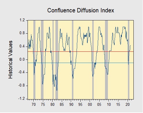
In July, the diffusion index rose further above the recession indicator, signaling that the recovery continues. In the financial markets, a sharp rise in COVID-19 cases led to a modest sell-off in equities throughout the month. Meanwhile, construction and manufacturing activity slowed as increasing costs for materials and labor continue to be a problem for homebuilders and factories. Lastly, the labor market remains strong as payrolls expanded at a faster than expected pace. As a result, eight out of the 11 indicators are in expansion territory. The diffusion index rose from +0.3939 to +0.4545, remaining well above the recession signal of +0.2500.

The chart above shows the Confluence Diffusion Index. It uses a three-month moving average of 11 leading indicators to track the state of the business cycle. The red line signals when the business cycle is headed toward a contraction, while the blue line signals when the business cycle is headed toward a recovery. On average, the diffusion index is currently providing about six months of lead time for a contraction and five months of lead time for a recovery. Continue reading for a more in-depth understanding of how the indicators are performing and refer to our Glossary of Charts at the back of this report for a description of each chart and what it measures. A chart title listed in red indicates that indicator is signaling recession.

Read the full report

Asset Allocation Weekly – This Recovery is Different (August 27, 2021)

by the Asset Allocation Committee | PDF

Since the Federal Reserve was granted independence in 1951 there have been 11 recessions.  Although each recession and recovery are somewhat unique, analysts tend to compare them for clues about future economic activity and policy actions.  In terms of monetary policy, Chair Powell has staked out a dovish path, suggesting that the first rate hike may not occur until 2023.  However, recent comments from Fed officials suggest the chair’s position is becoming increasingly isolated.
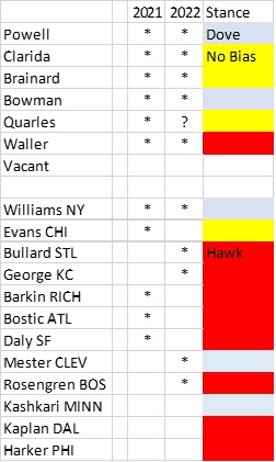
On this table, voters are designated by stars.  Currently, there are five committed doves on the FOMC.  We expect the no-bias camp to vote for stimulus reduction next year at the earliest.  The hawks, on the other hand, are committed to moving this year.  Although we could see a rise in dissents later this year, we suspect that policy will remain steady until 2022.

Next year could be interesting, to say the least.  Powell’s term as chair ends in February and Quarles’s term as vice chair for regulation ends in October 2021.  His full term as governor extends to 2032; although it is customary for a governor to step down once a vice chair position ends, Quarles has indicated he will stay around for a while.  If the no-bias group shifts to tightening, Powell may have to tighten or face losing a vote.

Monetary policy in recoveries and expansions has varied over the years.  Prior to 1982, it wasn’t always clear from the behavior of fed funds alone whether policy had changed.  To estimate changes, we can also use the New York FRB discount rate as an indicator.
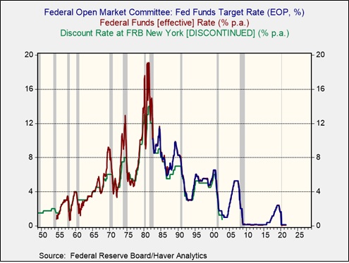
Looking at the recessions from 1955 (the first after independence) onward, what is striking is that the FOMC often moved to raise rates rather quickly after the recession ended.  During the seven recessions, the average number of months from the end of the recession to the first rate hike is 13 months.  In the past three, the average is 48 months.  It has been four decades since the FOMC raised rates quickly into a recovery.  For three decades, investors have become accustomed to the slow withdrawal of stimulus.

However, this recovery appears to be much different than the past three.  In part, the recovery has been stronger due to massive fiscal and monetary policy support.  But another factor is that the recession, although short in duration, was unusually deep.  Although sometimes deep recessions have “L”-shaped recoveries, this one did not.  One way to see this is by comparing job openings to the number of unemployed workers.
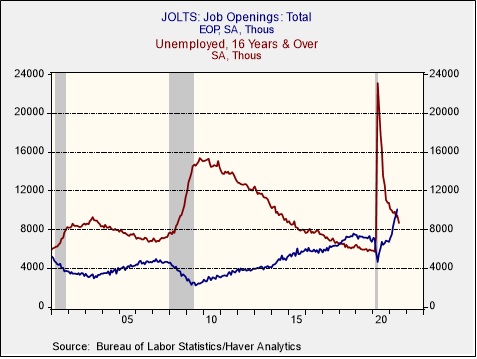
During the entirety of the recovery from the 2001 recession, the number of unemployed exceeded job openings.  In the previous recovery, it took until March 2018, almost nine years after the recession ended, for openings to exceed the number of unemployed.  In the current recovery, we crossed that line in May, 13 months after the last recession ended.

Unfortunately, the JOLTS report, which measures job openings, started in 2000, so it doesn’t provide a long-term history.  The Conference Board had a series where it measured help wanted ads relative to the number of unemployed.  It was discontinued in 2010.  Although that number is a ratio based on an index, we created a model from the JOLTS report that approximates the help wanted/unemployed ratio to the present.
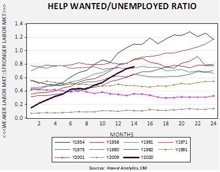
Comparing the behavior of the help wanted/unemployed ratio from the end of every recession since Fed independence, the current recovery is acting more like the pre-1990 cycles.  We have denoted the past three with dots on their lines and it is notable that the labor market didn’t improve over the two years after the end of the recessions.  So far, the FOMC leadership is acting as if this recovery is similar to the past three cycles; if it is not, policy will likely need to tighten much faster than the market expects.

View PDF

Weekly Geopolitical Report – Data and Geopolitics: Part II (August 23, 2021)

by Patrick Fearon-Hernandez, CFA | PDF

In Part I of this report, we discussed why today’s political leaders and governments are now paying such close attention to the control of data and information, and what that means for geopolitics.  In Part II, we will show how China is perhaps the best example of modern state control over data and information.  Indeed, China’s current “industrial policy” is essentially a form of “information policy.”  A central strategy for China’s current leadership is to generate, utilize, control, and protect information as a way of building up its geopolitical and economic power.  To wrap up the discussion, we will discuss the ramifications of this trend for investors.

Read the full report

Asset Allocation Weekly – The Impact of Older Americans on the Labor Market (August 20, 2021)

by the Asset Allocation Committee | PDF

In analyzing the path for the economy, an important factor is separating the temporary effects of the pandemic from those that are longer lasting.  The debate over whether inflation will be transitory is tied to this determination.  The impact on the labor markets is another element.  One change that appears to be permanent is that the pandemic accelerated retirement among baby boomers.

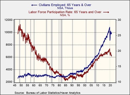
Currently, Americans born in 1959 or earlier are eligible for Social Security, but 65 years old remains the traditional retirement age.  Americans working past 65 years old, at least as a percentage of the total labor force, was common after WWII.  Social Security was still relatively new.  However, from 1947 to 1985, the participation rate for Americans over the age of 65 fell from the 28.6% peak in October 1949 to a low of 10.4% in June 1984.  The number of Americans in the labor force over the age of 65 peaked at 11.2 million in February 2020.  It has fallen since the onset of the pandemic.  The participation rate, the percentage of workers relative to the labor force, has declined since the onset of the pandemic and is continuing to decline.

The chart above shows both the actual number of civilians employed over the age of 65 and the percentage of these workers compared to the labor force of 65-year-olds and older.  Participation has been rising since the early 1990s.  Some of this rise is simply due to a rising population of Americans aged 65 years and older relative to the total population.

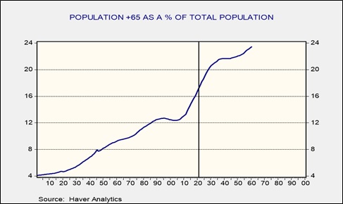
This chart shows the actual and projected level of 65-year-olds and older compared to the total population.  The percentage has been rising since 2003 and is forecast to plateau in 2040.  The entire baby boom generation will be 65 years or older by the end of the decade.

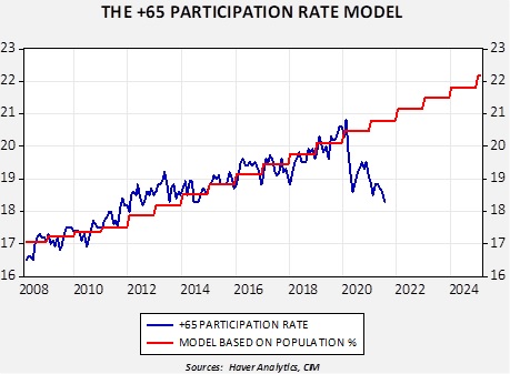
We developed a simple model to measure labor participation of those 65 years and older compared to the population of that age cohort.  Starting in 2008, the model generally predicted the path of participation in this age bracket.  However, since the pandemic, participation has plunged, and the pattern suggests that it’s likely permanent.  Using a similar calculation using the employment/population ratio for this age cohort, the decline in older worker employment represents around 833,000 jobs.  Assuming a stable labor force, that would have reduced the overall unemployment rate to 4.9%.

What impact would a decline in workers aged 65 and older have?  Since older workers are often paid more due to their years of service, losing these workers will, at least initially, improve margins.  It will almost certainly lead to some increased hiring of younger workers and may accelerate lowering the age of the workforce.  Industries will not be equally affected; some are at high risk.  For example, in 2020, 32.9% of farmers and 25.0% of aircraft assemblers are in this age bracket.

For markets, older Americans who leave the workforce may be inclined to reduce their equity positions.  However, returns in fixed income are paltry, so the potential negative impact might be less than one would expect.  Dividend-paying equities could be particularly attractive.  But overall, the impact on financial markets will likely be centered on the wage effects.

View PDF

Weekly Geopolitical Report – Data and Geopolitics: Part I (August 16, 2021)

by Patrick Fearon-Hernandez, CFA | PDF

For decades now, the post-industrial “information age” has been a key topic of interest for economists, business leaders, financial managers, and investors.  All have come to appreciate the implications of silicon-based semiconductors and the opportunities they create for mass data management, storage, communications, and analytics.  In recent years, data has also become a major concern for governments.  In Part I of this report, we discuss why political leaders are now paying closer attention to the control of data and information, and what that means for geopolitics.  In Part II next week, we will show how governmental control over data and information is playing out in China, in particular, and conclude with the ramifications for investors going forward.

Read the full report