by Asset Allocation Committee | PDF
One key worry for investors these days is whether massive fiscal stimulus, loose monetary policy, and accelerating economic growth will spark runaway inflation. That concern has been a major factor in driving down fixed income prices and boosting bond yields since the beginning of the year. However, we’ve been arguing that any acceleration in consumer prices this year is likely to be fleeting. Much of the expected rise in inflation will simply reflect “base effects” as current prices are compared to the extraordinarily weak prices at the beginning of the coronavirus pandemic one year ago. In spite of recent supply chain disruptions, such as the February freeze in Texas and the grounding of the Ever Given container ship in the Suez Canal, there’s also a lot of excess industrial capacity and unused labor in the U.S. and other major developed countries. The overall high availability of resources will likely help keep a lid on inflation for some time to come. In this report, we discuss yet another factor that will probably hamper inflation: population aging.
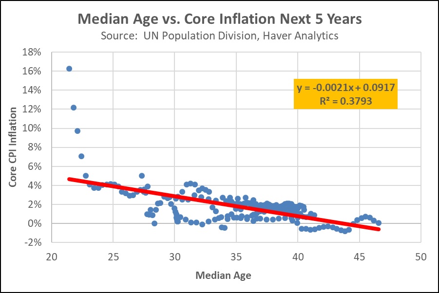
As shown in the chart below, a study we recently conducted suggests that when a country has a higher median age, it tends to have lower inflation in the coming years. Our study looked at the median ages and inflation experience over time for a sample of 10 major economies, each of which has a relatively comparable measure of “core” consumer inflation (consumer price changes excluding the volatile categories of food and energy). Countries in the sample ranged from developed nations like the U.S., Japan, and France to “emerging” or recently developed markets like Mexico, South Korea, and Israel. Across the sample, our study showed that for every additional year of median age, a country’s average annual inflation rate over the coming five years declined by approximately 0.2%. Similar inflation declines were noted for forward periods ranging from one to 15 years. For perspective, a one-year rise in median age is what the U.S. experienced when its median age increased from 37.3 years in 2013 to 38.3 years in 2020.
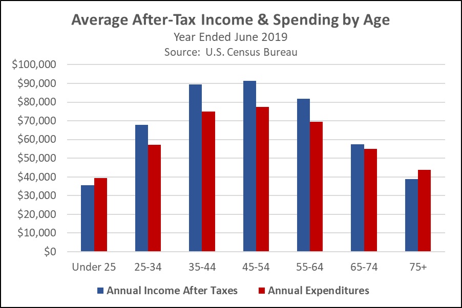
Our analysis suggests population aging holds down inflation primarily through the mechanism of weaker demand. A separate study that we’ve conducted shows that at least in large, developed countries such as the U.S., people tend to reduce their consumption spending as they approach and then enter retirement (see chart below). As birth rates fall, average ages increase, and a greater share of the country’s population enters pre-retirement or retirement. Overall consumption expenditures then grow more slowly than they otherwise would, and the weakening in demand makes it harder for companies to raise prices.
To be sure, plenty of factors can have a bigger impact on inflation in the near term, such as the base effects, fiscal stimulus, and supply disruptions mentioned above. That explains why the estimated equation in the first chart has a relatively low “R2” (a measure of how well the equation fits the relationship; an equation with a strong fit would have an R2 of 0.60 or more). Population aging is probably best thought of as an important background factor inhibiting inflation over the longer term, much like technological innovation or globalization. Population aging is to inflation what a big luggage carrier on the roof of your car is to your top speed: along with the size of your engine, your tire pressure, and other factors, it’s one of many things that can limit just how fast your car can go. That’s why we think falling birth rates and rising median ages in countries across the world should help convince investors that persistently high inflation probably won’t be a problem until further in the future.
View PDF