by Asset Allocation Committee
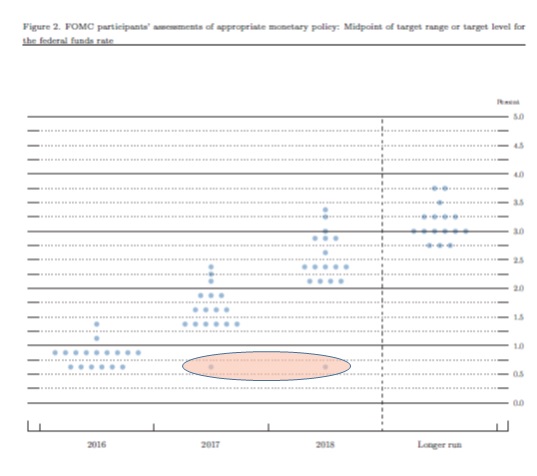
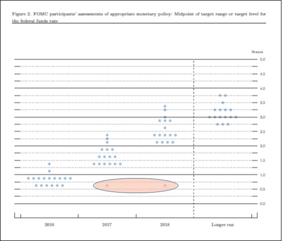
Last week, St. Louis FRB President Bullard issued a position paper that represents a significant departure from what has been standard policy at the Federal Reserve. Our first hint that something had changed was noticed in the dots chart. First, there were two dots that indicated no change in policy in 2017 and 2018. Second, there were only 16 forecasts for the “longer run.” The unexpectedly low dots, shown below in the oval, were initially thought to be attributed to the known dovish members of the committee, such as Governor Brainard or Chicago FRB President Evans. However, as part of the aforementioned paper, St. Louis FRB President Bullard “outed” himself as the lower dots.
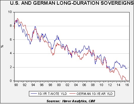
Bullard argues that instead of viewing the economy as having a long-term structural equilibrium, there are a series of medium- to long-term “regimes.” These regimes, although not necessarily permanent, are persistent, and thus monetary policy should be shaped to the regime and not some theoretical equilibrium. The other important point is that regimes themselves are not forecastable. In other words, Bullard assumes a regime in place will stay in place until there is clear evidence of change. The current regime is characterized by real GDP growth of about 2%, unemployment around the current level of 4.7% and inflation in the area of 2% (using the Dallas FRB trimmed mean CPI). This implies that productivity will likely remain low and, due primarily to abnormally large liquidity premiums on safe assets, fixed income returns will be low, as will interest rates. He also assumes no recession on the horizon.
What does this mean? Assuming the current regime stays in place, Bullard believes that the proper fed funds rate is 63 bps, suggesting a target range of 50-75 bps for fed funds, or a single rate hike for the next two years. By design, if policymakers adopt the Bullard model, monetary policy will no longer be anticipatory, but will be adaptive to condition changes with a lag. This is probably a more honest approach to policy but one we suspect will be rejected by the other 16 members of the FOMC or any future governors (there are two unfilled seats on the FOMC). Why? Because adopting this policy will undermine the “oracle” image that the Fed tries to project. In other words, there will be no more “maestros,” the moniker given to Chairman Greenspan.
The problem with Bullard’s policy model will be at the point of regime change—when regimes change, the Fed will be playing catch up to the new regime which will probably require aggressive moves. Understanding the new regime during its transition will take time. On the other hand, Bullard’s program will end much of the speculation on policy; note that Bullard’s dots mostly follow the Eurodollar futures market. In effect, the financial markets will likely set rates (which they really do anyway).
We would expect heated debates on Bullard’s position. First, it undermines the whole Taylor Rule/Phillips Curve model narrative. This model is one of the important tools the FOMC uses in setting policy. Bullard’s notion of regimes could allow for the Taylor Rule to be used but would likely argue that its parameters would change based upon regime conditions. Second, by design, when regimes change, major adjustments in interest rates are likely. The Fed seems to want to avoid major moves, although this is probably impossible in practice. Third, losing the oracle image carries risks in that there would be constant speculation on whether or not the current regime is in danger of ending. If markets become convinced that the parameters of policy are fluid, it would add another layer of uncertainty. For a FOMC that prizes transparency, this move would be difficult. Finally, the dots chart becomes irrelevant because it can only be trusted as long as the current regime is maintained. We will be watching carefully to see how much support Bullard receives for his position. We suspect he will be mostly alone. However, if Bullard’s position gains traction, the fixation on the Fed should wane over time which is probably a healthy long-term development.