

by the Asset Allocation Committee | PDF
Politics is the art of the possible…
Although there have been attempts to treat it as a science (hence the study of political science), the necessary art of politics is to convince people to accept policies that may be contrary to their best interest. This quote sums up the problem succinctly.
We all know what to do, but we don’t know how to get re-elected once we have done it.
Policy actions are sold. Merely telling the public that a difficult policy mix is necessary doesn’t work very well. So, policymakers create narratives to justify and explain why something difficult won’t be all that bad or won’t affect anyone you know. For example, higher taxes on upper-income households are packaged as “paying one’s fair share.” Windfall profit taxes are there to “share the pain.”
The Federal Reserve faces a similar problem. Merely indicating that policy needs to be tightened is unpopular. So, major policy changes must be couched in a manner that the public will accept. Alan Greenspan realized that monetary policy could reduce equity prices; in 1996, he hinted, with the term “irrational exuberance,” that equity prices were too strong relative to earnings. The blowback was severe enough that he never mentioned it again. Federal Reserve policy on this topic is that market bubbles cannot be determined in real-time, and if one occurs, it is easier to address the damage afterward.[1]
Another example is Paul Volcker’s shift to money supply targeting from interest rate targeting. Money supply targeting allowed the Fed to raise rates to unprecedented levels. Targeting a 19.1% fed funds rate (for the record, in June 1981) would have been impossible politically. But having that rate occur “naturally” by constraining the money supply led to the necessary outcome in a politically possible manner.
We may be seeing the Powell Fed attempting something similar. Although the Philips Curve has been mostly disavowed by the Fed, in reality, the spirit of the relationship remains; to contain inflation, the Fed has to slow the economy down enough to create slack in the economy. In simple terms, it means the Fed must create unemployment to bring inflation down. Even under conditions of low unemployment, such a policy is politically unpalatable.
So, both Chair Powell and Governor Waller have suggested that instead of raising unemployment, it may be possible to reduce the “froth” in the labor markets by decreasing the number of job openings. That idea is tied to a concept called the “Beveridge Curve.”
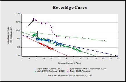
The Beveridge Curve looks at the relationship between job openings and unemployment. This curve attempts to show the efficiency between job openings and filling those openings. In general, moving away from the origin suggests less efficiency. The slope of the curve is also important. A flatter slope suggests greater efficiency because it takes relatively fewer job openings to lower unemployment. We have created curves for the last four business cycles, starting in 1994. After the 2001 recession, the efficiency of the labor market improved as the curve moved toward the origin. Although, the slope did steepen. In the expansion of 2009 through 2020, efficiency fell. That was offset partially by a flatter slope.
The points in the box show the end of the last expansion. Note how the slope essentially steepened. As job openings rose, it became harder to fill them. And then the pandemic hit. The current curve has steepened dramatically; the most recent data point is shown with an arrow. Essentially, the Powell/Waller position is that wage pressures could ease if openings fell back to the slope of the green line running from 2020 into early 2021. In other words, we could see slack develop without a significant rise in the unemployment rate. Waller argues that if hiring efficiency improves, we might be able to ease inflation pressures without a recession.
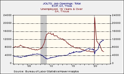
This chart is another way of looking at the data. It measures the number of unemployed to the number of job openings. Note that from 2018 to 2020, openings briefly exceeded the unemployed; at that time, the Beveridge curve slope started to steepen. Pre-pandemic, the difference between the above chart and wage growth for non-supervisory workers does show a +70% positive correlation with the difference leading wage growth by about a year. So, if job openings decline, over time, it should ease wage pressures.
However, the pandemic has upended the job market to some extent. This event led to an increase in older workers leaving the workforce; so far, robust wages have not been enough to draw them back into the labor force. It seems more likely that bringing down job openings will probably require some rise in unemployment. But by focusing on job openings instead of increasing unemployment, the FOMC may buy some degree of political cover to weaken the labor market.
[1] This is similar to Bob Uecker’s advice on how to catch a knuckleball…” wait until it stops rolling and pick it up.”