

Asset Allocation Weekly (November 8, 2019)
by Asset Allocation Committee
The Federal Reserve, in its Financial Accounts of the United States database,[1] has created a Distributional Financial Accounts sub-database that measures household wealth by percentile groups. The data is only reported in four broad categories (Top 1%, 90% to 99%, 50% to 89%, and bottom 50%) and has a fairly short history, starting in Q3 1989. However, even with these limitations, it offers some interesting insights into which different segments of society hold wealth.
For starters, we group the data by the top 10% compared to the bottom 90%.
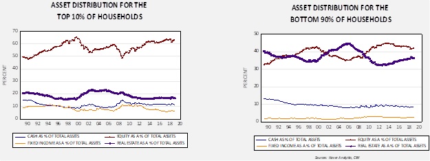
Both charts compare four categories of wealth—cash, equities, fixed income and residential real estate, including vacant land—relative to total assets. A clear distinction between the two groups is that the top 10% hold most of their wealth in equities. Real estate represents less than 20% for the top 10% but it’s around 40% of assets for the bottom 90% of households. Equities represent around 40% of assets for the bottom 90% as well. This tells us that booms and busts affect households differently relative to their wealth; a housing boom tends to make the bottom 90% wealthier, while a bull market in stocks is a bigger deal to the top 10%.
The ratio of equity and real estate wealth for the top 10% to the bottom 90% highlights this factor.
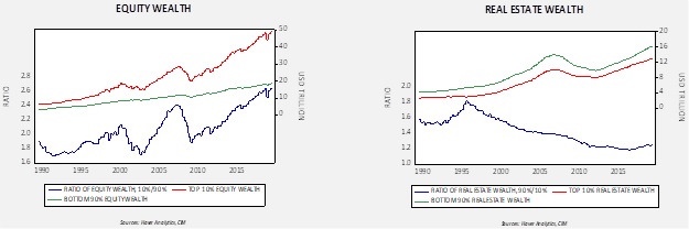
Currently, the equity wealth of the top 10% exceeds the bottom 90% by 2.6x. In terms of real estate, the bottom 90% hold more in total terms, but the two segments tend to mirror each other.
Finally, the ratios of net worth and liabilities show a similar pattern.
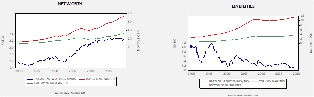
The top 10% net worth exceeds the net worth of the bottom 90% by 2.2x. Liabilities of the bottom 90% exceed those of the top 10% by 3.1x.
These charts show the relative risk to the economy from various market events. A bear market in equities will have much less of an impact on the economy than would declining home prices. Higher borrowing costs will hurt the bottom 90% more than the top 10%. And, in terms of net worth, the difference between the top 10% and the bottom 90% highlights the precarious nature of the latter.
[1] This database was previously called the “Flow of Funds.”