

Asset Allocation Weekly (June 25, 2021)
by the Asset Allocation Committee | PDF
Every quarter, the Federal Reserve publishes the Financial Accounts of the U.S., previously referred to as the Flow of Funds report. The report is huge and provides a balance sheet and income statement of sorts for the economy. The data offer interesting insights into the financial situation of the economy. In this week’s report, we will highlight some of our favorite charts.
This first chart shows net saving for the economy.
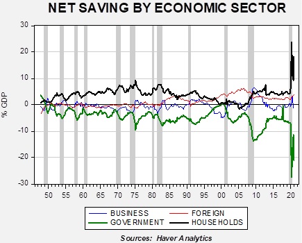
Net saving is a balance sheet concept; saving in one sector must, by design, be offset by dissaving in another. The pandemic has clearly led to a historic accumulation of household saving, mostly created by a similar increase in government dissaving. How these household savings are used will be the key to the economy and markets for the next few years. If it goes to consumption, inflation will likely accelerate. It could also go toward debt reduction, which would lead to slower immediate growth but lay the groundwork for better future consumption. It could also go to financial assets; later this month, the Fed will update the distribution data and we will update the allocation of this saving by income group. Although the household saving and government dissaving does dominate the chart, the foreign and business saving data are also important. Foreign saving is the inverse of the current account; since the U.S. runs a current account deficit, essentially, it is acquiring foreign saving. That number has started to rise as well. On the other hand, business saving has turned negative, which often supports increases in business investment.
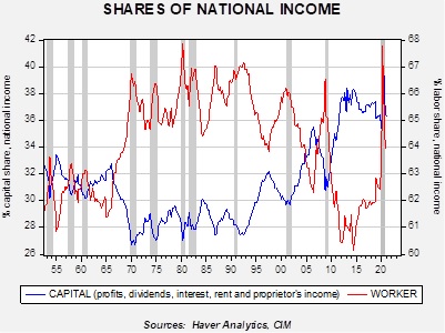
This chart shows the shares of national income by capital and labor as a percentage of national income. Since 1990, when communism fell, we have seen capital income rising against labor in each business cycle. There is a tendency for labor to gain on capital during recessions, mostly because capital income tends to fall more than wages during recessions. At some point, we suspect this trend will be reversed as it isn’t politically sustainable. But that change probably won’t occur until much later this decade.
Finally, the last chart that caught our attention was one that shows we are nearing a normalization of housing finance.
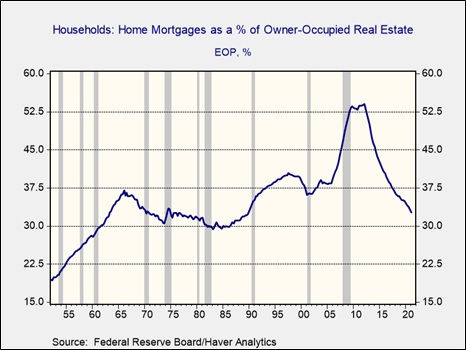
This chart shows home mortgages as a percentage of the value of real estate. At the peak of the housing crisis, home mortgages were more than 50% of the value of housing. This was partly due to leverage and partly due to falling home prices. The combination of conservative housing finance and rising home prices has led to rising home equity (and, consequently, lower leverage as this chart shows). We are not at the level of the mid-1980s, but we are approaching it. As home finance improves, it should bolster further expansion in the housing sector.