

Asset Allocation Weekly (July 9, 2021)
by the Asset Allocation Committee | PDF
In our report from June 25, we discussed the data from the Financial Accounts of the U.S., otherwise known by its original name, the Flow of Funds Report. There is a section of the report that comes out a couple weeks after the initial release known as the Distributional Financial Accounts of the U.S. This second dataset provides a balance sheet by wealth percentile. In other words, it provides the breakdown of assets, liabilities, and net worth by the top 1% of households, the next 9%, the middle 40%, and the bottom 50%. For the most part, we aggregate the top 1% and the next 9% in our analysis.
In the earlier report, we noted that household saving has risen dramatically due to government transfer payments. This report gives us an indication of who is holding the cash.[1]
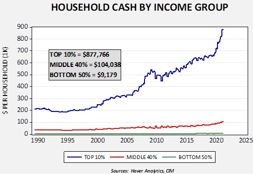
Over the past year, cash holdings of the top 10% are up $161,000. Holdings of the middle 40% are up $14,962, while that of the bottom 10% are up $2,051. Although there have been large government transfers, targeted to the bottom 90%, most of the additional liquidity is in the hands of higher income households.
Net worth rose across all household categories.
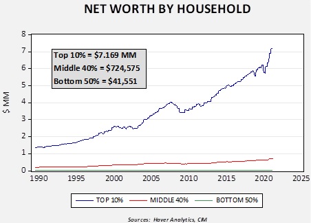
Over the past year, the top 10% saw their net worth rise by $1.4 million. The middle 40% increased by $101,090, and the bottom 50% rose by $10,786.
Finally, in terms of liabilities relative to cash, the bottom 50% are steadily deleveraging.
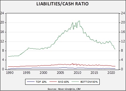
This chart shows a macro form of the cash ratio. Currently, the bottom 50% liabilities exceed cash by 8.8x. The ratio for the middle 40% is 1.3x and it is 0.4x for the top 10%. The key point of this chart is that the bottom 50% have been deleveraging since the Great Financial Crisis.
These three charts are sending a similar message, which is that the distribution of cash and assets does not support sustained inflation. We would need to see more liquidity and assets held in the middle and bottom income brackets, but most of the liquidity is held by the top 10% of households. They are less likely to use it to buy goods and services and more likely to invest. With regard to the third chart, it’s always difficult to know when a household reaches a point where it is comfortable with its debt levels and wants to borrow again. Current levels are consistent with values from 1995 to 2000. However, we note that in the early 1990s, a ratio of 6x was normal. If this group of households decides to further reduce its debt, the chances of this liquidity feeding a reflation would be further reduced.
[1] We define cash as currency and near-cash equivalents, e.g., bank deposits, money market funds, and cash held in pensions.