

Asset Allocation Weekly (March 2, 2018)
by Asset Allocation Committee
The recent rise in long-duration yields has been partially blamed on rising inflation expectations. Although this reason is a possible explanation, the reality is that it’s more likely the fixed income markets are simply adjusting to a faster pace of policy tightening. In this report, we examine the differences between cyclical and secular trends in inflation.
Cyclical trends in inflation are driven by available slack in the economy. In purely theoretical terms, it’s based on the slope of the aggregate supply curve. As available capacity is depleted, additional demand intersects supply when the slope of the supply curve is becoming increasingly vertical.
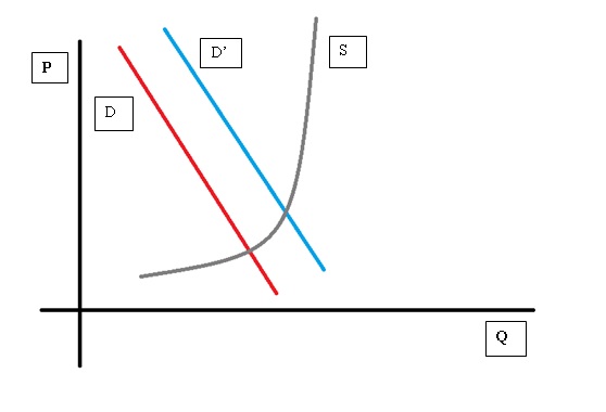
This stylized drawing shows that as demand rises from D to D’, the quantity supplied rises but so do price levels. Obviously, the slope of the supply curve is critical. Policies designed to increase the supply side of the market will tend to bring more output with less inflation. Cyclical inflation is a function of movements along an existing aggregate supply curve, which is fixed in the short run. In the long run, the supply curve can expand or contract; the former leads to lower inflation at all levels of demand and the latter leads to higher levels of inflation at all levels.
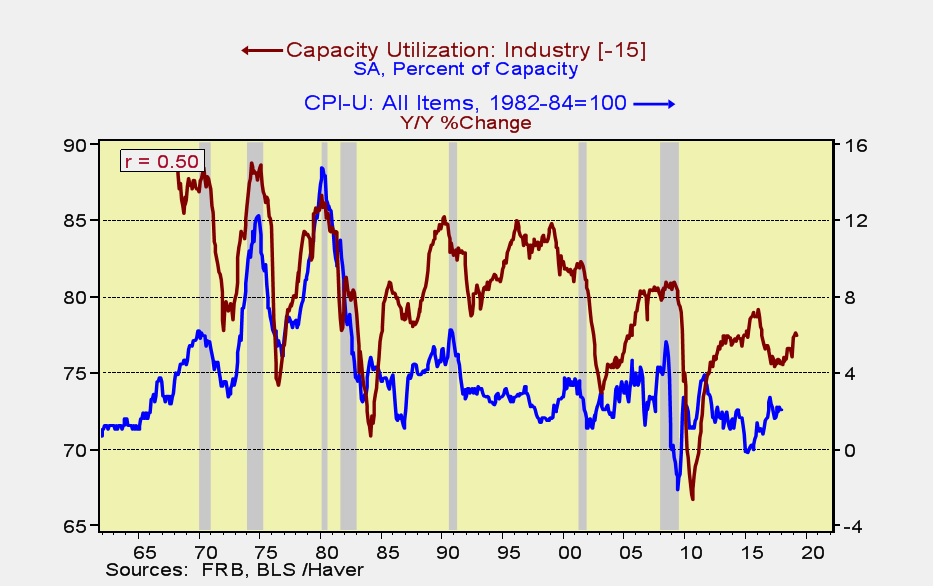
This chart shows the relationship between the yearly change in inflation and capacity utilization; the latter leads inflation by five quarters. Note that in the 1970s into the early 1980s, high levels of capacity utilization were consistent with very high levels of inflation. If the relationship between inflation and capacity utilization that existed in 1972-82 had been maintained, the current level of utilization would have generated inflation of 4.5%, reaching 5.3% by early 2019. But, clearly, the relationship has changed.
We believe the key elements of structural inflation are trade and regulation. An economy open to trade can tap excess capacity globally, and one that is deregulated can rapidly introduce new techniques and technology to improve productivity. The upside to this these policies is lower inflation at each level of aggregate demand; the downside is usually higher levels of inequality.
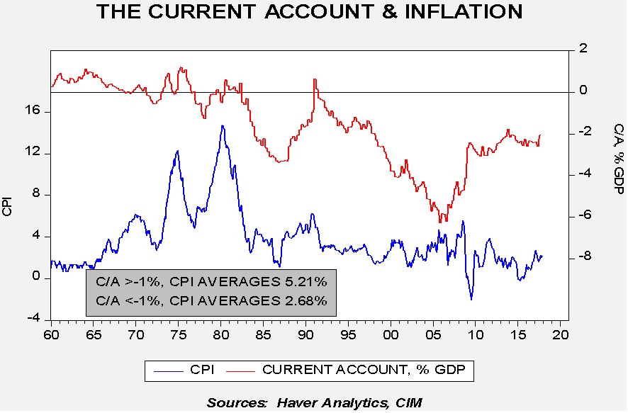
This chart shows the current account with inflation. Inflation fell dramatically as the current account deficit rose from the early 1980s forward.
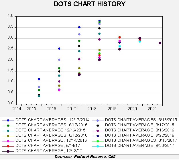
The recent lift in long-term interest rates appears to be due to a re-evaluation of monetary policy expectations. The FOMC’s dots chart has consistently expected normalization in three to four years’ time. However, slow growth and low inflation have persistently pushed off that actual tightening into the ever distant future. The chart below shows the average of the FOMC members’ dots for future year-end fed funds rates. For example, in December 2014, the committee expected the terminal rate in 2018 to be 3.75%. Note how that rate for the end of 2018 steadily declined until last December’s average of just over 2%, or two hikes this year. We expect three increases are more likely.
Although our base case is that secular inflation factors remain unchanged, we are watching trade policy very closely. If the president makes good on his promises to restrict imports, the potential is there for at least a significant secular inflation scare. So far, there has been more rhetoric than action but that may change in the coming year. The FOMC would face a dilemma if inflation expectations were to become “unanchored.” Do they move up the fed funds target with enough vigor to offset the rise in inflation caused by the leftward shift of the aggregate supply curve and likely face a “tweet storm” from the White House, or do they acquiesce to the negative change in aggregate supply and allow inflation fears to return in earnest? Hopefully, Chair Powell won’t face that difficult choice but, if he does, the potential for market disruption would be high.