

Asset Allocation Bi-Weekly – The Devil Is in the Details (August 8, 2022)
by the Asset Allocation Committee | PDF
U.S. policymakers used deregulation and globalization to corral inflation from 1966 to 1982. Unfortunately, that policy was at odds with America’s superpower role, which required the U.S. to act as global importer of last resort. If the U.S. didn’t consume all the goods the world wanted to sell to Americans, the world economy would face a liquidity crisis. Policymakers addressed the issues of containing inflation and providing global liquidity by deregulating financial services, which made it easier for households to borrow money. Although deregulation and globalization slowed real income growth, the ability to borrow allowed households to absorb global imports, holding the international system together. After 1995, this lending was increasingly attached to residential real estate, which was considered safe. Sadly, one of the key economic imbalances that was revealed during the Great Financial Crisis was excessive household debt. Since the crisis, the economy has been trying to address this debt overhang. There has been some progress as household debt peaked at 129.4% of after-tax income in Q1 2008 but fell to 84.4% in Q1 2021. Since then, it has risen to 96.5%.
Although policymakers haven’t targeted this issue, we believe that addressing this debt situation is not only key to improving the health of the economy, but the austerity required to reduce debt may be a factor behind political polarization. The last time the U.S. had a similar debt issue was in the late 1920s when the Great Depression was the resolution, although the situation wasn’t fully addressed until WWII. From a financial perspective, WWII finally resolved the private sector debt problem by placing that debt on the public balance sheet. The debt relative to the size of the economy was reduced on the public balance sheet through financial repression.
One of the difficulties in discussing debt is proper scaling; in other words, how do we know when debt is “too high”? Economists often use nominal GDP or some sort of income measure to scale debt. The problem is that both GDP and income are “flow” data, meaning that they measure a quantity calculated over a period of time, while debt is “stock” data, which is a level at a specific time. In terms of debt, income or GDP may or may not tell us much about the ability to service the debt.
Accounting often creates ratios that measure stock or flows. For example, assets divided by liabilities are two stock numbers that give us some idea about the balance sheet of a firm or household. Clearly, if the assets exceed liabilities, it suggests solvency.
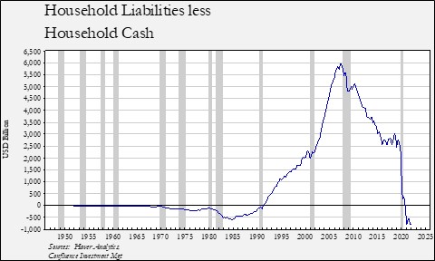
From 1970 to 1990, American households had more cash than debt.[1] After 1990, household leverage rose, peaking with debt exceeding cash to the tune of nearly $6.0 trillion. The difference narrowed after the Great Financial Crisis by more than 50%. The huge injection of fiscal aid to households during the COVID-19 pandemic finally led to cash exceeding debt for the first time in three decades.
So, have we resolved the household debt problem? Perhaps, but the Federal Reserve’s Distributional Financial Accounts, which examines household balance sheets by income, suggests that the debt situation hasn’t necessarily been fixed.
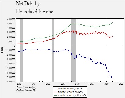
We divide households into three groups: the top 10%, the middle 40%, and the bottom 50%. The top 10% has seen its cash levels rise relative to debt for most of this century, but this difference widened dramatically during the pandemic. Since the upper income brackets were mostly excluded from direct cash payments, it’s likely that this group liquidated appreciated assets. We do note that all three classes took on more debt, but in the case of the top 10%, the cash accumulation far exceeded these new liabilities. The middle 40% saw cash rise relative to debt into Q1 2021, but over the past year, liabilities grew modestly relative to debt. However, for the bottom 50%, net debt continued to rise even with the influx of pandemic transfer payments.
We don’t have a data series by income prior to 1989, so we can’t compare what occurred during and after WWII, but, given the high marginal tax rates of that period, we suspect that the lower income classes saw their balance sheets improve. What can we take away from the above chart? First, as interest rates rise, consumption may fall since the bottom 50% increased their leverage during the pandemic. Consumption will then have to come from the upper 50%. Second, given the massive cash balances of the top 10%, asset prices could find support in the coming months. Although higher cash yields from rising interest rates might keep this cash on the sidelines, we suspect this level of cash will eventually find its way into the equity, commodity, and debt markets. This flow may depend on signs that the FOMC is near the end of its tightening cycle, but once such a catalyst emerges, the conditions for a strong financial market recovery are in place. The great unknown, of course, is which market the potential flows will favor.
[1] This dataset, from the FRB’s Financial Accounts of the U.S., includes households plus non-profits that service households. Thus, strictly speaking, this isn’t just households, but data suggests the non-profit contribution is relatively minor.