

Asset Allocation Weekly (April 13, 2018)
by Asset Allocation Committee
One of the great unknowns in this recovery and expansion is the proper measure of economic slack. Although it’s a term that is rather easy to understand in the abstract, actually defining it is difficult. The Congressional Budget Office (CBO) produces an estimate of potential GDP but it is, at best, a rough measure based on population growth, estimates of productivity and capital stock. The famous “Taylor Rule[1]” uses the difference between actual and potential GDP in its calculation of the neutral policy rate. However, due to the uncertainty surrounding potential GDP, Greg Mankiw, an economics professor at Harvard and Chair of Economic Advisors under President Bush, offered another version of the Taylor Rule, which we call the “Mankiw Rule.” The Mankiw Rule substitutes the unemployment rate less the non-accelerating inflation rate of unemployment (NAIRU). In other words, Mankiw proposes the labor markets are a better measure of slack.
The primary attraction of the Mankiw Rule for policymakers is that it fits well with the FOMC’s other working model, the Phillips Curve, which postulates that there is an inverse relationship between the unemployment rate and inflation. The Mankiw Rule’s primary flaw is that NAIRU isn’t directly observable (although the CBO calculates it as well). It also has a secondary flaw, which is that the unemployment rate may not be the best measure of slack in the labor markets.
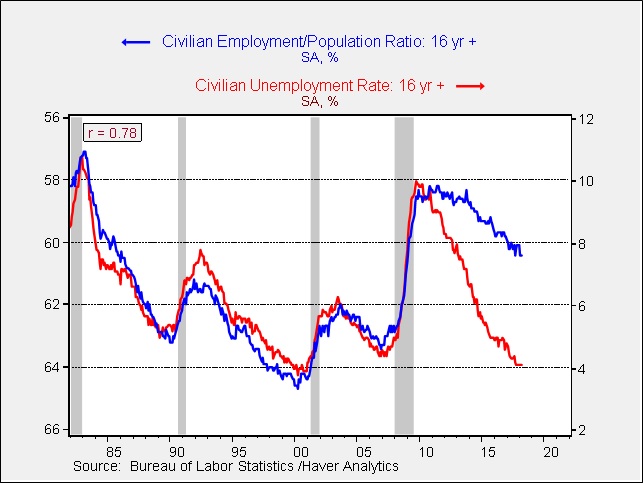
This chart shows the relationship between the unemployment rate and the employment/population ratio (inverted scale). From 1980 to 2010, the two series correlated at 94%. But, the relationship has broken down in this recovery and expansion.
The problem for policymakers is determining which of these two series for the labor market best measures slack. The unemployment rate is at levels that would usually be considered full employment, which would suggest that monetary policy should be tightening rapidly. On the other hand, the employment/population ratio indicates ample slack in the labor market, which would argue for slow tightening at best.
The general consensus among economists is that the employment/population ratio is depressed due to baby boom retirements and structural unemployment caused by globalization and automation. Thus, these workers are not really available for hiring. The high level of long-term unemployment would tend to bolster that position.
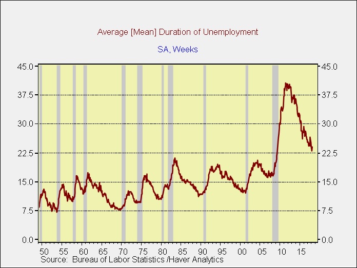
This chart shows the average duration of unemployment. Previous cycle highs were generally around 21 weeks; during expansions the trough is usually around 12 weeks, although the cycle low exceeded 15 weeks in the last expansion. In the Great Financial Crisis, the average duration peaked at 40.7 weeks and remains elevated, but it has been declining. The existence of long-term unemployment does support the idea that the unemployment rate is probably a more accurate measure of slack as the gap shown in the first chart is due to structural unemployment and baby boom retirements.
However, if slack is disappearing, it should be showing up in wages. Thus, comparing the two measures of slack to wage growth should really be the ultimate determinant of which measure is best for policymakers. In this regard, the employment/population ratio has outperformed recently.
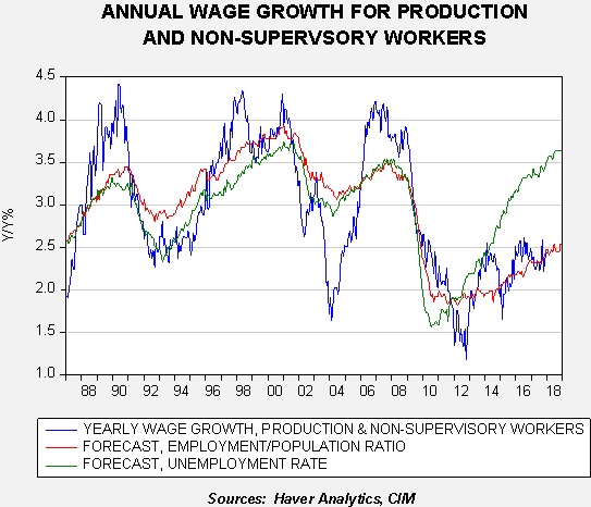
This chart shows the forecast of annual wage growth for production and non-supervisory workers using the unemployment rate in one model and the employment/population ratio in the other. Until 2012, neither model was clearly superior to the other. However, since 2014, the employment/population ratio has been clearly superior. Both independent variables tend to lead wages by nine months. The employment/population ratio predicts that wage growth for this broad segment of workers should remain around 2.5% through the end of this year.
Our primary concern about monetary policy is determining the likelihood of a mistake that would lead to excessive tightening and raise the odds of a recession. Studying the two variations of the Mankiw model, one that uses the unemployment rate and another that uses the employment/population ratio, should offer insights into the chances of a policy error.
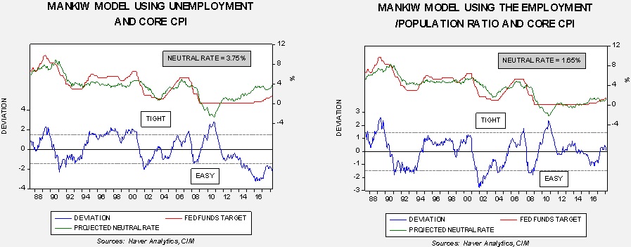
This chart shows the two models. The unemployment rate model suggests the FOMC is woefully behind the curve and needs to raise rates aggressively. The employment/population ratio model suggests the FOMC has achieved policy neutrality and should only raise rates further with evidence of rising inflation. The Fed dots chart average indicates the fed funds target will reach 2.25% by year’s end, or two more rate hikes this year. If all variables remain stable, the unemployment rate model will still signal that policy is accommodative. The employment/population ratio will not reach restrictive until rates reach 2.75%, which would be one standard error above the forecast. The estimates from the dots chart suggest that scenario would happen in 2019, when another three hikes are expected.
Our analysis of comments from members of the FOMC suggests that policymakers believe the unemployment rate is the proper measure of slack. Thus, the odds of a policy mistake are increasing. However, the calculation of the employment/population ratio suggests we aren’t there quite yet. Thus, it is probably too soon to become overly defensive in portfolios based on the domestic economy and monetary policy alone. There may be other reasons (geopolitical and political) to be cautious but, for now, our Asset Allocation Committee remains optimist about risk assets.
[1] Neutral nominal policy rate = neutral real rate + 0.5(actual vs. target inflation) + 0.5(real GDP – real potential GDP)